
Brand guide
10 November 2026
0 Start
This release
- Release
- 2026.11.10-1
- Effective
- 10 November 2026
- Supersedes
- Release 2026.11.09-2
- Owner
- Steven Brown, who decides the brand's rules. sbrown@concertai.com
- Status
- A draft for Steven Brown's review. It replaces the current release once he approves it; until then it goes no further than TeraRecon marketing.
- Based on
- The agency's Brand guidelines, R1 V4, September 2026 (Bread n Butter), complete in this guide. What changed in this release
0.1 Start here
This guide is the source of truth for the TeraRecon brand. Where a deck, a file, a template or a note disagrees with it, the guide wins and the other place gets fixed.
The rules are ours. Each one has a level (Must, Should or May), a permanent code to cite it by, and the source it comes from. The agency's guidelines (Bread n Butter, R1 V4, September 2026) are here complete, in their words, each page under the rules of the chapter it informs.
Need a file? Go to Files. Need a quick answer? Essentials covers most jobs. A word you don't know, such as ground, lockup or bento, is in the glossary.
Just need a Teams background, banner or template? The brand kit has only those.
From the agency
The agency's front pages, word for word.
Agency guidelines R1 V4, p. 2
A look ahead ·
The contents list Gradients and PowerPoint; R1 V4 has no pages for them. Gradients are on the color pages (p.9-10) and in the color rules; PowerPoint is in the typography rules and the Files section.
Agency guidelines R1 V4, p. 3
Everything you need. All in one place. ·
These guidelines were created to help ensure consistent expressions of who we are and how we connect with our audiences across communications. They are intended for the exclusive use of TeraRecon and our partners, and should be kept confidential. Please read it carefully and adhere to the guidance in all your work.
Agency guidelines R1 V4, p. 4
About ·
TeraRecon delivers enterprise imaging intelligence that helps health systems unlock the full value of imaging through connected workflows, AI-driven insights, and coordinated care.
0.2 Essentials
The brand on one screen.
Logo

Charcoal on White, Bone, Cyan and Aqua. White on Cobalt, Deep Cobalt, the Cobalt Gradient and Charcoal. One flat color, no effects, full lockup. Which logo on each color
Color
#004AFF2935 C#221ECD293 C#00C2FF2995 C#404040425 C#F5F5F225% 2330 C#FFFFFFpaper#00CFD93115 C#9A5EFF2101 C#D47AD9238 CClick any value to copy it.
Blues lead. Aqua, Violet and Orchid mark products, as gradients from Cobalt; a product slide or card can sit on its category gradient, never on a flat category color. Full palette
Type
- Headlines
- Public Sans Extra Light, tracking −20 (−0.02 em), leading ≈ size, sentence case: capitalize the first word and proper names, nothing else
- Body
- Public Sans Regular, tracking −10 (−0.01 em), leading ≈ 150%
- PowerPoint
- The Public Sans template, fonts embedded and spacing built in. For new text, copy a placeholder rather than starting a text box.
- Install
- Editing a TeraRecon deck or letter: nothing to install; the fonts travel in the file. Making new artwork: install Public Sans from the ZIP in Files.
Cobalt Gradient
Radial, #004AFF → #3800AB. Crop the darkest corner out.
Particle flow
One flat pill color on one ground. Fade with a ground-colored layer. Never White pills. Agency files only. More
Tagline
See it through
Always inside its oval, large or small.
Spot inks: Cobalt 2935 C, Deep Cobalt 293 C, Cyan 2995 C. Expect them duller than the screen. Print rules
By task
| Task | Grid | Rules |
|---|---|---|
| LinkedIn post | 1080 × 1350 or 1200 × 1200 | LAYOUT-03, LAYOUT-01, LAYOUT-02, LAYOUT-07, LOGO-06, LOGO-11, TYPE-01, TYPE-04 |
| Slide | 1920 × 1080 | TYPE-02, TYPE-01, TYPE-03, LOGO-11, GRAPHIC-12, LAYOUT-07 |
| Email banner | 1200 × 240, email banner | LOGO-17, LAYOUT-03, LOGO-11, LOGO-04 |
| Booth or print panel | 816 × 1056, Letter; other sizes from the short side | PRINT-01, PRINT-05, PRINT-02, LAYOUT-01, LOGO-04, LOGO-14 |
| Web page | Web panels, WEB-10 Panels, corners and gutters on web pages | WEB-10, WEB-09, WEB-11, WEB-01, LAYOUT-02, COLOR-09 |
Every rule carries one of three levels
- Must
- Do this.
- Should
- Do this unless there's a reason not to.
- May
- Allowed, or worth testing; not standard.
How rules are markedMust, Should, May; codes; sources; who decides
- Must Required. Do this. A Must may name its exceptions; anything else needs Steven Brown's decision.
- Should Recommended. Do this unless there's a reason not to.
- May Optional. Allowed, or worth testing; not standard.
| Shown as | Meaning |
|---|---|
| Agency guidelines R1 V4, p. N | the page of the agency's guidelines the rule comes from |
| Decided (date) | a decision made since the guidelines; Steven decides brand rules |
| Measured (date) | a fact checked against a source file; the evidence is in the brand folder's visual ledger |
Every rule has a permanent code, such as LOGO-02: the letters name its chapter, and the number never passes to another rule. Use the link beside a rule to copy its address.
Steven Brown decides brand rules. Steven Brown Design maintains this page and its build.
0.3 Files
Ready-made art for Teams, LinkedIn and email, the PowerPoint templates, the font and the color swatches.
Just need a Teams background, banner or template? The brand kit has only those.
Logos
Vector SVGs, for screen and print, from the agency's final artwork with the colors named correctly. Which one goes where: which logo on each color. Printers who need PDF or EPS: ask Steven Brown.
Lockup
The everyday logo: Charcoal or White, by the ground (LOGO-11 Pick the logo color by the ground).
 Charcoal SVG, 6 KBWhite, Bone and light backgrounds
 White SVG, 6 KBCobalt and the approved dark backgrounds in LOGO-11
 Cobalt SVG, 6 KBSteven Brown's approval required for this piece (LOGO-12)
 Bone SVG, 6 KBSteven Brown's approval required for this piece (LOGO-12)
Orbit mark
Use only in the cases named in LOGO-01 Use the full lockup: an app icon, a favicon, a social avatar, or a small mark above a statement.
 Charcoal SVG, 1 KB
 White SVG, 1 KB
 Cobalt SVG, 1 KBSteven Brown's approval required for this piece (LOGO-12)
 Bone SVG, 1 KBSteven Brown's approval required for this piece (LOGO-12)
Wordmark
Use not yet defined. For ordinary work, use the full lockup (LOGO-01 Use the full lockup); the question is open.
 Charcoal SVG, 5 KB
 White SVG, 5 KB
 Cobalt SVG, 5 KBSteven Brown's approval required for this piece (LOGO-12)
 Bone SVG, 5 KBSteven Brown's approval required for this piece (LOGO-12)
Set up a Teams background
1920 × 1080. The art sits at the sides and the logo top left, so your face stays clear and the logo isn't hidden behind your name label.
- Before or during a meeting, open Effects and avatars (or More › Video effects).
- Choose More video effects › + Add new and pick the downloaded file.
- Select it. Your own preview looks mirrored. This is normal: everyone else in the meeting sees the logo the right way round.
PNG 282 KB
PNG 168 KB
PNG 279 KB

PNG 688 KB

PNG 315 KB
PNG 494 KB
Set up a LinkedIn banner
1584 × 396, LinkedIn's size for a profile background. Your profile photo covers the lower left (the gray circle; hover over a banner to hide it), so the copy starts to its right. There is no template for post images yet.
- On your profile, select the camera icon on the background image.
- Choose Upload photo, pick the file, and leave the zoom at the default.

PNG 179 KB


PNG 195 KB


PNG 309 KB

Set up your email signature
The signature is set in Public Sans, with Arial for readers who don't have it. The banners are made at 1200 × 240 and shown at 600 × 120, so they stay sharp on high-resolution screens.
- Type your details into the form, with your @terarecon.com email, and pick your office. The preview shows your signature as it will look.
- Select Copy signature.
- In Outlook, open Settings › Accounts › Signatures (in classic Outlook for Windows, File › Options › Mail › Signatures), start a new signature and paste.
- To add a banner, put the cursor under the address, insert one of the banners, set its width to 600 px and link it to terarecon.com.
- Choose the signature for new messages and for replies, then send yourself a test.
A sample signature, with placeholder details. Make your own with the form on the guide's web page.
| Your Name |
| Your title |
| Mobile +1 000 000 0000 |
| your.name@terarecon.com |
 |
| www.terarecon.com |
| TeraRecon | 39650 Liberty St, Ste 370 Fremont, CA 94538 |
The form needs JavaScript. Without it, select the signature, copy it, and change the details after you paste.

PNG 41 KB


PNG 191 KB

PNG 105 KB
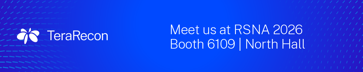
- MustLOGO-17
Make your email signature with the brand kit's signature form: your name, title, mobile and @terarecon.com email, then the Charcoal lockup, www.terarecon.com and the address of your office, picked from the form's list. One of the kit's email banners may go under it.
Why and source
One block for everyone keeps signatures alike and every address written the same way. Text is Charcoal and links Deep Cobalt; the name is set larger, not bold. The lockup is 150 px wide on White, so it stays readable when a mail app turns dark, and loads from a fixed address on terarecon.com that later kit releases never move.
LOGO-17 Email signature: the block from the brand kit. Decided 29 October 2026.
PowerPoint, fonts and swatches
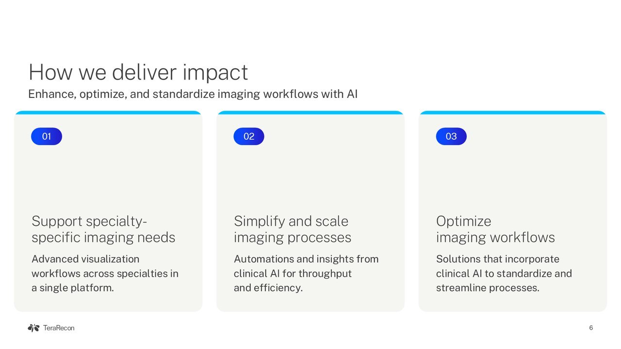
Use the Public Sans template for every deck.
- Download PowerPoint template and double-click it. PowerPoint opens a new, untitled deck from it.
- Choose layouts from Home › New Slide; the cover, section, content and closing layouts carry the brand art.
- When you save, keep File › Options › Save › Embed fonts in the file on, so Public Sans travels with the deck.

Letterhead
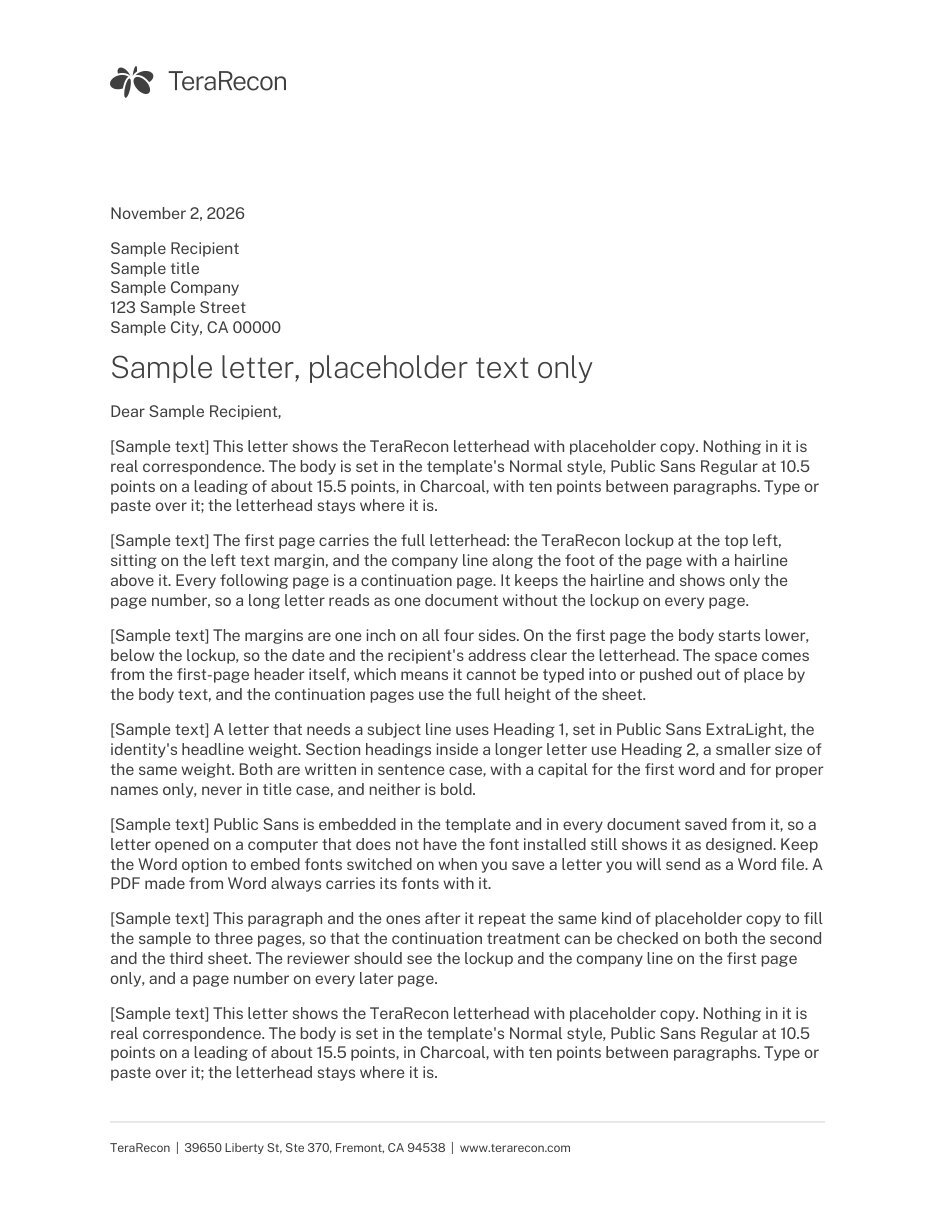
One Word template per office and paper size: US Letter for every office, A4 for Frankfurt and Tokyo. Public Sans is embedded, so nothing needs installing.
- Download the Word template for your office and double-click it. Word opens a new, untitled letter from it.
- Click each gray prompt (the date, the recipient, the subject, the letter, your name) and type over it. The first page carries the logo and your office's address; later pages show the page number.
- Keep File › Options › Save › Embed fonts in the file on, so Public Sans travels with a letter you send as a Word file. To send a PDF, use File › Save As and choose PDF.
For a printer: Fremont, CA (US Letter) PDF, Frankfurt, Germany (A4) PDF, Frankfurt, Germany (US Letter) PDF, Tokyo, Japan (A4) PDF, Tokyo, Japan (US Letter) PDF.
Every filerole, format, size, version and use
Production files are ready to use; preview files are for screens only; pointers are locations in the TeraRecon brand folder, not downloadable here: ask Steven Brown for access. Checksums are in release-manifest.json.
| File | Role | Format | Size | Version | Use |
|---|---|---|---|---|---|
| Teams background, light 1: Bone, flow | Production | PNG 1920 × 1080 px |
282 KB | v1, 7 Oct 2026 | Teams video background |
| Teams background, light 2: White, tiles | Production | PNG 1920 × 1080 px |
168 KB | v1, 7 Oct 2026 | Teams video background |
| Teams background, light 3: Bone, heart | Production | PNG 1920 × 1080 px |
279 KB | v1, 7 Oct 2026 | Teams video background |
| Teams background, dark 1: Cobalt flow | Production | PNG 1920 × 1080 px |
688 KB | v1, 7 Oct 2026 | Teams video background |
| Teams background, dark 2: gradient, card | Production | PNG 1920 × 1080 px |
315 KB | v1, 7 Oct 2026 | Teams video background |
| Teams background, dark 3: Charcoal, spine | Production | PNG 1920 × 1080 px |
494 KB | v1, 7 Oct 2026 | Teams video background |
| LinkedIn banner 1: Cobalt flow | Production | PNG 1584 × 396 px |
179 KB | v1, 7 Oct 2026 | LinkedIn profile background |
| LinkedIn banner 2: Bone flow | Production | PNG 1584 × 396 px |
195 KB | v1, 7 Oct 2026 | LinkedIn profile background |
| LinkedIn banner 3: gradient, anatomy | Production | PNG 1584 × 396 px |
309 KB | v1, 7 Oct 2026 | LinkedIn profile background |
| Email-signature banner 1: gradient, tagline | Production | PNG 1200 × 240 px |
41 KB | v1, 7 Oct 2026 | Email signature, shown at 600 px wide |
| Email-signature banner 2: Bone flow | Production | PNG 1200 × 240 px |
191 KB | v1, 7 Oct 2026 | Email signature, shown at 600 px wide |
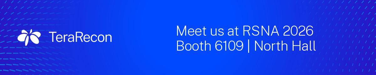
| Email-signature banner 3: RSNA 2026, Booth 6109 | North Hall | Production | PNG 1200 × 240 px |
105 KB | v2, 30 Oct 2026 | Email signature, shown at 600 px wide Use until the end of RSNA 2026; then stop using it. |
| Email-signature logo: Charcoal lockup on White | Production | PNG 450 × 82 px |
10 KB | v1, 29 Oct 2026 | The logo the email signature loads from terarecon.com, shown at 150 px wide |

| File | Role | Format | Size | Version | Use |
|---|---|---|---|---|---|
| TeraRecon 2026 PowerPoint template | Production | POTX | 2.3 MB | v4, 26 Oct 2026 | New decks: double-click to start one. Public Sans is embedded. |
| Public Sans, static TTFs with the SIL Open Font License | Production | ZIP | 594 KB | Public Sans 2.x static, as filed 8 Oct 2026 | Unzip first. Windows: select all the .ttf files, right-click, Install. Mac: open them and choose Install Font. Headlines use Extra Light, never Thin. Also on Google Fonts. SIL Open Font License 1.1 (OFL.txt inside); free to install and share. |
| Letterhead, Fremont, CA: Word template | Production | DOTX | 327 KB | v1, 2 Nov 2026 | Letters from the Fremont office: double-click to start one. Public Sans is embedded. |
| Letterhead, Fremont, CA: print PDF | Production | 21 KB | v1, 2 Nov 2026 | For a printer: the first page and a continuation page. | |
| Letterhead, Frankfurt, Germany: Word template | Production | DOTX | 327 KB | v1, 2 Nov 2026 | Letters from the Frankfurt office (TeraRecon GmbH): double-click to start one. Public Sans is embedded. |
| Letterhead, Frankfurt, Germany: print PDF | Production | 22 KB | v1, 2 Nov 2026 | For a printer: the first page and a continuation page. | |
| Letterhead, Tokyo, Japan: Word template | Production | DOTX | 327 KB | v1, 2 Nov 2026 | Letters from the Tokyo office: double-click to start one. Public Sans is embedded. |
| Letterhead, Tokyo, Japan: print PDF | Production | 22 KB | v1, 2 Nov 2026 | For a printer: the first page and a continuation page. | |
| Letterhead, Frankfurt, Germany, A4: Word template | Production | DOTX | 327 KB | v1, 3 Nov 2026 | Letters on A4 from the Frankfurt office (TeraRecon GmbH): double-click to start one. Public Sans is embedded. |
| Letterhead, Frankfurt, Germany, A4: print PDF | Production | 22 KB | v1, 3 Nov 2026 | For a printer: the first page and a continuation page, A4. | |
| Letterhead, Tokyo, Japan, A4: Word template | Production | DOTX | 327 KB | v1, 3 Nov 2026 | Letters on A4 from the Tokyo office: double-click to start one. Public Sans is embedded. |
| Letterhead, Tokyo, Japan, A4: print PDF | Production | 22 KB | v1, 3 Nov 2026 | For a printer: the first page and a continuation page, A4. |
| File | Role | Format | Size | Version | Use |
|---|---|---|---|---|---|
| Swatches for screen work, RGB (.ase) | Production | ASE | 1 KB | v2, 23 Sep 2026 | Illustrator, InDesign, Photoshop: screen documents |
| Swatches for process print, CMYK (.ase) | Production | ASE | 1 KB | v2, 23 Sep 2026 | Print jobs without spot inks |
| Swatches for spot print, PANTONE (.ase) | Production | ASE | 1 KB | v2, 23 Sep 2026 | Spot-ink print; Bone is a 25% tint of 2330 C |
| Color, type and web layout tokens as CSS custom properties | Production | CSS | 6 KB | 3 Nov 2026 | Web themes: copy into the theme. Includes the web type scale per breakpoint (WEB-09), radii, widths and gutters (WEB-10), spacing (WEB-11), the card copy column (WEB-07) and the category card gradients (COLOR-11), generated from those rules |
| File | Role | Format | Size | Version | Use |
|---|---|---|---|---|---|
| Lockup, Charcoal, SVG | Production | SVG | 6 KB | agency final, 23 Sep 2026 | Light grounds, and Cyan and Aqua: the default. |
| Lockup, White, SVG | Production | SVG | 6 KB | agency final, 23 Sep 2026 | Cobalt, Deep Cobalt, the Cobalt Gradient, Charcoal and dark photos. |
| Lockup, Cobalt, SVG | Production | SVG | 6 KB | agency final, 23 Sep 2026 | One-color jobs on a light material, where Cobalt is the only ink. |
| Lockup, Bone, SVG | Production | SVG | 6 KB | agency final, 23 Sep 2026 | Dark grounds where the other light elements are Bone. |
| Orbit mark, Charcoal, SVG | Production | SVG | 1 KB | agency final, 23 Sep 2026 | Light grounds, and Cyan and Aqua: the default. |
| Orbit mark, White, SVG | Production | SVG | 1 KB | agency final, 23 Sep 2026 | Cobalt, Deep Cobalt, the Cobalt Gradient, Charcoal and dark photos. |
| Orbit mark, Cobalt, SVG | Production | SVG | 1 KB | agency final, 23 Sep 2026 | One-color jobs on a light material, where Cobalt is the only ink; the website favicon (the Cobalt Orbit set in HubSpot Brand). |
| Orbit mark, Bone, SVG | Production | SVG | 1 KB | agency final, 23 Sep 2026 | Dark grounds where the other light elements are Bone. |
| Wordmark, Charcoal, SVG | Production | SVG | 5 KB | agency final, 23 Sep 2026 | Light grounds, and Cyan and Aqua: the default. |
| Wordmark, White, SVG | Production | SVG | 5 KB | agency final, 23 Sep 2026 | Cobalt, Deep Cobalt, the Cobalt Gradient, Charcoal and dark photos. |
| Wordmark, Cobalt, SVG | Production | SVG | 5 KB | agency final, 23 Sep 2026 | One-color jobs on a light material, where Cobalt is the only ink. |
| Wordmark, Bone, SVG | Production | SVG | 5 KB | agency final, 23 Sep 2026 | Dark grounds where the other light elements are Bone. |
| Icon, White Orbit on the Cobalt Gradient, 1024 px PNG | Production | PNG 1024 × 1024 px |
507 KB | v1, 30 Oct 2026 | The master of the favicon and social avatar; scale down from this. |
| Icon, 512 px PNG | Production | PNG 512 × 512 px |
138 KB | v1, 30 Oct 2026 | Web app and social avatar uploads. |
| Icon, LinkedIn company-page logo, 400 px PNG | Production | PNG 400 × 400 px |
79 KB | v1, 30 Oct 2026 | The LinkedIn company-page logo. |
| Icon, iPhone home-screen icon, 180 px PNG | Production | PNG 180 × 180 px |
16 KB | v1, 30 Oct 2026 | The iPhone and iPad home-screen icon. |
| Lockup, Charcoal, 800 px PNG | Preview | PNG 800 × 145 px |
36 KB | 7 Oct 2026 | On-screen preview, light grounds. For print and large use, take the SVG logos above. |
| Lockup, White, 800 px PNG | Preview | PNG 800 × 145 px |
24 KB | 7 Oct 2026 | On-screen preview, Cobalt and dark grounds. For print and large use, take the SVG logos above. |
Logo vectors (AI, SVG, PNG): Lockup, Orbit Mark, Wordmark in Charcoal, Cobalt, Bone, Whitebrand\terarecon-2026\source\2026-09-23-final-deliverables\Logo\, or the CC library "TeraRecon 2026 - Brand" |
Pointer | — | — | agency final, 23 Sep 2026 | Production logos. The agency's White and Bone files are swapped; the CC library's symbols are named correctly. |






| File | Role | Format | Size | Version | Use |
|---|---|---|---|---|---|
Swatches: one .ase each for RGB, CMYK and PANTONEbrand\terarecon-2026\colour\ |
Pointer | — | — | v2, 23 Sep 2026 | Illustrator, InDesign, Photoshop |
Color and type tokens: tokens.json, tokens.cssbrand\terarecon-2026\ |
Pointer | — | — | 7 Oct 2026 | Code and web themes. The values on this page are built from tokens.json. |
Creative Cloud libraries "TeraRecon 2026 - Brand" and "- Graphics"brand\terarecon-2026\libraries\ |
Pointer | — | — | v1, 24 Sep 2026 | Swatches, gradients, type styles, logo and graphic symbols in one panel |
The agency's particle-flow and rendering filesbrand\terarecon-2026\source\2026-09-23-final-deliverables\Graphics\ |
Pointer | — | — | agency final, 23 Sep 2026 | Pre-approved particle flow (p.15-17) and the four renderings (p.19) |
The agency's guidelines as delivered (R1 V4 PDF) and the redline of their errorsbrand\terarecon-2026\source\2026-09-23-final-deliverables\Brand_Guidelines\ and brand\terarecon-2026\review\ |
Pointer | — | — | R1 V4, 23 Sep 2026 | Reference; this page carries all of their content |
deck-forge brand "terarecon"C:\GitHub\deck-forge\brands\terarecon\ |
Pointer | — | — | 8 Oct 2026 | Generated decks; its notes point here |
Visual identity
The parts of the identity and the rules for each.
Agency guidelines R1 V4, p. 5
Outlines the full visual system, including logos, color, typography, and graphic elements that create a consistent and recognizable brand expression.
Agency guidelines R1 V4, p. 6
Overview
In the panel: Public Sans · Extra Light · Light · Regular · SemiBold
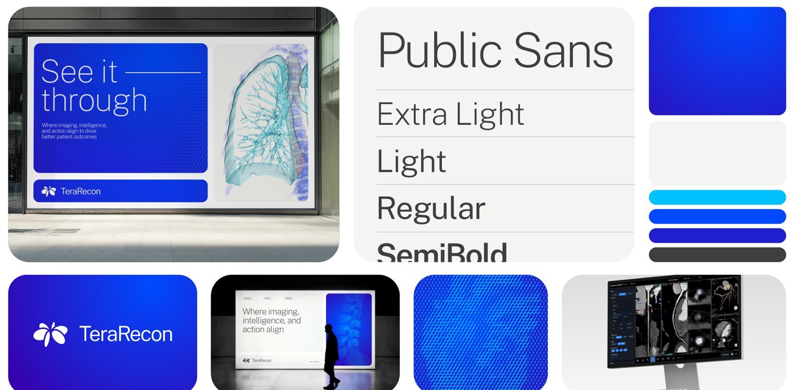
1.1 Philosophy
The ideas the rules come from.
Four words sum up the identity: bounded, precise, well‑defined and restrained. They are the reasons behind the rules, and the place to start when a rule is silent.
Bounded
Each thing is given a place and kept in it.
Clarity comes from knowing where one thing ends and the next begins. When two subjects overlap, both lose: copy laid over a product hides the product and is harder to read. Clinicians spend their day on dense, layered screens, and our pieces should be calm by contrast, with one subject in each space, seen whole.
The rule it explains: LAYOUT-05 One subject per panel.
Precise
We work the way our products do: measured and exact.
TeraRecon's products measure anatomy to the millimeter. Our layouts are measured too. Order comes from structure built into a piece, where its frames sit and how they line up, not from effects applied on top. A structured piece holds up at any size, and the next designer can rebuild it; one held together by masks and shadows cannot.
The rules it explains: LAYOUT-07 Panels on a clean grid and LAYOUT-04 Frame the scene, not the prop.
Well‑defined
Each thing is plainly itself.
Nobody should have to work out what they are looking at. Our audience reads medical images for a living and knows what a doctored one looks like. A product cut out of its photograph, given a glow or composited onto a gradient raises the question of what else was changed. We show the photograph as it was taken and let the panel do the cropping.
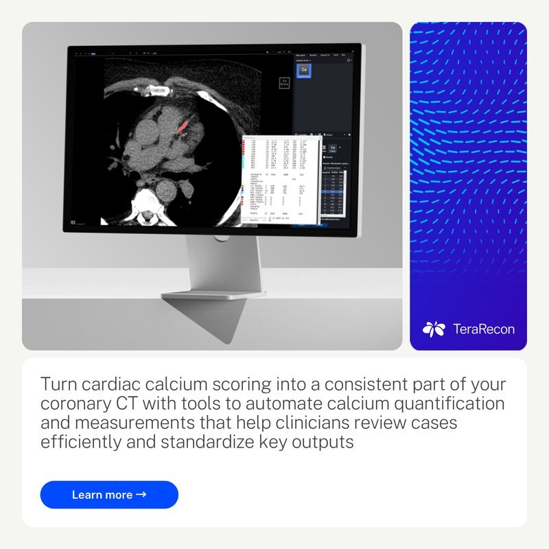
The rules it explains: LAYOUT-06 No image-editing effects and LAYOUT-04 Frame the scene, not the prop.
Restrained
Confidence needs no decoration.
A brand that trusts its product and its viewer does not need to raise its voice. We take things away before we add anything. Depth from shadows, bevels and glows is borrowed; the depth we use is real, a White panel on a Bone ground.
The rule it explains: LAYOUT-06 No image-editing effects.
The same ideas run through the agency's examples: each module has one job, related edges align, and the ground frames the whole. See LAYOUT-08 Divide the composition into distinct jobs and LAYOUT-09 Keep a visible frame and a consistent gutter rhythm. The four words are Steven Brown's, 3 November 2026.
1.2 Logo
Reach for these two. The rest of this chapter is for the unusual ground.
The lockup
 Steven Brown's approval required (LOGO-12)
 Steven Brown's approval required (LOGO-12)
- MustLOGO-01
Use the full lockup: the Orbit and the TeraRecon wordmark together. Exception: the Orbit alone where a lockup can't fit or TeraRecon is already named on the same surface: an app icon, a favicon, a social avatar, or a small mark above a statement.
Why and source
One lockup everywhere spares makers a choice. For anything outside these cases, ask Steven Brown. Whether to use the wordmark on its own is an open question.
LOGO-01 Use the full lockup. Agency guidelines R1 V4, p. 7; the Orbit exception decided 8 October 2026; merged with "The Orbit on its own, rarely" into one Must, written without hedges, by Steven Brown, 3 November 2026.
- MustLOGO-02
Use the logo files as supplied, in one flat color: never stretch, rotate, recolor, outline or fill the logo with a gradient.
Why and source
Shadows, glows and other effects come under LAYOUT-06 No image-editing effects. The gradient Orbit from the identity's development stays out of use.
LOGO-02 One flat color, as supplied. Agency guidelines R1 V4, p. 7; decision 30 September 2026 (call with Brian and Heather); shadows and glows moved to the one effects rule, 3 November 2026 (Steven Brown).
- MustLOGO-03
Keep one letter height of empty space on every side of the lockup, measured as the cap height of the TeraRecon wordmark.
Why and source
Nothing else enters that space: no type, edge of the piece, image detail or other logo. Take the measure from the lockup you are placing, so it scales with the logo. The Orbit alone has no wordmark to measure from; its clear space is an open question.
LOGO-03 Clear space around the lockup. Decided 30 October 2026; Steven Brown, on a call with Alexis (TeraRecon) about product labels.
- MustLOGO-04
Never set the full lockup smaller than 120 px wide on screen or 1 in (25 mm) wide in print.
Why and source
At those widths the wordmark's capitals are about 13 px tall on screen (like 18 px text) and about 0.11 in in print (like 11 pt type), and its thinnest strokes still hold. Measure the whole lockup, without its clear space. Where there is less room, or the lockup would be cropped, use the Orbit on its own if LOGO-01 Use the full lockup allows it; otherwise make room. The Orbit alone has no minimum yet; ask Steven Brown before setting it very small.
LOGO-04 Minimum size of the lockup. Decided 2 November 2026.
- MustLOGO-05
Use the logo files from this guide's Files section or the brand library: the agency's "White" and "Bone" files are swapped.
Why and source
The agency's file named Bone is pure white, and the one named White is off-white (RGB 247, 241, 236).
Files: Lockup, Charcoal, 800 px PNG; Lockup, White, 800 px PNG.
LOGO-05 Use the logo files named for what they are. Measured 23 September 2026.
- ShouldLOGO-06
Keep the logo modest and let the message be the big thing: the logo signs the piece, the headline speaks.
Why and source
- People read the biggest thing first. If that's the logo, the piece only says our name. If it's the message, it says why we matter, and the logo tells them who said it.
- A small logo reads as confident. Trusted brands sign their work; a huge logo looks like it's asking to be noticed.
- The system already says TeraRecon. Cobalt, particle flow, Extra Light type and the oval are recognized before anyone finds the logo.
- It's how the agency designed it. The T-shirt (p. 31) has a small lockup and a large "See it through"; the display (p. 24) gives the logo its own bar under the message.
- How small: easy to read at the distance the piece is seen from, and no bigger. If someone asks for it bigger, make the message clearer instead.
LOGO-06 A small logo and a big message. Decided 8 October 2026.
- ShouldLOGO-07
In everyday pieces, give the logo a fixed, quiet place apart from the message, sized for the piece's purpose.
Why and source
Covers, the app icon, signage and closing slides may give the logo more weight. See LOGO-06 A small logo and a big message.
LOGO-07 Treat the logo as attribution in ordinary messages. Drawn from the examples in Agency guidelines R1 V4, pp. 23, 24, 25, 26, 27, 28; rewritten as a Should in our own voice by Steven Brown's direction, 3 November 2026: "We are the source of truth, we don't need to refer back to the agency."
Agency guidelines R1 V4, p. 7
The TeraRecon logo lockup combines a refined wordmark with the Orbit mark, a symbol inspired by the alignment of imaging data, technology, clinical expertise, and human insight into a unified view. The Orbit mark visualizes intelligent coordination in motion, transforming complex signals into clarity and action.
The primary logo lockup should be used in most scenarios to ensure proper attribution and identification of the company. The Orbit mark and wordmark should be used more sparingly as visual shorthand and in environments where TeraRecon is already identified. The Charcoal and Cobalt versions of the logos should be used on lighter backgrounds and the Bone and White versions of the logos should be used on darker backgrounds. Do not alter, distort, rotate, recolor, or apply effects to the logo, and always maintain its clarity, proportions, and integrity.
Logo Lockup - Charcoal · Logo Lockup - Cobalt · Logo Lockup - Bone · Logo Lockup - White
The Orbit and the wordmark


 Steven Brown's approval required (LOGO-12)
 Steven Brown's approval required (LOGO-12)


 Steven Brown's approval required (LOGO-12)
 Steven Brown's approval required (LOGO-12)
- MustLOGO-08
The website favicon is the Cobalt Orbit, as set in HubSpot Brand. The social avatar and the app icon (the LinkedIn company-page logo, the iPhone home-screen icon, any other avatar) are the White Orbit, alone, centered on a square of the Cobalt Gradient.
Why and source
The favicon is Cobalt by Steven Brown's approval for this one use: the Cobalt Orbit on a transparent ground, the website's default favicon. The avatar and app icon follow the agency's app icon on p. 29: the Orbit fills 78% of the square's width so it holds at small sizes, and the gradient runs from Cobalt at the top-left corner, with its darkest corner cropped outside the square. The Orbit stands alone here under LOGO-01 Use the full lockup, and is White on the avatar because LOGO-11 Pick the logo color by the ground gives White on the Cobalt Gradient. Make every avatar size from the 1024 px master.

The avatar and app icon, at 256 px. Files: Icon, White Orbit on the Cobalt Gradient, 1024 px PNG; Icon, 512 px PNG; Icon, LinkedIn company-page logo, 400 px PNG; Icon, iPhone home-screen icon, 180 px PNG; Orbit mark, Cobalt, SVG.
LOGO-08 Favicon, social avatar and app icon. Decided 30 October 2026; the Cobalt favicon approved by Steven Brown, 30 October 2026: "Actually that favicon is fine it's just not propogating".
- MustLOGO-09
Use the Orbit alone for a profile picture, never the full lockup.
Why and source
A profile picture is cropped to a circle or a rounded square and shown at a few dozen pixels. A lockup there is either cropped, which it may never be, or shrunk below its minimum size (LOGO-04 Minimum size of the lockup) until it fails WCAG. Use the avatar file: the White Orbit on the Cobalt Gradient (LOGO-08 Favicon, social avatar and app icon).
Files: Icon, White Orbit on the Cobalt Gradient, 1024 px PNG; Icon, 512 px PNG; Icon, LinkedIn company-page logo, 400 px PNG.
LOGO-09 The Orbit, not the lockup, as a profile picture. Decided 2 November 2026; written without "generally" by Steven Brown, 3 November 2026.
- MustLOGO-10
Don't make logos for products. Name a product in type, in Public Sans beside or under the TeraRecon lockup; a product name may be set as a plain wordmark, never with its own symbol.
Why and source
One mark keeps the master brand strong and spares designing, approving and policing one for every product. The category colors (p. 10) already tell the categories apart.
LOGO-10 No product logos. Decided 8 October 2026; context clarified 3 November 2026 (documentation).
Agency guidelines R1 V4, p. 8
The same text as p.7, for the Orbit mark and the wordmark on their own.
Orbit Mark - Charcoal · Wordmark - Charcoal · Orbit Mark - Cobalt · Wordmark - Cobalt · Orbit Mark - Bone · Wordmark - Bone · Orbit Mark - White · Wordmark - White
Which logo on each color
Light grounds: Charcoal
Cobalt and dark grounds: White
Bone and Cobalt: one job each
Never
Advanced visualization for every reading room 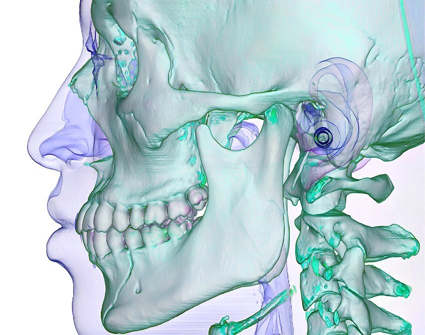
Ratios use the WCAG contrast calculation. This guide sets a 4.5:1 target for its approved logo/background pairings; that is TeraRecon's target, not a general WCAG requirement for logos. Screen colors shown; check print on a proof.
- MustLOGO-11
Use the one logo color the table gives for the ground the logo sits on.
Why and source
The agency allows two colors on each kind of ground (p. 7); the table Logo color by ground narrows it to one, from the agency's examples and measured contrast. Keeping Cobalt for one-color jobs is our decision: the agency allows Cobalt on light grounds, and p. 4 sets the Cobalt Orbit above Charcoal text.
Logo color by ground Ground Logo Why White, Bone, light grays, light photos Charcoal The default everywhere. 9.5–10.4:1. Cobalt, Deep Cobalt, the Cobalt Gradient, the Cobalt end of a category gradient White 6.1–12.0:1. Charcoal, black, dark photos White 10.4–21:1. Cyan or Aqua Charcoal White fails here (2.1:1 and 1.9:1). Flat Violet, Orchid, or any mid-tone No logo Nothing reaches 4.5:1; category solids are never full grounds. Dark ground where the other light elements are Bone Bone Rare: ask Steven Brown first. So the mark matches the type beside it. One-color jobs on a light material: single-spot print, promo items, embroidery Cobalt (PANTONE 2935 C) Rare: ask Steven Brown first. Only where Cobalt is the only ink or thread; never beside Charcoal type. Files: Lockup, Charcoal, 800 px PNG; Lockup, White, 800 px PNG.
LOGO-11 Pick the logo color by the ground. Decided 7 October 2026.
- MustLOGO-12
Use the Charcoal or the White logo. Exception: the Cobalt or the Bone logo, only with Steven Brown's approval for that piece.
Why and source
The brand kit gives employees the Charcoal and White lockups only. The guide keeps the Cobalt and Bone files for the cases named in the table Logo color by ground, under LOGO-11 Pick the logo color by the ground.
LOGO-12 Charcoal or White; Cobalt and Bone by approval. Decided 26 October 2026; the exception written without hedges by Steven Brown, 3 November 2026.
- MustLOGO-13
Over a photo, the logo goes only where the area is calm, the contrast is good and it covers nothing of the photo's subject; choose the logo color for the area directly under it. Over a pattern, choose the color the same way. Where no such area exists, or it is mixed, put the logo on a flat panel.
Why and source
See LAYOUT-05 One subject per panel. A shadow or outline added to make the logo read breaks LAYOUT-06 No image-editing effects.
LOGO-13 Over a photo or pattern, judge the area under the logo. Decided 7 October 2026; the photo conditions decided 3 November 2026 (Steven Brown: "Logo is sort of in-between. It can only go over a photo if it is in a non-busy area with good contrast and, critically, is not covering the subject of the photo.").
- MustLOGO-14
Set "See it through" in its outlined oval. The large, loose display treatment (p. 24, 25 and 31) is used only with Steven Brown's approval.
Why and source
The loose treatment runs the words large, with a rule after "it" (p. 24, 25), or stacked over particle flow on apparel (p. 31). LOGO-15 Size the tagline by its role sizes the oval by the tagline's role. A new lockup that combines the logo and the tagline needs Steven Brown's approval before it is used.

In our work: Logo with the tagline in its oval, one color, PANTONE 425 C LOGO-14 "See it through" sits in its oval. Decided 22 September 2026; the loose display treatment held for approval by Steven Brown, 3 November 2026: "Tagline will typically be in the oval for now."
- ShouldLOGO-15
Set the tagline in its oval in both of its roles, and size it by the role: large as the main message, small as a signature.
Why and source
LOGO-14 "See it through" sits in its oval sets the oval; the loose display treatment needs Steven Brown's approval. As the main message: a closing panel, a booth header or a cover. As a signature: under the lockup on a feed post, a decal or a label.
LOGO-15 Size the tagline by its role. Drawn from the examples in Agency guidelines R1 V4, pp. 13, 14, 23, 24, 25, 31; rewritten as a Should in our own voice by Steven Brown's direction, 3 November 2026: "We are the source of truth, we don't need to refer back to the agency."; both roles set in the oval by Steven Brown, 3 November 2026: "Tagline will typically be in the oval for now."; context clarified 3 November 2026 (documentation).
- MayLOGO-16
Give the logo its own rounded bar under the main card, the same width as the card.
Why and source
A Bone bar with the Charcoal logo and the tagline oval at the right, or a Cobalt bar with the White logo.
In our work: the booth, all the way round.
LOGO-16 The lockup bar. Drawn from the examples in Agency guidelines R1 V4, pp. 23, 24; rewritten as a May in our own voice by Steven Brown's direction, 3 November 2026: "We are the source of truth, we don't need to refer back to the agency."
1.3 Color
Click any value to copy it.
Primary colors
- HEX
#004AFF→#3800AB- RGB
0, 74, 255→56, 0, 171
- HEX
#F5F5F2- RGB
245, 245, 242- CMYK
0, 0, 2, 3- PANTONE
25% 2330 C- Ink
- how the ink prints
- HEX
#004AFF- RGB
0, 74, 255- CMYK
100, 63, 0, 2- PANTONE
2935 C- Ink
- how the ink prints
- HEX
#221ECD- RGB
34, 30, 205- CMYK
100, 76, 0, 9- PANTONE
293 C- Ink
- how the ink prints
- HEX
#00C2FF- RGB
0, 194, 255- CMYK
79, 3, 0, 0- PANTONE
2995 C- Ink
- how the ink prints
- HEX
#404040- RGB
64, 64, 64- CMYK
0, 0, 0, 75- PANTONE
425 C- Ink
- how the ink prints
Also in the palette
- HEX
#FFFFFF- RGB
255, 255, 255- CMYK
0, 0, 0, 0- Ink
- how the ink prints
- HEX
#3800AB- RGB
56, 0, 171- CMYK
90, 95, 0, 0
White is the second neutral; in print it is unprinted paper. Deeper Cobalt is the Cobalt Gradient's dark stop, and on web pages also the flat dark ground (WEB-01 Deeper Cobalt is the dark ground on web pages). The gradient chip gives its real stops; the agency's p. 9 prints Deep Cobalt's values as its start.
- MustCOLOR-01
Use the values in this guide's palette: Cobalt's RGB, Violet's HEX and Deeper Cobalt's CMYK, as printed on pp. 9–10, are wrong.
Why and source
- Cobalt RGB is printed 0, 74, 205; its HEX and the agency's color files give 0, 74, 255.
- Violet HEX is printed 995EFF beside RGB 154, 94, 255, which is 9A5EFF.
- Deeper Cobalt CMYK is printed 33, 24, 20, 2, which is a gray; use 90, 95, 0, 0 (derived). It has no PANTONE.
COLOR-01 Use the corrected values. Measured 23 September 2026.
- MustCOLOR-02
Use these colors: screen values on screen, the PANTONE for print, CMYK only when spot inks aren't available.
Why and source
Screen is the master. Each chip shows the screen color beside a screen approximation of the ink; neither is a printed proof.
COLOR-02 The palette, for screen and print. Agency guidelines R1 V4, pp. 9–11; values from tokens.json.
Agency guidelines R1 V4, p. 9
Color palette
The TeraRecon color palette is designed to communicate precision, clarity, and technical progress. Anchored by the Cobalt to Deeper Cobalt gradient and energized by small accents of Cyan, it balances trusted expertise with intelligent innovation, while the neutrals of Charcoal, Bone, and White provide contrast, focus, and simplicity throughout the system. When the gradient is used in application, the darkest of the Deeper Cobalt is always cropped outside of the application but provides a darker richness to the gradient beyond Deep Cobalt.
Category colors
TeraRecon Advanced Visualization
- HEX
#00CFD9- RGB
0, 207, 217- CMYK
77, 2, 21, 0- PANTONE
3115 C
In use: product card (COLOR-11)
TeraRecon Advanced Visualization
TeraRecon Imaging Workflows
- HEX
#9A5EFF- RGB
154, 94, 255- CMYK
54, 56, 0, 0- PANTONE
2101 C
In use: product card (COLOR-11)
TeraRecon Imaging Workflows
TeraRecon Insights
- HEX
#D47AD9- RGB
212, 122, 217- CMYK
11, 70, 0, 0- PANTONE
238 C
In use: product card (COLOR-11)
TeraRecon Insights
- MustCOLOR-03
Use Aqua, Violet and Orchid as gradients from Cobalt. Exception: as solids in small accents; never as a full-flood ground or on type.
Why and source
The only solid category color at size in the agency's examples is the chip inside a product tag (p. 20). As particle-flow pills, only in an approved pairing (Aqua on Cobalt, for print). A product slide, card or panel may sit on its category gradient (Cobalt into the category color, the dominant use on p. 10), with the White logo at the Cobalt end.
COLOR-03 Category colors belong to products and stay small. Agency guidelines R1 V4, p. 10; type: decision 8 October 2026; written without "mainly" by Steven Brown's direction, 3 November 2026.
- MustCOLOR-04
Aqua, Violet and Orchid, their tints and their gradients, appear only where the piece is about that category: Aqua for Advanced Visualization, Violet for Imaging Workflows, Orchid for Insights. Everywhere else the palette is Cobalt, Deep Cobalt, Cyan, Charcoal, Bone and White. A category color is never a neutral, a decoration or a tint behind unrelated content.
Why and source
COLOR-04 Category colors only where that service line is the subject. Decided 10 October 2026; Steven Brown, website restage iteration review; clarifies p. 10.
- ShouldCOLOR-05
Keep the TeraRecon structure recognizable, and mark the category with a contained treatment such as a panel or a tag.
Why and source
Check: does the category read as TeraRecon while staying distinct from the other two? The agency shows this on one website family, so it does not require a Cobalt outer hero in every medium.
COLOR-05 Keep category identity inside the master-brand frame. Drawn from the examples in Agency guidelines R1 V4, pp. 10, 20; rewritten as a Should in our own voice by Steven Brown's direction, 3 November 2026: "We are the source of truth, we don't need to refer back to the agency."
Agency guidelines R1 V4, p. 10
Color palette · Categories
The TeraRecon category color system provides clear differentiation across the portfolio while maintaining a cohesive brand experience. Each category is anchored by a distinct accent color: Aqua for TeraRecon Advanced Visualization, Violet for TeraRecon Imaging Workflows, and Orchid for TeraRecon Insights. These colors create immediate recognition across communications, product experiences, and marketing materials while reinforcing the unique role each offering plays within the broader TeraRecon ecosystem.
The primary expression of category color is through gradients that transition from Cobalt into the designated category color. These gradients should serve as the dominant application of the category palette. Solid category colors should be used sparingly as subtle accents to support hierarchy, emphasis, or navigation and should never be used as full-flood backgrounds or dominate a composition.
TeraRecon Advanced Visualization · TeraRecon Imaging Workflows · TeraRecon Insights
Tertiary colors
- HEX
#D6333D- RGB
214, 51, 61- CMYK
10, 95, 80, 1
- HEX
#F2572B- RGB
242, 87, 43- CMYK
0, 81, 93, 0
- HEX
#F58F18- RGB
245, 143, 24- CMYK
0, 52, 100, 0
- HEX
#FDB50F- RGB
253, 181, 15- CMYK
0, 32, 100, 0
- HEX
#B5C121- RGB
181, 193, 33- CMYK
34, 11, 100, 0
- HEX
#45AB2B- RGB
69, 171, 43- CMYK
74, 6, 100, 0
- HEX
#019E99- RGB
1, 158, 153- CMYK
81, 16, 44, 0
- HEX
#851E26- RGB
133, 30, 38- CMYK
29, 97, 85, 33
- HEX
#A63A1F- RGB
166, 58, 31- CMYK
24, 88, 100, 17
- HEX
#BB5A26- RGB
187, 90, 38- CMYK
20, 75, 100, 8
- HEX
#AE7F2A- RGB
174, 127, 42- CMYK
29, 48, 100, 9
- HEX
#769424- RGB
118, 148, 36- CMYK
59, 25, 100, 6
- HEX
#407625- RGB
64, 118, 37- CMYK
77, 31, 100, 19
- HEX
#316E6B- RGB
49, 110, 107- CMYK
82, 40, 55, 18
- MustCOLOR-06
Use the tertiary colors only in charts and graphs, never in hero graphics or large color fields.
Why and source
On the web they also mark clinical areas by a fixed map (WEB-06 Clinical areas take tertiary colors by a fixed map); those marks count as chart use.
COLOR-06 Tertiary colors are for charts. Agency guidelines R1 V4, p. 11; the web's clinical-area marks counted as chart use by Steven Brown, 3 November 2026 ("It's a chart."), after the map decided 16 October 2026 ("We'll go with tertiary colors for body modules.").
Agency guidelines R1 V4, p. 11
Color palette
The tertiary palette extends the primary spectrum from magenta to blue, providing additional range in specific cases. These colors are reserved for selective use, primarily in charts and graphs where clear differentiation is required beyond the core palette. They should be used sparingly and never applied to hero graphics or large color fields, ensuring the primary and sub-brand colors remain visually dominant.
Gradients
The dark ground: covers, section openers, hero cards, closing slides
Thin edge strips on cards
Advanced Visualization: product cards and tags
Imaging Workflows: product cards and tags
Insights: product cards and tags
A category gradient that carries White copy changes its angle and stops: COLOR-11 White copy on a category gradient sits on the Cobalt end.
- MustCOLOR-07
Use the gradients with these stops; Deeper Cobalt and the mid blue #0083FF exist only as gradient stops.
Why and source
When the Cobalt Gradient is used, its darkest corner is cropped outside the piece (p. 9). On screen, add slight noise or dither so a gradient doesn't band.
COLOR-07 Gradients. Agency guidelines R1 V4, pp. 9–10; stops from the agency's InDesign file.
- MustCOLOR-09
Text on Cyan or Aqua is Charcoal, never White: Charcoal measures 5.0:1 on Cyan and 5.4:1 on Aqua, White 2.1:1 and 1.9:1.
Why and source
It holds wherever text meets these colors, in any medium: a Cyan ground, a chip, a button or a tag.
COLOR-09 Charcoal text on Cyan and Aqua. Decided 13 October 2026; Steven Brown, website restage decision D5, first as the web rule WEB-04; restated by color pair for every medium by Steven Brown, 3 November 2026: "One rule per color pair."
- MustCOLOR-10
Text on Violet is White; text on Orchid is Charcoal.
Why and source
Violet and Orchid appear as solids only in small accents (COLOR-03 Category colors belong to products and stay small), so this pairing carries short labels such as a product chip. White on Violet measures 3.9:1 and Charcoal on Orchid 3.7:1: below the 4.5:1 that WCAG AA asks of ordinary text. The 3:1 allowance applies to large text: at least 18 pt, or 14 pt bold. A 12–14 px SemiBold chip is not large text. Logo/brand-name text has a specific exemption; a functional label does not become exempt because it uses brand colors. The other inks measure lower: Charcoal on Violet 2.7:1, White on Orchid 2.8:1. The chip sizes, and Steven Brown's acceptance of these chips (13 October 2026), are in WEB-05 Text on product chips.
COLOR-10 White text on Violet, Charcoal text on Orchid. Decided 13 October 2026; Steven Brown, website restage decision B (category chips), first in the web rule WEB-05; restated by color pair for every medium by Steven Brown, 3 November 2026: "One rule per color pair."; context clarified 3 November 2026 (documentation).
- MustCOLOR-11
A category gradient that carries White text runs at 315 degrees, with the category color at 0 %, #0083FF at 10 % and Cobalt from 26 %, and the copy sits on the Cobalt end.
Why and source
With the gradient's own stops (category 0 %, #0083FF 64.8 %, Cobalt 100 %), White copy over the lower half sits on the category color (1.9:1 on Aqua); White on Cobalt is 6.1:1. A category gradient that carries no White text, and every other gradient, keeps its own stops (COLOR-07 Gradients). On the web, a product card holds its copy column to 76 % of its width (WEB-07 Product card copy column).
COLOR-11 White copy on a category gradient sits on the Cobalt end. Decided 13 October 2026; Steven Brown, website restage decisions D8 and B (panel contrast), first in the web rule WEB-07; restated for every medium by Steven Brown, 3 November 2026: "One rule per color pair."
- ShouldCOLOR-08
Set headlines in White on Cobalt grounds and over particle flow, and in Charcoal on Bone and White. Keep Cobalt, Cyan and the category colors out of headlines.
Why and source
The grounds, from most to least used: the Cobalt Gradient, Bone, White around cards, and flat Cobalt in lockup bars. Charcoal is a ground only behind the White logo.
COLOR-08 Text colors on grounds. Drawn from the examples in Agency guidelines R1 V4, pp. 2–34; rewritten as a Should in our own voice by Steven Brown's direction, 3 November 2026: "We are the source of truth, we don't need to refer back to the agency."
Swatches
Swatch files for Illustrator, InDesign and Photoshop; CSS for web themes.
The values as the agency printed themAgency guidelines R1 V4, pp. 9–11, for reference; copy values from the palette above
| Color | HEX | RGB | CMYK | PMS |
|---|---|---|---|---|
| Cobalt to Deeper Cobalt Gradient: start | 221ECD | 34, 30, 205 | 100, 76, 0, 9 | |
| Cobalt to Deeper Cobalt Gradient: end | 3800AB | 56, 0, 171 | 33, 24, 20, 2 | |
| Bone | F5F5F2 | 245, 245, 242 | 0, 0, 2, 3 | 25% 2330 C |
| Cobalt | 004AFF | 0, 74, 205 | 100, 63, 0, 2 | 2935 C |
| Deep Cobalt | 221ECD | 34, 30, 205 | 100, 76, 0, 9 | 293 C |
| Cyan | 00C2FF | 0, 194, 255 | 79, 3, 0, 0 | 2995 C |
| Charcoal | 404040 | 64, 64, 64 | 0, 0, 0, 75 | 425 C |
| Color | HEX | RGB | CMYK | PMS |
|---|---|---|---|---|
| Aqua | 00CFD9 | 0, 207, 217 | 77, 2, 21, 0 | 3115 C |
| Violet | 995EFF | 154, 94, 255 | 54, 56, 0, 0 | 2101 C |
| Orchid | D47AD9 | 212, 122, 217 | 11, 70, 0, 0 | 238 C |
| Color | HEX | RGB | CMYK |
|---|---|---|---|
| Red | D6333D | 214, 51, 61 | 10, 95, 80, 1 |
| Red 2 | 851E26 | 133, 30, 38 | 29, 97, 85, 33 |
| Red Orange | F2572B | 242, 87, 43 | 0, 81, 93, 0 |
| Red Orange 2 | A63A1F | 166, 58, 31 | 24, 88, 100, 17 |
| Orange | F58F18 | 245, 143, 24 | 0, 52, 100, 0 |
| Orange 2 | BB5A26 | 187, 90, 38 | 20, 75, 100, 8 |
| Yellow | FDB50F | 253, 181, 15 | 0, 32, 100, 0 |
| Yellow 2 | AE7F2A | 174, 127, 42 | 29, 48, 100, 9 |
| Yellow Green | B5C121 | 181, 193, 33 | 34, 11, 100, 0 |
| Yellow Green 2 | 769424 | 118, 148, 36 | 59, 25, 100, 6 |
| Green | 45AB2B | 69, 171, 43 | 74, 6, 100, 0 |
| Green 2 | 407625 | 64, 118, 37 | 77, 31, 100, 19 |
| Teal | 019E99 | 1, 158, 153 | 81, 16, 44, 0 |
| Teal 2 | 316E6B | 49, 110, 107 | 82, 40, 55, 18 |
1.4 Typography
Public Sans
If these lines don't look like the agency's p. 12, Public Sans hasn't loaded and you're seeing a stand-in font.
- MustTYPE-01
Set headlines and sub-headlines in Public Sans Extra Light (tracking -20, leading about the type size) and body copy in Public Sans Regular (tracking -10, leading about 150%).
Why and source
The agency's examples set headlines and body only in Extra Light and Regular; the other weights on p. 12 appear only in the p. 6 type specimen. Reach for size and color before bold.
Files: Public Sans, static TTFs with the SIL Open Font License.
TYPE-01 Public Sans, two weights. Agency guidelines R1 V4, pp. 12–13.
- MustTYPE-02
Use the TeraRecon Public Sans template for every deck, with "Embed fonts in the file" on when saving.
Why and source
This replaces p. 12's "Aptos is the default" for PowerPoint. The template embeds Public Sans, so decks carry it to machines without it installed.
Files: TeraRecon 2026 PowerPoint template.
TYPE-02 PowerPoint: the Public Sans template, fonts embedded. Decided 22 October 2026.
Agency guidelines R1 V4, p. 12
Public Sans is the primary typeface for TeraRecon to be used across all external brand and marketing applications. Its clean, modern form supports clarity and precision, reinforcing the brand’s focus on intelligence and usability. As an open-source font, Public Sans is accessible and easy to implement across teams and platforms and can be downloaded here. To maintain consistency and integrity, the typeface should never be stretched or skewed.
For internal documents and PowerPoints, Aptos is the default font that should be used.
Aptos
Light · Regular · SemiBold · Bold
Shown in Aptos where this computer has it. Decks use the Public Sans template instead: TYPE-02 PowerPoint: the Public Sans template, fonts embedded.
Type styling
Current headline and tagline
See it through
LOGO-14 "See it through" sits in its oval and LOGO-15 Size the tagline by its role.
Agency typography specimen, as supplied
Preserved as supplied. Use the current headline above. The tagline follows LOGO-14 "See it through" sits in its oval in current work; its loose display treatment requires Steven Brown's approval.
The agency's sample, as printed. Current wording: TYPE-04 Clinical intelligence.
Web sizes: WEB-09 The web type scale, in 2.2 Digital and print.
Sentence case, always
Capitalize the first word of a headline and proper names. Nothing else: not the other words of a title, not a button, not a heading on a slide. Title Case is the slip that makes a piece look off-brand.
Where imaging, clinical intelligence, and action align
Avoid, in title case: Where Imaging, Clinical Intelligence, and Action Align
- MustTYPE-03
Set headlines and sub-headlines in sentence case, never Title Case.
Why and source
Capitalize the first word and proper names only: "See it through", "Where imaging, clinical intelligence, and action align".
TYPE-03 Sentence case. Agency guidelines R1 V4, p. 13.
- MustTYPE-04
Write "clinical intelligence", never "intelligence" alone: the headline reads "Where imaging, clinical intelligence, and action align".
Why and source
The agency's sample on p. 13 predates this decision and is kept as the agency wrote it. Use the new wording on every piece. "Imaging intelligence" stays as it is for now, as in "enterprise imaging intelligence".
TYPE-04 Clinical intelligence. Decided 9 October 2026.
- ShouldTYPE-05
Never leave a single word alone on the last line of a headline or sub-headline, and avoid it in body copy; break the line by hand, or rewrite.
Why and source
A one-word last line is called an orphan. Avoid widows too: a paragraph's last line stranded at the top of the next column or page. In PowerPoint and print, add a line break (Shift+Enter) before the last two or three words. On web pages,
text-wrap: balanceon headings andtext-wrap: prettyon body text do it automatically.TYPE-05 No one-word last lines. Decided 8 October 2026.
- ShouldTYPE-06
Set headlines left-aligned and ragged right, never hyphenated; a headline that is one phrase takes no period.
Why and source
- One phrase, no period: "See it through", "Coordinated imaging intelligence", "Zero-click 3D batching".
- Two sentences keep their punctuation, and the line breaks after the first: "Everything you need. / All in one place.", "Questions? / We're here to help."
- Break lines by sense, not by the box: "Where imaging, / clinical intelligence, / and action align".
TYPE-06 Headline setting. Drawn from the examples in Agency guidelines R1 V4, pp. 3, 13, 14, 24, 25, 33; rewritten as a Should in our own voice by Steven Brown's direction, 3 November 2026: "We are the source of truth, we don't need to refer back to the agency."
- ShouldTYPE-07
Use capitals only inside category chips, product tags and buttons, never for loose labels or headlines.
Why and source
TYPE-07 Capitals only in chips and tags. Drawn from the examples in Agency guidelines R1 V4, pp. 20, 23, 26; rewritten as a Should in our own voice by Steven Brown's direction, 3 November 2026: "We are the source of truth, we don't need to refer back to the agency."
- ShouldTYPE-08
Keep the main message light, large and spacious, and set supporting text apart by size and position; keep heavier weights for small labels.
Why and source
Check: is the main message plainly the first thing read, with the supporting labels clearly below it?
TYPE-08 Let scale and placement carry the headline hierarchy. Drawn from the examples in Agency guidelines R1 V4, pp. 13, 23, 24, 25, 26, 27, 28, 34; rewritten as a Should in our own voice by Steven Brown's direction, 3 November 2026: "We are the source of truth, we don't need to refer back to the agency."
Agency guidelines R1 V4, p. 13
Public Sans Extra Light is the primary weight for headlines and sub-headlines, set in sentence case to maintain a clear, modern tone. Leading should closely match the type size, with tracking set to -20 for a consistent, refined appearance. For body copy, Public Sans Regular is the primary weight, supporting readability and balance across longer passages. Leading is more open than headlines, approximately 50% greater than the type size, with tracking set to -10 to ensure clarity and ease of reading.
Headlines and sub-headlines should be set in sentence case, not in title case. The page shows “Where Imaging, Intelligence, and Action Align” struck through.
1.5 Graphic language
Overview
- ShouldGRAPHIC-01
Build pages from this small set of devices.
Why and source
Repeated devices Device How Agency pages Cards and bento Rounded rectangles, one corner radius per piece, in a grid with even, narrow gutters, mixing a stat, a headline, particle flow, a rendering, product UI and the logo. Content sits on a large Bone panel on White. p. 6, 14 Stat card A large Extra Light number with its label under it, on the Cobalt Gradient with quiet particle flow below. p. 14 Edge strip A thin strip along an edge of a card, usually the top or bottom, sometimes a vertical one at the left (p. 14): Cyan, Cobalt, or a gradient such as the Aqua Gradient under the precision marks (p. 18). p. 14, 18, 25, 28 Section number "02" in an outlined obround in White on the gradient, or in a filled Cobalt → Deep Cobalt obround with a White numeral on Bone. p. 2, 5, 18, 27 Category chips Outlined hairline obrounds with small capitals, across the top of a card. p. 23 Product tag An outer obround in Cobalt → category color, holding a solid category chip with capitals in the ink its color takes: Charcoal on Aqua, White on Violet, Charcoal on Orchid (COLOR-09, COLOR-10). p. 20 Descriptor tag A small rounded rectangle one step darker than Bone, with Charcoal text. p. 28 Button An outlined obround with White text and a filled circle arrow. p. 26 In our work: the booth, all the way round.
GRAPHIC-01 Repeated devices. Drawn from the examples in Agency guidelines R1 V4, as listed; rewritten as a Should in our own voice by Steven Brown's direction, 3 November 2026: "We are the source of truth, we don't need to refer back to the agency."; the product tag's chip ink set by color pair instead of White capitals by Steven Brown, 3 November 2026: "One rule per color pair."
- ShouldGRAPHIC-02
Put the main message where the image is calmest, and use the crop and placement to keep that area quiet.
Why and source
Check: at its final size, does the image support the words instead of breaking them up?
GRAPHIC-02 Give the reader a quiet landing zone. Drawn from the examples in Agency guidelines R1 V4, pp. 17, 23, 24, 26, 28; rewritten as a Should in our own voice by Steven Brown's direction, 3 November 2026: "We are the source of truth, we don't need to refer back to the agency."
- ShouldGRAPHIC-03
Give each capsule, tag and small rectangle one job, a label, a status or an action, and keep it smaller than what it labels.
Why and source
The shapes are listed in GRAPHIC-01 Repeated devices. Check: does the shape carry a label, a status or an action, rather than decorate? This is not a fixed component set: capsules with different jobs may take different fills.
GRAPHIC-03 Give compact shapes recognizable jobs. Drawn from the examples in Agency guidelines R1 V4, pp. 20, 23, 25, 26, 27, 28; rewritten as a Should in our own voice by Steven Brown's direction, 3 November 2026: "We are the source of truth, we don't need to refer back to the agency."
- ShouldGRAPHIC-04
Run a thin gradient strip along one edge of its panel, never across the middle of the message.
Why and source
The top or bottom edge, or the left edge for a vertical strip. A panel needs none.
GRAPHIC-04 Attach thin gradient accents to an edge. Drawn from the examples in Agency guidelines R1 V4, pp. 14, 18, 25, 28; rewritten as a Should in our own voice by Steven Brown's direction, 3 November 2026: "We are the source of truth, we don't need to refer back to the agency."
Agency guidelines R1 V4, p. 14
The TeraRecon graphic language brings intelligence, connection, and momentum to life through flowing particle forms, technical structure, and vibrant gradients. Inspired by the Orbit mark, these elements visualize the movement of data, workflows, and clinical decision-making across the healthcare ecosystem.
The system should feel precise, dynamic, and optimistic, balancing technical sophistication with clarity and simplicity. Connected to the mark, round corners and obrounds are used providing a connective device and tool for highlighting content. Used consistently, it creates a distinctive visual expression that transforms complex information into a connected and approachable experience.
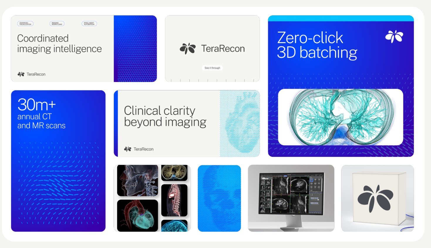
Anatomical particle flow



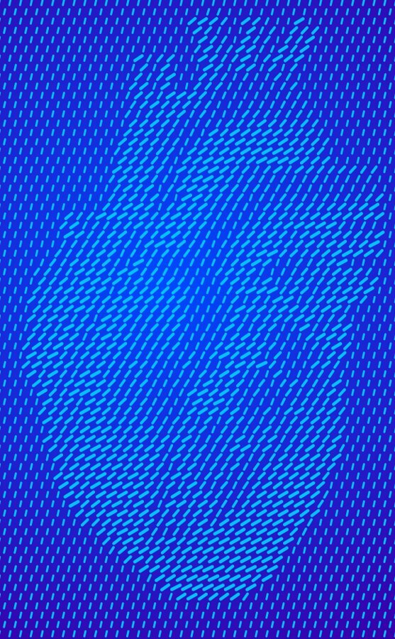
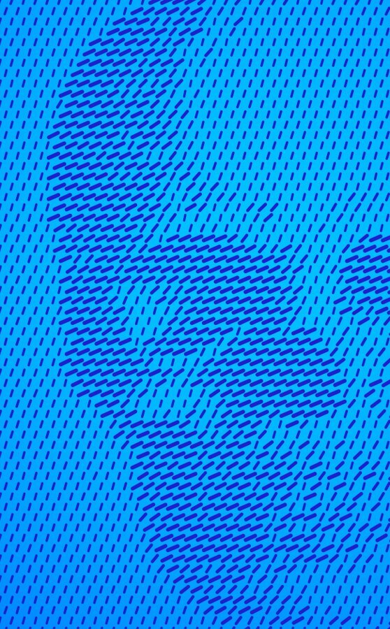

- MustGRAPHIC-05
Make particle flow one flat pill color on one ground: no third color, no tint and no gradient in the pills.
Why and source
Contrast comes from pill size, not color.
GRAPHIC-05 Particle flow is a duotone. Decided 8 October 2026.
- MustGRAPHIC-06
Generated particle flow follows the pill geometry measured from the agency's files: pills on a hexagonal lattice, long and thin, nearly parallel to their neighbors, with one size value driving length, width and angle.
Why and source
Measured from about 28,000 pills in the agency's 26 August Illustrator files. Everything is in units of the pitch p, the distance between neighboring pill centers. The numbers are in
tokens.jsonunderpattern.pill; Duotone Studio draws to them by default, andbuild-source\measure_pills.pychecks a generated file. Abstract fields also bend their flow along paths (p. 17), so a field has no single angle; the formula sets each pill's angle against the field's local flow.One Rhythm pill geometry, in units of the pitch p Property Value Lattice Hexagonal: rows 0.866 p apart, alternate rows offset p/2 Size One value s, 0 to 1, drives every dimension; a field is one grayscale size map Fine pills (most fields) Width 0.073 + 0.136 s, length 0.306 + 0.908 s: aspect 4.2 to 5.8 Bold pills (stand-alone Cyan-on-light image tiles) Width 0.190 + 0.137 s, length 0.670 + 0.536 s Longest pill 1.21 p, so neighbors stay within about 27° of each other Angle (fine) 108 − 241 s + 96 s² degrees from horizontal: large pills lie flat, small ones vary Angle (bold) 78 − 55 s degrees Whole field May be mirrored, or turned by up to about 20° GRAPHIC-06 Pill geometry: the One Rhythm standard. Measured 19 September 2026.
- MustGRAPHIC-07
Never use White for the pills.
Why and source
Category colors may be pills where a pairing is approved, as Aqua on Cobalt is for print.
GRAPHIC-07 Never White pills. Decided 8 October 2026.
- MustGRAPHIC-08
Fade particle flow with a solid in the ground color laid over the pills, running from opaque to transparent, so the pills stay one color and sink into the ground.
Why and source
Measured: every faded field in the agency's final files is made this way, including p. 4's pale pills (Cyan under White at about 78%).
GRAPHIC-08 A fade is a separate layer. Decided 8 October 2026.
- MustGRAPHIC-09
Show anatomy at high contrast (Cyan on Bone or Cyan on Cobalt) so the body part is clearly identifiable, and use it where a 3D rendering is present.
Why and source
In our work: the booth, all the way round.
GRAPHIC-09 Anatomy at high contrast. Agency guidelines R1 V4, p. 15.
- MustGRAPHIC-10
Use the agency's particle-flow files, or particle flow that has been approved before use.
Why and source
Approval comes from Steven Brown, who also has the agency's files.
Files: The agency's particle-flow and rendering files.
GRAPHIC-10 Pre-approved particle flow only. Agency guidelines R1 V4, pp. 15–17.
- ShouldGRAPHIC-11
On screen, put particle flow on the Cobalt Gradient most of the time; flat grounds give variety.
Why and source

In our work: The live particle flow for terarecon.com: Cyan pills on the Cobalt Gradient, shaped by a spinning heart GRAPHIC-11 Digital particle flow sits on the Cobalt Gradient. Decided 8 October 2026.
- ShouldGRAPHIC-12
Keep particle flow inside a rounded card, not edge to edge on a page. Exceptions: environmental wall bands and apparel.
Why and source
GRAPHIC-12 Particle flow inside rounded cards. Drawn from the examples in Agency guidelines R1 V4, pp. 14–31; rewritten as a Should in our own voice by Steven Brown's direction, 3 November 2026: "We are the source of truth, we don't need to refer back to the agency."
Agency guidelines R1 V4, p. 15
The particle flow graphic language visualizes TeraRecon’s ability to bring clarity to complexity. Streams of particles converge to reveal anatomical forms, symbolizing how imaging data, clinical context, and intelligent workflows come together to create a complete picture. The result is a distinctive expression of insight, precision, and discovery that reinforces TeraRecon’s role in helping care teams see more and act with confidence.
One main expression of this is with parts of anatomy which helps anchor the TeraRecon visual language in the world of medical imaging. When using this technique, use higher contrast colors (Cyan on Bone or Cyan on Cobalt) so the body parts should be clearly identifiable. This expression should be used within the broader brand ecosystem where a 3D rendering is present to clearly communicate the advanced visualization techniques. Always use pre-approved and provided assets when implementing in compositions.
Abstract particle flow




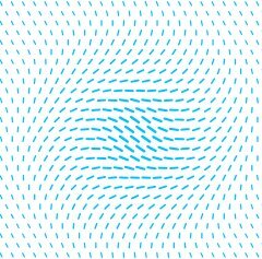











- ShouldGRAPHIC-13
Choose an approved field whose direction suits its job: anatomy that reads as a body part, or abstract flow that moves along paths.
Why and source
Anatomical fields run in near-parallel diagonals; abstract fields bend along their paths (GRAPHIC-06 Pill geometry: the One Rhythm standard). Use the supplied files (GRAPHIC-10 Pre-approved particle flow only). The agency gives each field its job: anatomy "helps anchor the TeraRecon visual language in the world of medical imaging" (p. 15), and abstract flow "creates a sense of momentum and intelligent connection while adding depth and energy to layouts" (p. 16). So anatomy suits a piece about seeing the body in imaging, and abstract flow a piece about data and workflows moving.
GRAPHIC-13 Match particle direction to the kind of field. Drawn from the examples in Agency guidelines R1 V4, pp. 15, 16, 17; rewritten as a Should in our own voice by Steven Brown's direction, 3 November 2026: "We are the source of truth, we don't need to refer back to the agency."; context clarified 3 November 2026 (documentation).
Agency guidelines R1 V4, p. 16
Same text as p. 15.
While the anatomical presentation anchors within the medical imaging category, the other primary expression is the abstract particle flow. It creates a sense of momentum and intelligent connection while adding depth and energy to layouts. Particle flows can be scaled, cropped, and layered to enhance compositions, but should always support content rather than compete with it. Many usages are lower contrast and fade to the background for a more subtle presentation within the system. Always use pre-approved and provided assets when implementing in compositions.
Agency guidelines R1 V4, p. 17
Same text as p. 16.
Precision marks
- MustGRAPHIC-14
Never put precision marks and particle flow in the same composition.
Why and source
As drawn on p. 18: ten hairline marks in a mid gray (#8D8E89), evenly spaced from 10% to 90% of the card's width, each about 2.5% of the width tall, standing on an Aqua Gradient edge strip about 5% of the width deep.
GRAPHIC-14 Not with precision marks. Agency guidelines R1 V4, p. 18.
Agency guidelines R1 V4, p. 18
Precision marks are subtle graphic accents inspired by the accuracy and technical sophistication of medical imaging. Used sparingly along the edges of a composition, they add structure, rhythm, and a sense of precision while remaining secondary to the primary content. Precision marks should not be used alongside particle flow graphics within the same composition, ensuring a clean and focused visual expression.
1.6 Layout
Panels on a grid: how a piece is put together.
Anatomy of a piece
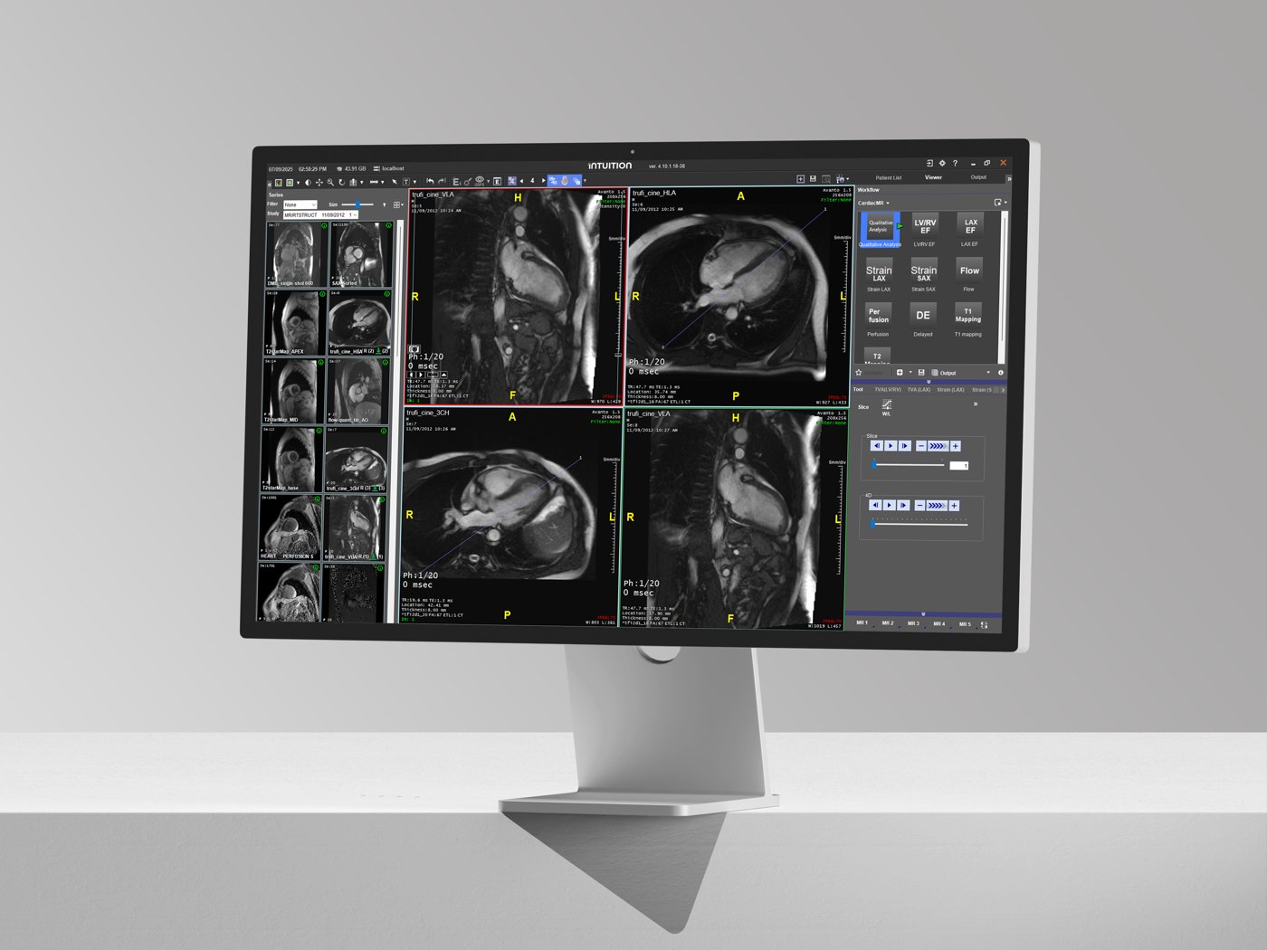
The Italy LinkedIn ads are three panels on a Bone ground at 1200 × 1200 px, measured here from the delivered export.
- Ground. Bone, with a 48 px margin on all four sides: the 4% border, in the ground's color.
- Photo panel, 832 × 718 (on the grid, 6 × 5 modules: 824 × 684). The monitor in a black-and-white studio photograph, with only the screen in color. The photograph fills the panel, and the panel's edge is the only crop.
- Brand panel, 256 × 718 (on the grid, 2 × 5 modules: 264 × 684). A Cyan pill field on the Cobalt Gradient, fading out toward the foot, where the White lockup sits on calm ground. Its width is the lockup and its clear space: 28 + 200 + 28 px.
- Copy panel, 1104 × 370 (on the grid, 8 × 3 modules: 1104 × 404). White, with a 40 px inset. Public Sans Extra Light in Charcoal, left-aligned.
- Button. Cobalt with Public Sans SemiBold, 40 px from the panel's left and bottom edges.
What makes it work
Do and avoid
LAYOUT-04 Frame the scene, not the prop
LAYOUT-05 One subject per panel
LAYOUT-06 No image-editing effects
LAYOUT-07 Panels on a clean grid
The grid
The standard for square pieces is the 8 × 8 grid at 1200 × 1200 px. Set the margin, the gutter and the module once; after that, a layout is a choice of how many modules each panel spans, and the edges line up on their own.
- 48 px Margin
- 4% of the side, the same on all four sides.
- 16 px Gutter
- Between every pair of panels, across and down.
- 124 px Module
- Eight across and eight down: 8 × 124 + 7 × 16 = 1104, the width inside the margins.
- 24 px Radius
- On every panel in the piece.
- 1 to 8 Span
- A panel covers whole modules and the gutters between them, n × 124 + (n − 1) × 16 px. No panel edge falls inside a module.
Why the Italy ads sit 8 px off this grid across and 34 px down is in LAYOUT-03 The square grid: 8 × 8 at 1200 × 1200 px
Every other format takes the same grid, worked out from its short side; a format 3:1 or wider takes 12 columns. Find your format here.
| Format | Margin | Gutter | Modules | Module size | Radius |
|---|---|---|---|---|---|
| 1080 × 1350 | 43 | 14 | 8 across × 10 down | 112 wide × 113–114 tall | 22 |
| 1200 × 1200 | 48 | 16 | 8 × 8 | 124 × 124 | 24 |
| 1200 × 627 | 25 | 8 | 16 across × 8 down | 64–65 wide × 65–66 tall | 13 |
| 1080 × 1920 | 43 | 14 | 8 across × 15 down | 112 wide × 109–110 tall | 22 |
| 1920 × 1080 | 43 | 14 | 15 across × 8 down | 109–110 wide × 112 tall | 22 |
| 816 × 1056, Letter | 33 | 11 | 8 across × 11 down | 84–85 wide × 80 tall | 16 |
| 1128 × 191, banner | 8 | 15 | 12 columns | 78–79 wide | 4 |
| 1584 × 396, LinkedIn banner | 16 | 21 | 12 columns | 110–111 wide | 8 |
| 600 × 200, email header | 8 | 8 | 12 columns | 41–42 wide | 4 |
| 1200 × 240, email banner | 10 | 16 | 12 columns | 83–84 wide | 5 |
Panels
A comic page and a bento box give each thing its own compartment and keep the compartments apart. Nothing spills into its neighbor, and the whole is still one page or one meal. Our pieces work the same way.
Bentos on one grid
Four layouts on the same 8 × 8 grid. Each panel spans whole modules, given as columns × rows, and holds one subject.
The layout rules
- MustLAYOUT-01
On a framed piece, make the border 4% of the artboard's short side, the same on all four sides, in the ground's color, Bone or White.
Why and source
Anything from 3.5% to 4.5% is fine. On a printed piece the border is never under 1/8 in: the trimmer drifts by 1/32 to 1/16 in, and a thinner border shows it as one side thicker than the other. On screen, round to whole pixels. The border is the ground showing around the panels (LAYOUT-02 Grounds alternate as they nest). Full-bleed pieces, the environmental band (p. 30) and apparel (p. 31) have no border. The agency's framed pieces measure 3.4% to 4.4% (pp. 23, 24, 25 and 28).
The border at 4% of the short side Artboard Short side Border Slide or screen, 1920 × 1080 px 1080 px 43 px Letter brochure or flyer, 8.5 × 11 in 8.5 in 0.34 in (about 11/32 in) Poster, 24 × 36 in 24 in 0.96 in Card, 5 × 7 in 5 in 0.2 in (3/16 in is inside the range) Business card, 3.5 × 2 in 2 in 1/8 in, the print minimum LAYOUT-01 Border width. Decided 9 October 2026; measured on the agency's p. 23, 24, 25 and 28 (visual ledger 5a); the border's color set to the ground's, Bone or White, by Steven Brown, 3 November 2026.
- MustLAYOUT-02
Alternate grounds as they nest: a Bone ground holds White panels, and a White panel may hold Bone bentos. Never set a panel directly on a ground of its own color.
Why and source
Bone is the default ground on the web. The border of a framed piece takes the ground's color (LAYOUT-01 Border width).
LAYOUT-02 Grounds alternate as they nest. Decided 3 November 2026; Steven Brown, on the brand guide audit: "I really like bone as a background on web… bone as a background, white for a div, and bone again as a bento is possible."
- MustLAYOUT-03
Lay out a square piece at 1200 × 1200 px on the 8 × 8 grid: a 48 px margin, 16 px gutters, 124 px modules and a 24 px corner radius, with every panel spanning whole modules.
Why and source
Every other format takes the same grid, worked out from its short side: a margin of 4% of the short side, rounded to whole pixels and the same on all four sides (LAYOUT-01 Border width); a gutter of 1/75 of the short side; eight modules across the short side; and on the long side, the number of rows that keeps the modules closest to square, with the remaining length divided evenly. Where the pixels don't divide evenly, modules differ by at most 1 px. A format 3:1 or wider, such as a banner or an email header, takes 12 full-height columns instead, with the same margin and a gutter of 1/75 of the long side; its columns differ by at most 1 px. The corner radius is 1/50 of the short side. The table under The grid gives the common formats. The eight-panel arrangement is for a poster, booth or brochure; a feed post takes fewer panels, so it stays uncrowded. The Italy LinkedIn ads sit off this grid by 8 px across and 34 px down: their photo and brand panels are 832 and 256 px wide and 718 px tall over a 370 px copy panel, where the grid's 6 + 2 columns over 5 + 3 rows give 824 and 264 px over 684 and 404 px. Their brand panel is sized from the lockup and its clear space (28 + 200 + 28 px).
The grid for common formats, in px: under The grid.
LAYOUT-03 The square grid: 8 × 8 at 1200 × 1200 px. Decided 3 November 2026; Steven Brown, adopting the grid drawn for the Italy LinkedIn ads as the standard for square pieces; every other format worked out from its short side, with the margin equal on all four sides, by Steven Brown, 3 November 2026: "Keep the border equal."; context clarified 3 November 2026 (documentation).
- MustLAYOUT-04
Make the design with the layout: place and size each panel precisely, and let the photograph fill it, cropped only by the panel's edge.
Why and source
A product stands in its real or studio setting (see PHOTO-01 Product UI on real devices), and the panel's corners are the only crop. Masking or cutting out a product comes under LAYOUT-06 No image-editing effects.
LAYOUT-04 Frame the scene, not the prop. Decided 2 November 2026; Steven Brown, on the Italy LinkedIn ads: "We achieve design through precise layout within frames, not through masking individual props."; masking moved to the one effects rule, 3 November 2026 (Steven Brown).
- MustLAYOUT-05
Give each subject its own panel, and never layer one subject on top of another: no copy over the product, and nothing breaking out of its frame.
Why and source
A subject is what a panel is about: a photograph, a rendering, the product UI or a block of copy. The logo is not a subject: it may sit over a photo only as LOGO-13 Over a photo or pattern, judge the area under the logo allows.
LAYOUT-05 One subject per panel. Decided 2 November 2026; Steven Brown, on the Italy LinkedIn ads: "We do not layer subjects on top of each other."
- MustLAYOUT-06
Use no image-editing effects: no masking or cut-outs, drop shadows, bevels, glows, blurs or anything like them, on panels, cards, photographs, products, logos, buttons, chips or type.
Why and source
Depth comes from the ground: White panels on a Bone ground, Bone bentos in a White panel (LAYOUT-02 Grounds alternate as they nest), a hairline in Charcoal at low opacity, or a tone step within the palette. The shadows inside a photograph are real light and stay.
LAYOUT-06 No image-editing effects. Decided 2 November 2026; Steven Brown, on the Italy LinkedIn ads: "We eschew photoshop-like tricks and effects; masking, drop shadows, bevels, etc."; merged with "No drop shadows" (decided 10 October 2026, website restage iteration review) into one Must by Steven Brown, 3 November 2026.
- MustLAYOUT-07
Lay out panels on a clean grid: one margin, one gutter and one corner radius for the whole piece, with every panel edge on a grid line.
Why and source
LAYOUT-03 The square grid: 8 × 8 at 1200 × 1200 px gives the numbers for a square piece.
In our work: English, page 1 of the Italy LinkedIn ads LAYOUT-07 Panels on a clean grid. Decided 2 November 2026; Steven Brown, on the Italy LinkedIn ads: "Emphasize the importance of clean grid systems."
- ShouldLAYOUT-08
Give each module one job, such as the message, the image or the attribution, then assemble the composition. Modules may differ in size and still read as one piece.
Why and source
Check: can a reader tell the main message, the supporting image and the attribution apart at a glance? LAYOUT-05 One subject per panel is the Must behind this.
LAYOUT-08 Divide the composition into distinct jobs. Drawn from the examples in Agency guidelines R1 V4, pp. 1, 14, 23, 24, 25, 28; rewritten as a Should in our own voice by Steven Brown's direction, 3 November 2026: "We are the source of truth, we don't need to refer back to the agency."
- ShouldLAYOUT-09
Align related edges, keep the gaps between modules even, and let the ground show as a frame around the composition.
Why and source
LAYOUT-07 Panels on a clean grid sets the numbers. Environmental bands and apparel are not framed. Check: do the edges and gaps group what belongs together?
LAYOUT-09 Keep a visible frame and a consistent gutter rhythm. Drawn from the examples in Agency guidelines R1 V4, pp. 14, 23, 24, 25, 28; rewritten as a Should in our own voice by Steven Brown's direction, 3 November 2026: "We are the source of truth, we don't need to refer back to the agency."
- ShouldLAYOUT-10
When the aspect ratio changes, keep the reading order and each element's role, and choose a new arrangement and crop for the new space.
Why and source
Compose a phone layout for its space rather than shrinking the desktop one. Check: does the narrow format keep the same message hierarchy?
LAYOUT-10 Recompose for the format. Drawn from the examples in Agency guidelines R1 V4, pp. 23, 25, 26, 28; rewritten as a Should in our own voice by Steven Brown's direction, 3 November 2026: "We are the source of truth, we don't need to refer back to the agency."
1.7 Renderings
Hero renderings
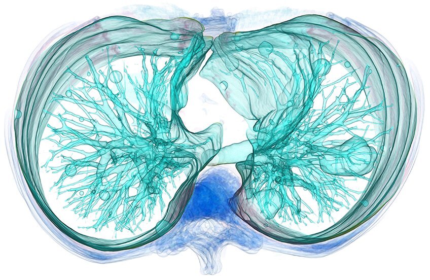
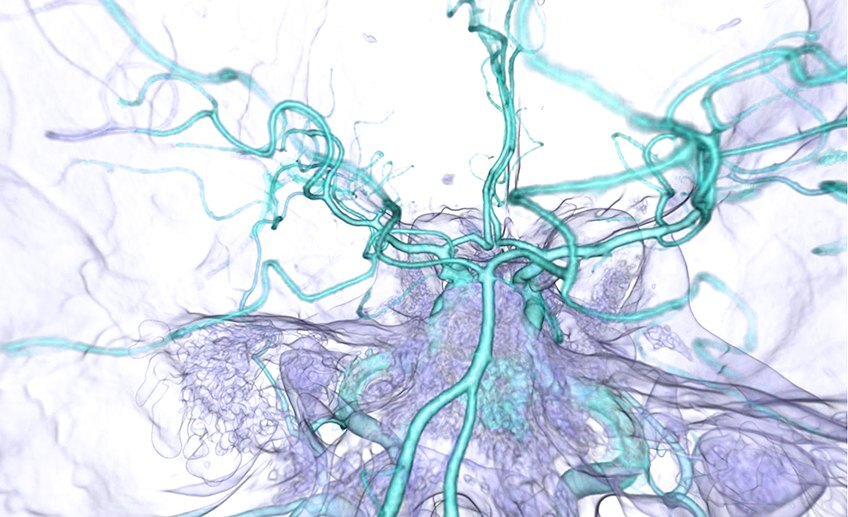
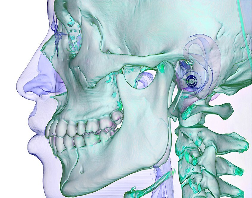
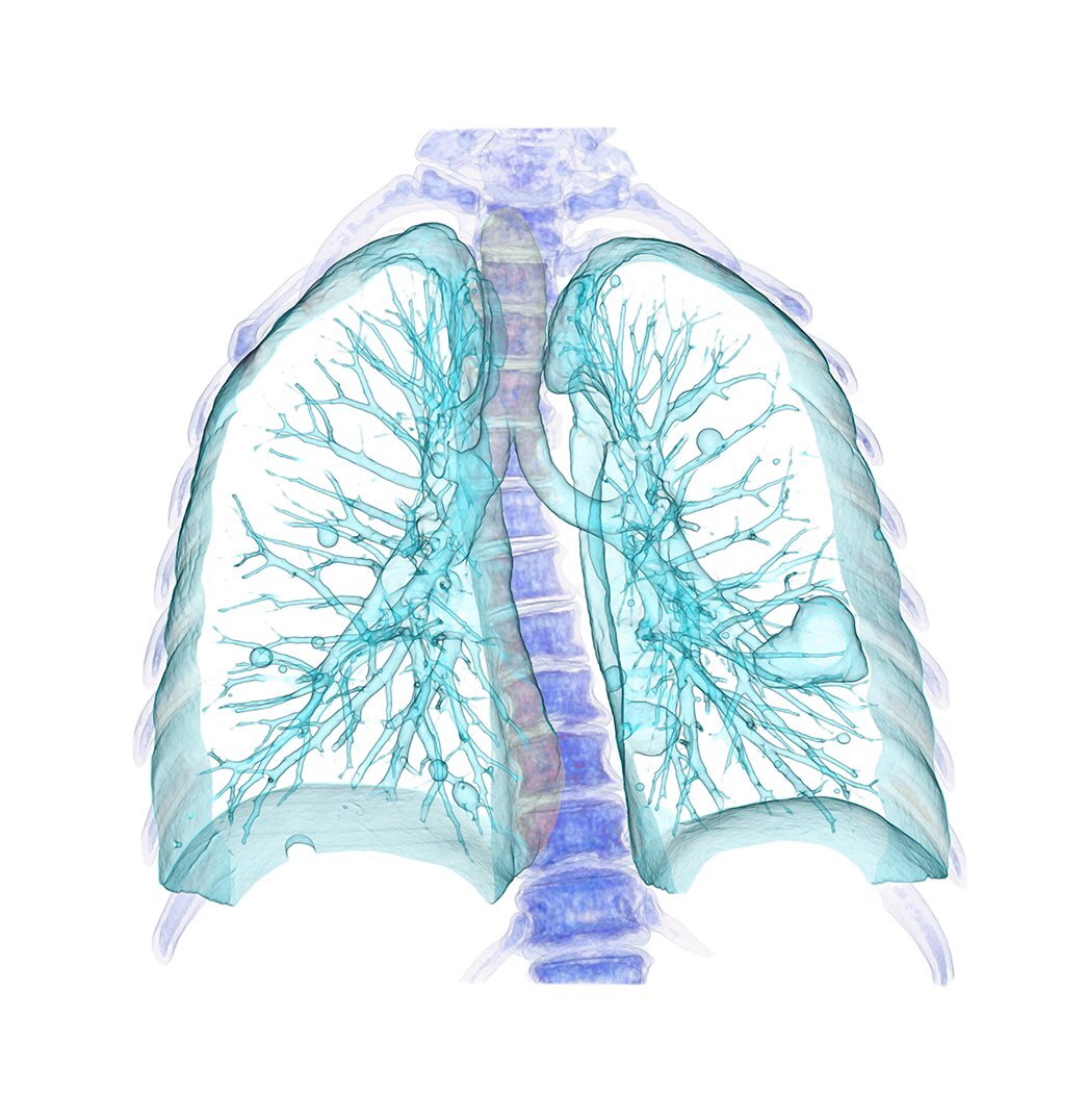
- ShouldRENDER-01
Set fine anatomy on a quiet surface that separates it from its surroundings, large enough to read at its final size.
Why and source
This does not mean recoloring diagnostic images or putting every clinical image on White. Check: can the anatomy be read at its final size?
RENDER-01 Give detailed anatomy a calm backing. Drawn from the examples in Agency guidelines R1 V4, pp. 14, 19, 20, 24; rewritten as a Should in our own voice by Steven Brown's direction, 3 November 2026: "We are the source of truth, we don't need to refer back to the agency."
Agency guidelines R1 V4, p. 19
Anatomical 3D renderings showcase the advanced visualization capabilities at the core of the TeraRecon platform. Featured in hero applications and brand moments, they highlight the depth, precision, and clinical sophistication of the software while creating an immediate connection to the imaging field. To maintain a cohesive brand expression in hero applications, renderings should be colorized within the shown spectrum. Original rendering coloring can be used in brand application, but this treatment should be used when featured in a composition or application.
Usage by category
Filled, as on the agency's p. 20; outlined with a gradient stroke, as on the RSNA booth. The chip's text follows WEB-05 Text on product chips.
- MustRENDER-02
Feature 3D renderings in Advanced Visualization, use them in a supporting role in Imaging Workflows, and keep them minimal in Insights.
Why and source
In compositions, colorize renderings within the spectrum shown on p. 19. The agency's examples put renderings on White rounded tiles, also inside a gradient card.
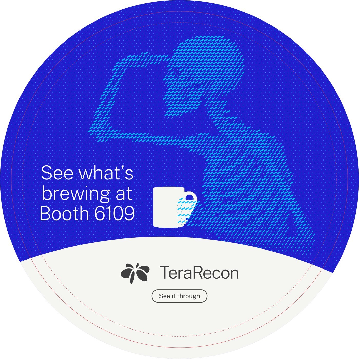
In our work: Table decal, lookout v4 proof (one design for all 15 tables) RENDER-02 Renderings lead in Advanced Visualization. Agency guidelines R1 V4, pp. 19–20.
Agency guidelines R1 V4, p. 20
The use of anatomical 3D renderings should align with the role imaging plays within each category. Renderings are used most prominently within TeraRecon Advanced Visualization, where rendering output is core to the offering. Within TeraRecon Imaging Workflows products like TeraRecon Detect, renderings should play a supporting role alongside workflow and connectivity-focused visuals. Within TeraRecon Insights, use should be minimal, with greater emphasis placed on data, intelligence, and analytics. This approach ensures each category remains visually aligned to its purpose while maintaining consistency across the TeraRecon portfolio.
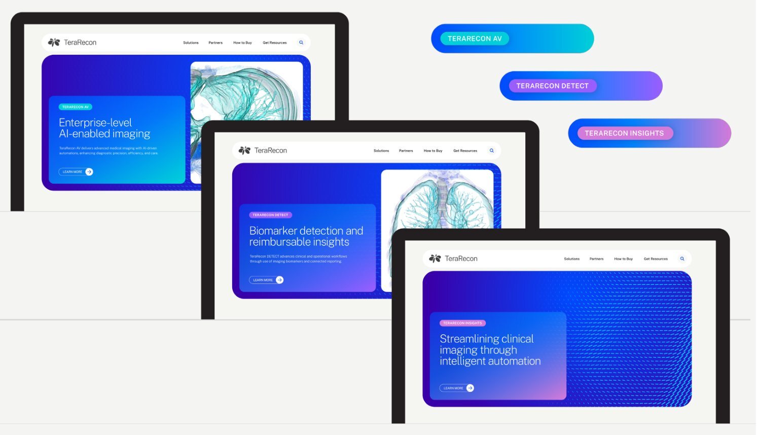
1.8 Photography
Product UI
- MustPHOTO-01
Show product UI on real devices in clean, real-world settings, never as a floating screenshot.
Why and source
In our work: the booth, all the way round.
PHOTO-01 Product UI on real devices. Agency guidelines R1 V4, p. 21.
Agency guidelines R1 V4, p. 21
Photography direction
Product UI should be shown within real-world clean environments on devices to reinforce clarity, credibility, and practical value. This approach introduces depth and consistency across applications, connecting digital experiences to the physical settings where decisions are made and outcomes are realized.
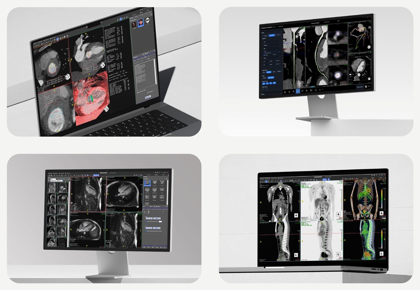
Brand examples
The identity applied: the agency's examples, the rules for screen and print, and the work we have delivered.
Agency guidelines R1 V4, p. 22
Showcases real-world applications of the brand to demonstrate how the system comes to life across different contexts and formats.
2.1 Agency examples
The agency's nine example pages, as delivered. Where one differs from a rule in this guide, the rule wins.
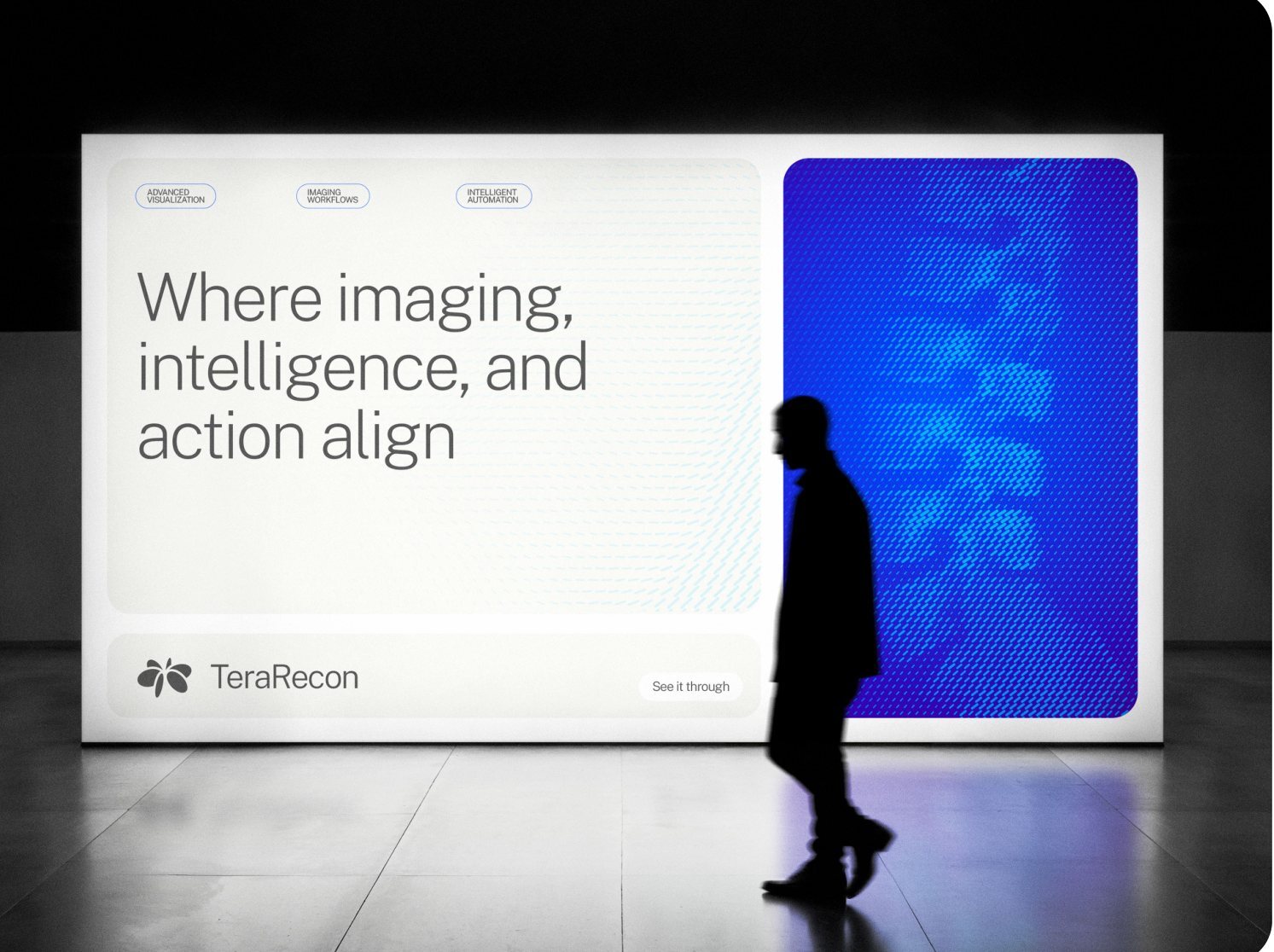
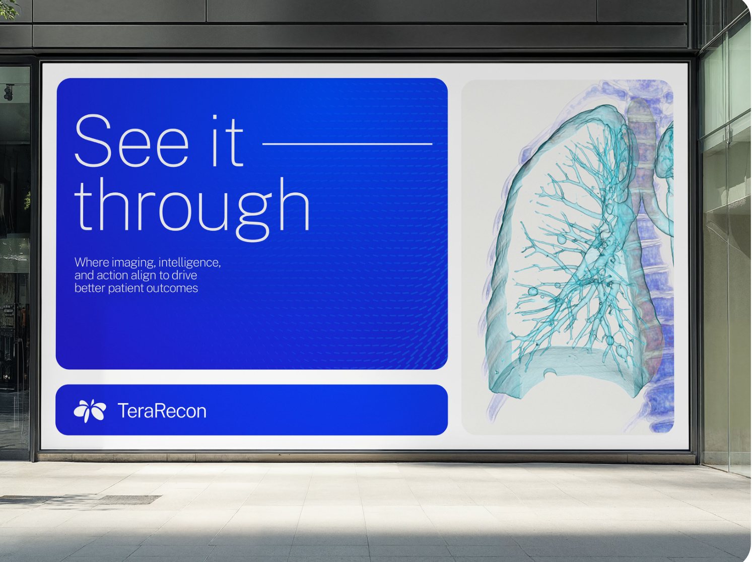
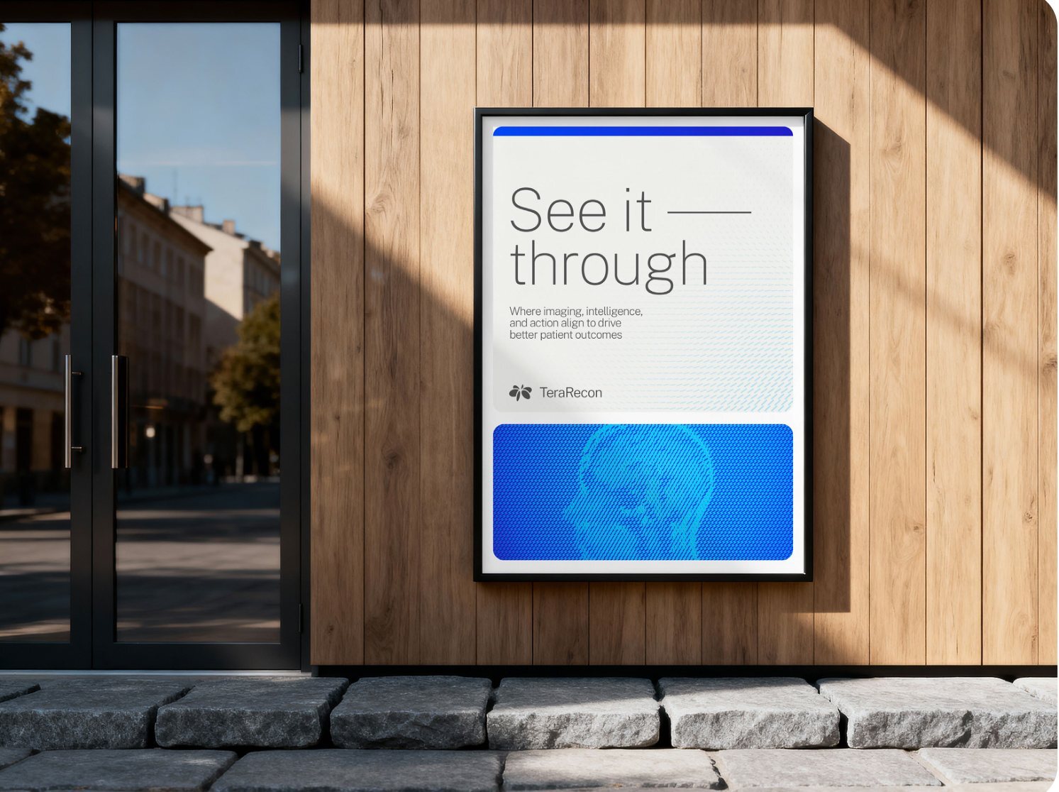
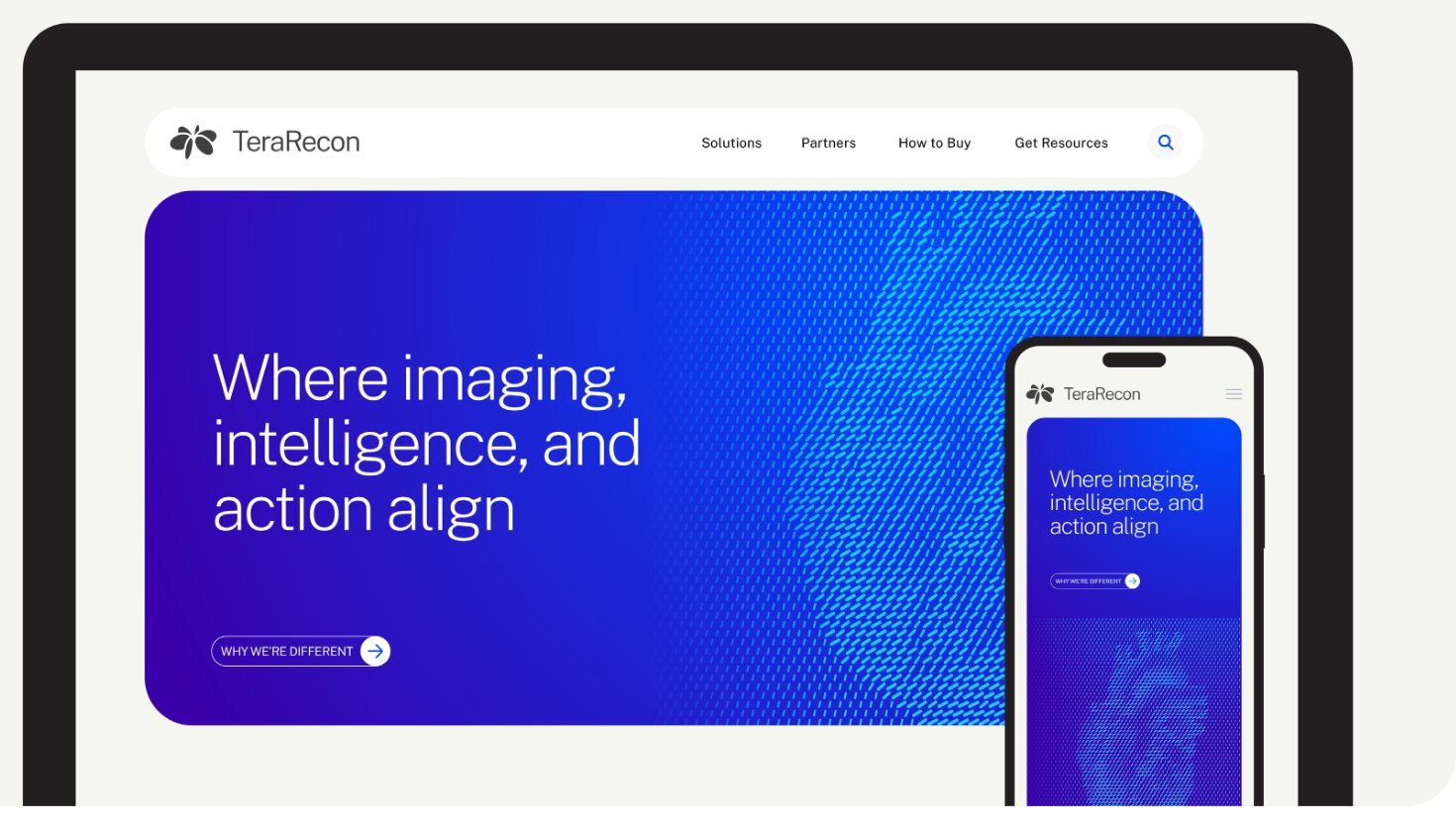
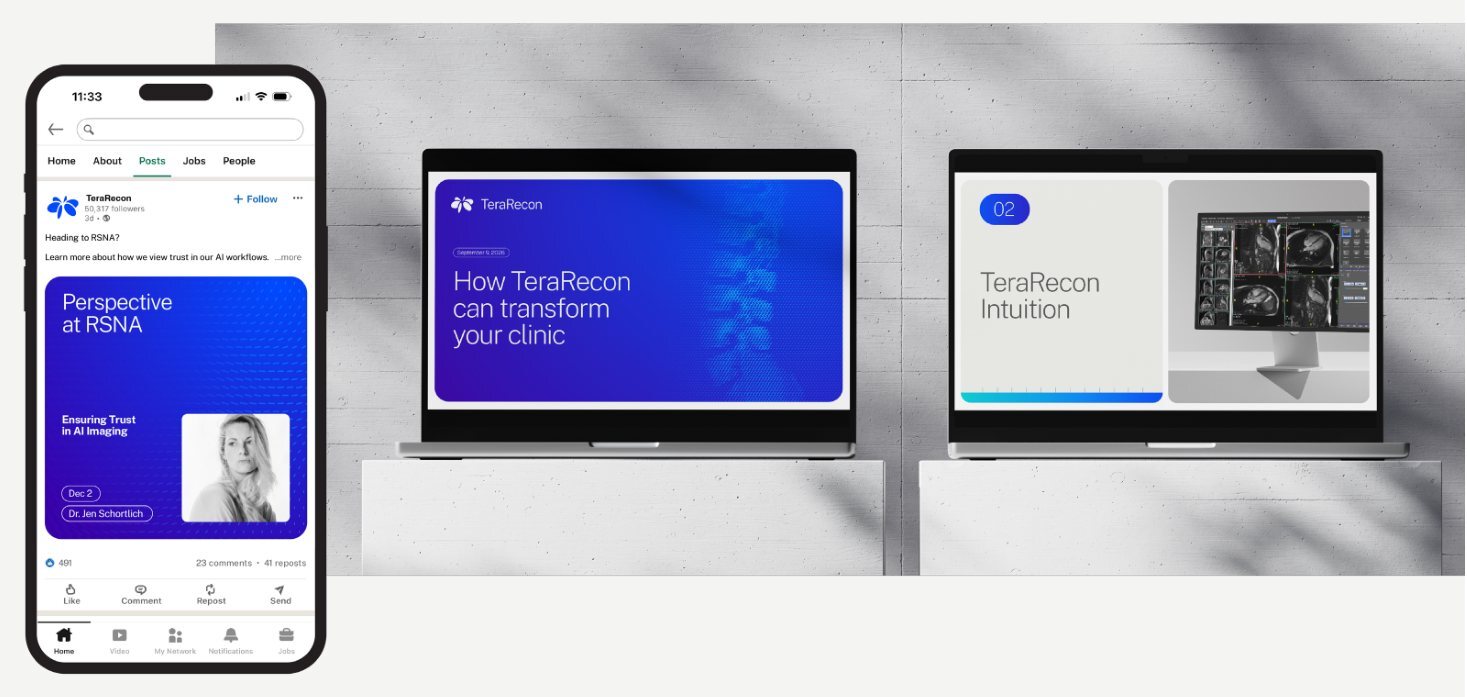
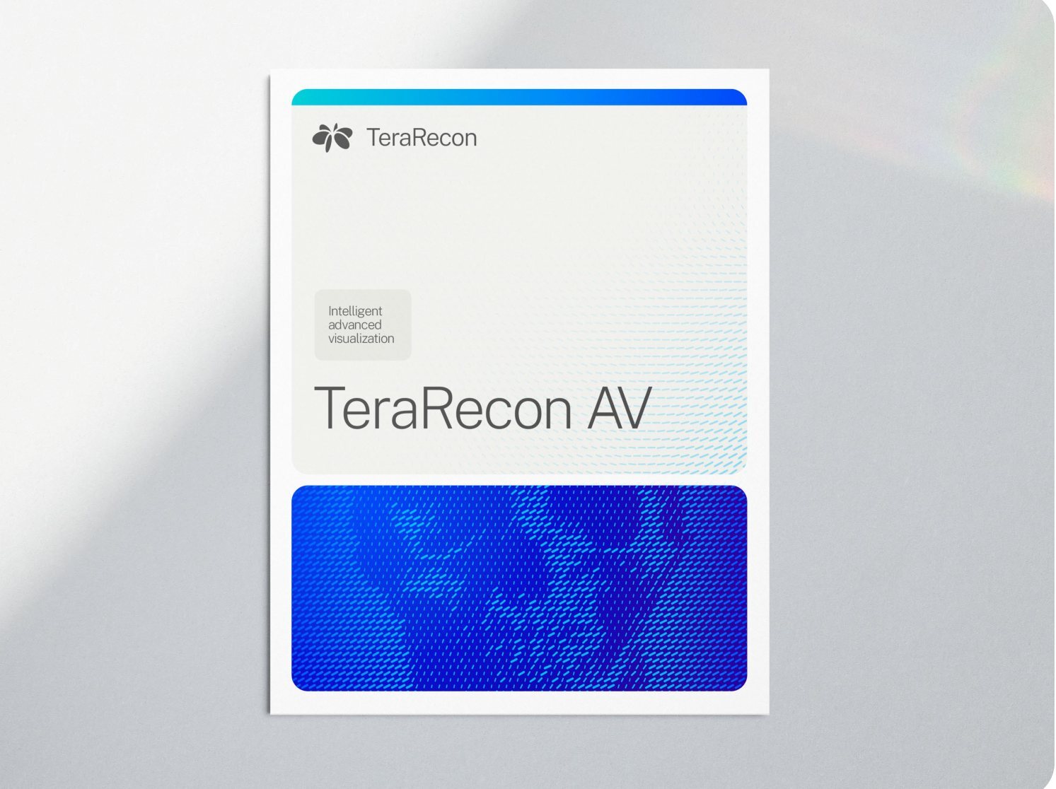
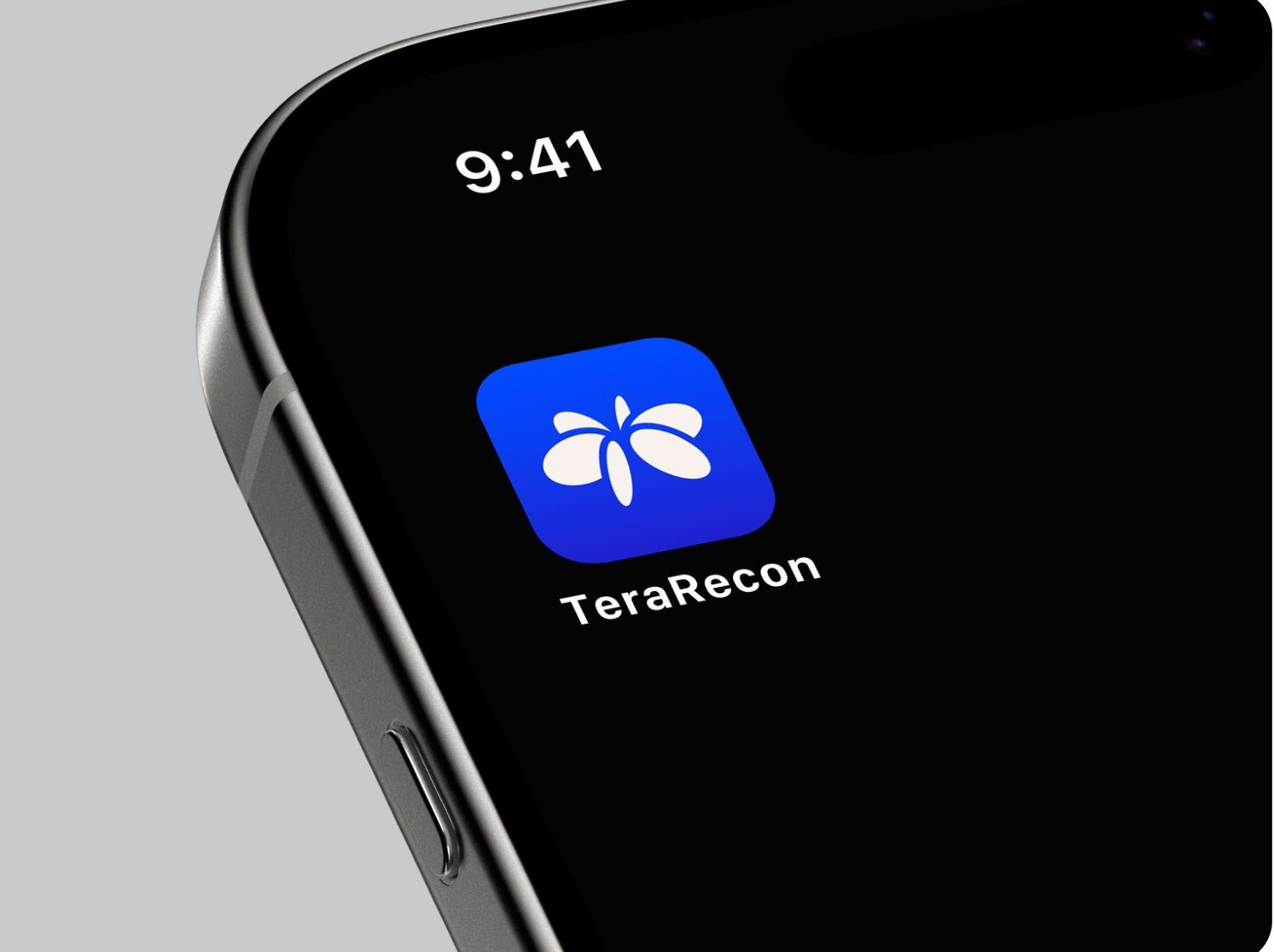
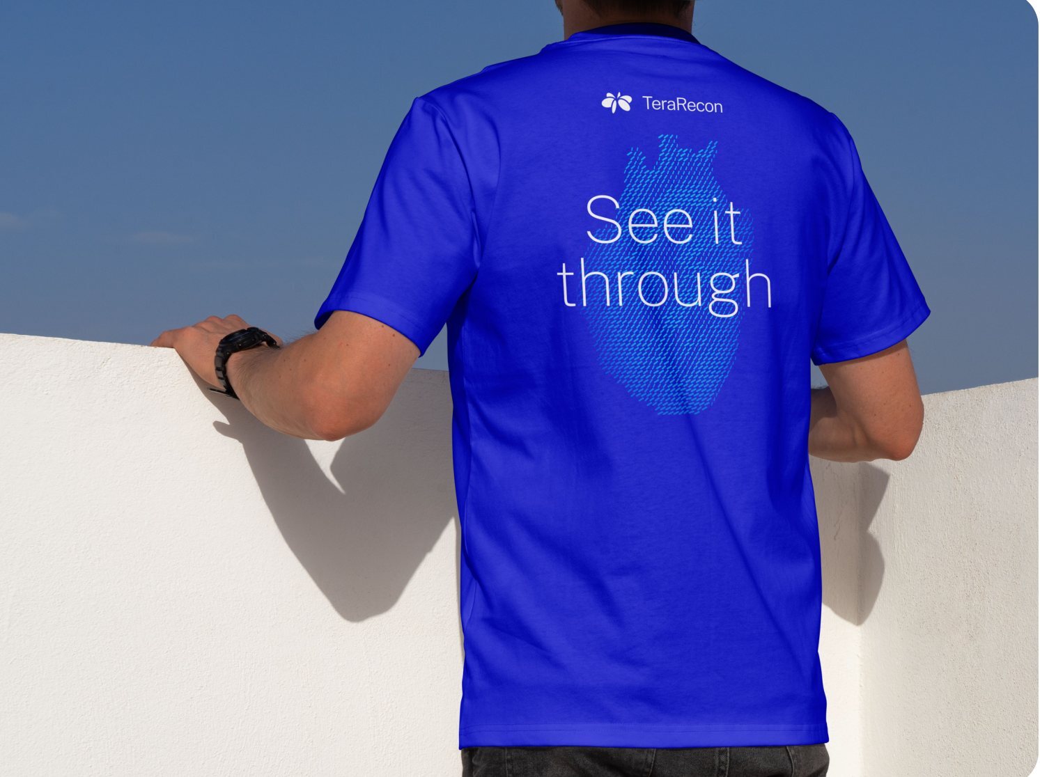
2.2 Digital and print
On screen, every rule in this guide applies as written. In print, the inks set the limits: Cobalt prints duller, and Deeper Cobalt has no ink.
Websites
The agency's guidelines set type and layout for print and slides; these rules add the sizes, spacing and colors for web pages.
- MustWEB-01
On web pages, a dark band or panel is flat Deeper Cobalt (#3800AB), the dark end of the Cobalt Gradient. White text on it measures 12.0:1.
Why and source
Elsewhere Deeper Cobalt is a gradient stop only (COLOR-07 Gradients). Deep Cobalt (#221ECD) stays the accent and text blue.
WEB-01 Deeper Cobalt is the dark ground on web pages. Decided 13 October 2026; Steven Brown, website restage decision D1; applied on the staged website from iteration 2.
- MustWEB-02
On web pages, a pill field with Deeper Cobalt (#3800AB) pills never sits on a White or Bone ground; where a field sits on a light panel or fades out of a Cobalt panel, its ground is Cyan (#00C2FF) with the pills in Deeper Cobalt.
Why and source
On White or Bone, Deeper Cobalt pills look stark; Deeper Cobalt measures 5.8:1 on Cyan.
WEB-02 Deeper Cobalt pills sit on Cyan, never White. Decided 14 October 2026; Steven Brown, website restage voice pins 20261014-204848-3ocj (Imaging Workflows hero) and 20261014-204928-wmuj (AI Framework hero); applied on the staged website 15 October 2026. Steven Brown: "Deeper cobalt pills mixed with a white background isn't really a great combination... It's just very stark... cyan might contrast well with deeper cobalt."
- MustWEB-05
A solid product chip on the web sets its text in the chip role, 14/12/12 px SemiBold, in the ink its category color takes.
Why and source
The ink is Charcoal on Aqua (COLOR-09 Charcoal text on Cyan and Aqua), White on Violet and Charcoal on Orchid (COLOR-10 White text on Violet, Charcoal text on Orchid). Violet and Orchid chips measure 3.9:1 (White on Violet) and 3.7:1 (Charcoal on Orchid): below the 4.5:1 that WCAG AA asks of ordinary text. The 3:1 allowance applies to large text: at least 18 pt, or 14 pt bold. A 12–14 px SemiBold chip is not large text. Logo/brand-name text has a specific exemption; a functional label does not become exempt because it uses brand colors. Steven Brown accepted them for chips on 13 October 2026, since a chip carries a product name and nothing else.
WEB-05 Text on product chips. Decided 13 October 2026; Steven Brown, website restage decision B (category chips); applied on the staged website from iteration 3; its inks restated by color pair in COLOR-09 and COLOR-10 by Steven Brown, 3 November 2026: "One rule per color pair."; context clarified 3 November 2026 (documentation).
- MustWEB-06
On the web, each clinical area carries one tertiary color, always the same one: Cardiology Red (#D6333D), Body imaging/oncology Yellow 2 (#AE7F2A), Pulmonology Teal 2 (#316E6B), Neurology Orange 2 (#BB5A26), Vascular Red 2 (#851E26), MSK Yellow Green 2 (#769424). Aqua, Violet and Orchid stay reserved for the product lines.
Why and source
The color marks the area and never carries text: a chip outline around Charcoal text, the selected tab's underline, the hotspot dot on the body figure, a card's left edge and its selected outline. Each color measures at least 3:1 on White and on Bone, the contrast WCAG asks of non-text marks (3.5:1 to 9.5:1 on White, 3.2:1 to 8.7:1 on Bone); the light Orange, Yellow, Yellow Green and Green fall below it, so their "2" shades are used. These marks count as chart use under COLOR-06 Tertiary colors are for charts. The map lives in the
module.cssof the Solution Category Explorer on the TeraRecon AV page.WEB-06 Clinical areas take tertiary colors by a fixed map. Decided 16 October 2026; Steven Brown, on Evan's note about the body module of the terarecon.com restage ("using different theme colors for the highlight by topic/solution area for body module"): "We'll go with tertiary colors for body modules."; counted as chart use, 3 November 2026: "It's a chart."
- MustWEB-07
A product card on a category gradient holds its copy column to 76 % of the card's width, so the copy stays on the gradient's Cobalt end.
Why and source
The gradient and its stops are COLOR-11 White copy on a category gradient sits on the Cobalt end.
WEB-07 Product card copy column. Decided 13 October 2026; Steven Brown, website restage decision D8 and B (panel contrast); applied on the staged website from iteration 4; its gradient restated for every medium as COLOR-11 by Steven Brown, 3 November 2026: "One rule per color pair."
- MustWEB-08
On web pages, card titles are set like every heading: Public Sans ExtraLight (200), tracking -0.02em. SemiBold stays on labels, chips and buttons.
Why and source
WEB-08 Card titles are headlines. Decided 13 October 2026; Steven Brown, website restage decision D4; applied on the staged website from iteration 2.
- MustWEB-09
Web pages set type on this scale, with breakpoints at 992 and 768 px. Headings are Public Sans ExtraLight (200) at -0.02em tracking; text is Regular (400) at -0.01em; labels, buttons and chips are SemiBold (600).
Why and source
Web type scale, in px Role 992 px and wider 768 to 991 px Below 768 px Weight Display 88 72 48 ExtraLight 200 Heading 1 64 56 40 ExtraLight 200 Heading 2 48 40 32 ExtraLight 200 Heading 3 32 28 24 ExtraLight 200 Heading 4 24 22 20 ExtraLight 200 Lead 22 20 18 Regular 400 Body 18 16 16 Regular 400 Small 16 14 14 Regular 400 Label and button 14 12 12 SemiBold 600 Chip 14 12 12 SemiBold 600 Navigation 16 16 16 Regular 400 WEB-09 The web type scale. Decided 13 October 2026; Steven Brown, website restage decision D7; applied on the staged website from iteration 2.
- MustWEB-10
Web page content sits in panels with a 24 px corner radius (16 px for a card inside a panel), at most 1568 px wide, with page gutters and gaps between panels of 40, 24 and 16 px (992 px and wider, 768 to 991 px, below 768 px).
Why and source
The agency names rounded forms and even, narrow gutters (p. 6, p. 14) but gives no values; these come from this guide page's own panels.
WEB-10 Panels, corners and gutters on web pages. Decided 13 October 2026; Steven Brown, website restage decision D8; applied on the staged website from iteration 4.
- MustWEB-11
Web pages space everything in steps of 4, 8, 12, 16, 24, 32, 48 and 64 px. Text is left-aligned; only the devices listed below are centered.
Why and source
- Centered devices: the statistic cards (value, label and step), the product explorer (its heading, tab row and product picture read as one), heroes (aligned by their own settings) and form buttons.
Web spacing, in px Space 992 px and wider 768 to 991 px Below 768 px Panel padding, all four sides 48 32 24 Between blocks in a panel 24 24 16 After a heading group 48 32 32 Between lines of text (paragraphs, list items) 16 16 16 Between columns 32 24 16 Body text measure 68 characters 68 characters 68 characters WEB-11 Spacing on web pages. Decided 13 October 2026; Steven Brown, website restage decision D9; applied on the staged website from iteration 7.
| Pills on ground | Inks | On screen | Ink, approximated |
|---|---|---|---|
| Cyan on Deep Cobalt | 2995 C on 293 C | ||
| Cyan on Cobalt | 2995 C on 2935 C | ||
| Aqua on Cobalt | 3115 C on 2935 C | ||
| Deep Cobalt on Cyan | 293 C on 2995 C | ||
| Cyan on White | 2995 C on paper | ||
| Cyan on Bone | 2995 C on 25% 2330 C |
- MustPRINT-01
In print, use the PANTONEs from the palette and expect them to be duller than the screen; use CMYK only as a fallback, knowing it can't reach Cobalt.
Why and source
Cobalt sits 15.6 ΔE (a measure of visible color difference) from its ink, and Deeper Cobalt has no ink.
PRINT-01 Screen is master; print is the nearest ink. Decided 8 October 2026.
- MustPRINT-02
Print particle flow as two flat spot inks, one for the pills and one for the ground, from the pairings above.
Why and source
The pairings are the rows of the table Print pairings at the top of 2.2 Print; the table under this rule gives each pairing's inks and contrast.
Print pairings Pills on ground Inks Contrast, screen / ink (ΔE) Cyan on Deep Cobalt 2995 C on 293 C 54.3 / 39.6, the strongest on screen Cyan on Cobalt 2995 C on 2935 C 38.9 / 31.4 Aqua on Cobalt 3115 C on 2935 C 47.6 / 41.5, the strongest in ink Deep Cobalt on Cyan 293 C on 2995 C 54.3 / 39.6 Cyan on White 2995 C on paper 28.6 / about 31.6 Cyan on Bone 2995 C on 25% 2330 C not measured PRINT-02 A print duotone is two spot inks. Decided 8 October 2026.
- MustPRINT-03
Run a print gradient only between two inks the job carries, at most PANTONE 2935 C → 293 C, with noise added against banding; when the printer can't hold two spots, use a flat spot ground.
Why and source
PRINT-03 Print gradients run between two inks. Decided 8 October 2026.
- MustPRINT-04
Make print fades the same way as on screen: the ground ink as a tint over the pills, running to zero; get a proof.
Why and source
PRINT-04 Fades in print. Decided 8 October 2026.
- MustPRINT-05
Use the spot pairings for offset and wide-format spot printing, and flat grounds for CMYK-only jobs; proof fabric (dye-sublimation banners and walls, called SEG, and apparel), which prints flatter than the swatch book.
Why and source
Extended-gamut printing is the printer's call.
In our work: the booth, all the way round.
PRINT-05 By process. Decided 8 October 2026; written without "prefer" by Steven Brown's direction, 3 November 2026.
- MayPRINT-06
For hero print pieces that should glow like the screen, a neon Cyan (PANTONE 801 C) on 2935 C may be proofed; it is not adopted.
Why and source
PRINT-06 Open question: a neon Cyan. Decided 8 October 2026.
Brief a printer
Paste this into the email that sends the files.
TeraRecon print specification
Inks. Print TeraRecon colors as PANTONE spot inks, Solid Coated: Cobalt PANTONE 2935 C, Deep Cobalt PANTONE 293 C, Cyan PANTONE 2995 C, Charcoal PANTONE 425 C. Bone is a 25% tint of PANTONE 2330 C. White is unprinted stock. Product colors appear only where the piece names a product: Aqua PANTONE 3115 C, Violet PANTONE 2101 C, Orchid PANTONE 238 C.
Process only. If the job must run in CMYK, tell us before printing. Use the CMYK values in the supplied swatches (Cobalt is C100 M63 Y0 K2); Cobalt prints noticeably duller in process.
Gradients. Run gradients between two spot inks the job already carries, such as 2935 C to 293 C, with noise to prevent banding. Do not rebuild them in process tints.
Pattern art. The pill pattern prints as two spot inks, one for the pills and one for the ground. Fades are tints of the ground ink over the pills. Keep the inks as supplied; do not convert them to process.
Proofs. A hard proof of every spot color before the run. For fabric (dye-sublimation, SEG, apparel), a printed sample; we expect fabric to print flatter than the swatch book.
Files. Logos are supplied as vector art (SVG; PDF or EPS on request). Do not redraw, recolor or substitute the logo or the pattern art.
Questions: Steven Brown, sbrown@concertai.com.
The research behind the print rules
How other brands handle the split between screen and print (researched 8 October 2026): one color name with screen and print values is the norm (IBM, GitLab); a separate palette where a color fails a medium (Newcastle University, UC Santa Barbara); special inks where the brightness is the brand (Lyft's neon pink; Monzo's fluorescent coral). No official guide found sets a print rule for brand gradients; GitLab keeps every gradient stop inside its palette.
2.3 Our work
The identity in use, newest first. Where a piece differs from a rule here, the rule wins.
Italy campaign LinkedIn ads
Delivered 2 November 2026
Six square ads, three in English and three in Italian, each three panels on a Bone ground: the monitor in a black-and-white studio photograph, a narrow brand panel and a White copy panel. Layout measures the first one panel by panel.
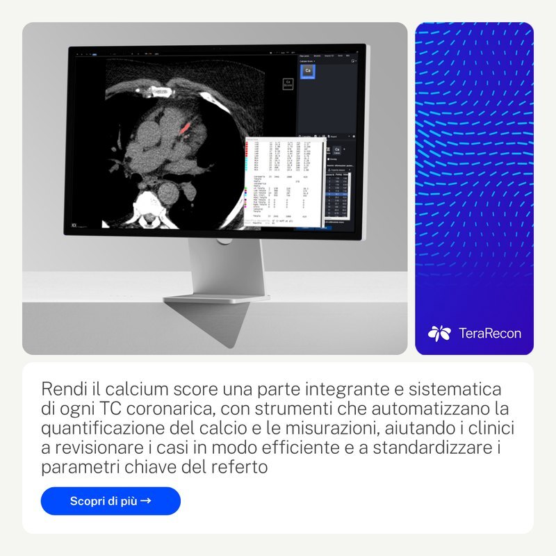
RSNA 2026, Booth 6109 | North Hall
Delivered Print files filed 8 October 2026; previz render 5 October 2026
Drag across the picture, or use the slider, to walk around the booth.
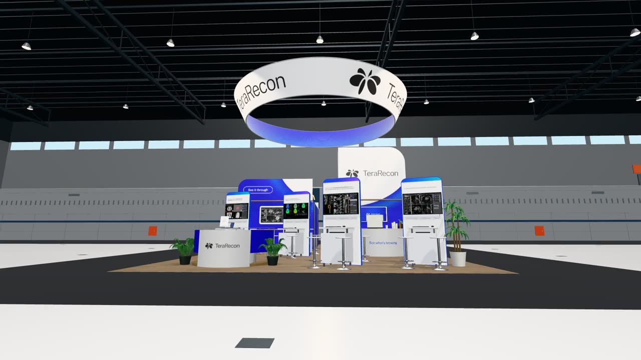 Drag to look around the booth
Employee brand kit and PowerPoint template v1
Delivered 8 October 2026
The Teams, LinkedIn and email art is under Files. The template's first version:
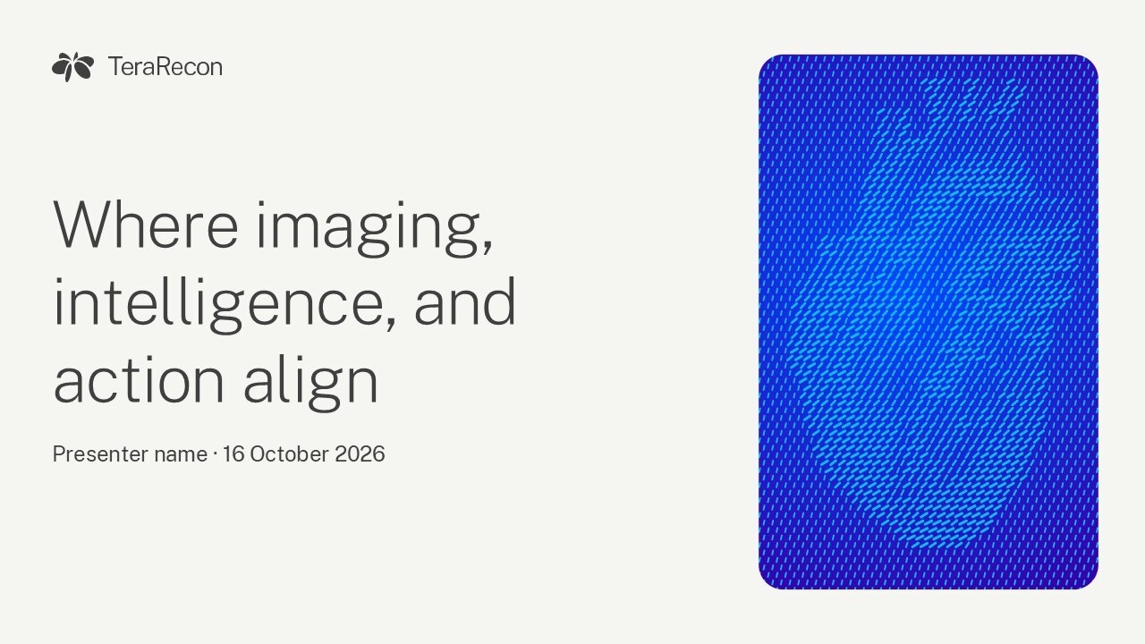
RSNA 2026 table decal and sanitizer lockup
Delivered Lockup delivered 7 October 2026; decal proof 8 October 2026, in review, shown as the newest design
Homepage hero field
Delivered 16 September 2026
Contact
Who to ask about the brand, and what to send.
Ask Steven Brown
Steven Brown
Brand guide owner, brand questions
sbrown@concertai.com
Send what you're making, where it will appear and a draft. Steven decides exceptions to the rules.
Looking for files?
Everything this guide offers is in 0.3 Files; the everyday ones are also in the brand kit.
Agency guidelines R1 V4, p. 32
Provides access to brand resources, assets, and key contacts to support consistent and accurate implementation of the brand.
Agency contact at delivery; brand questions go to Steven Brown.
Agency guidelines R1 V4, p. 33
Questions? We’re here to help. · Looking for assets?
For any needs relating to this brand guidelines document or to request further assets, reach out.
Brandon Slavinski · Senior Creative Director · bslavinski@concertai.com
Assets include: • Logos • Fonts • Color palette • Key graphics
See it through
A Changes, index and glossary
Every release, newest first, with the rules it touched; the questions waiting on Steven Brown; every rule by its code; and the words this guide uses.
Changes
Release 2026.11.10-110 Nov 2026, this release
Meaning changed:
- 10 Nov 2026 Fixed: the booth slider and drag in Examples turn the booth on www.terarecon.com, and a copied email signature carries only its fixed logo address.
Release 2026.11.09-29 Nov 2026
Meaning changed:
- 9 Nov 2026 New: Asset catalog, a page that describes the brand asset catalog and how to get in. Downloads and the brand kit link to it.
Release 2026.11.09-19 Nov 2026
Meaning changed:
- 9 Nov 2026 Start here: the product shot shows whole in its White panel, no longer cropped to fill it.
Release 2026.11.06-46 Nov 2026
Meaning changed: LAYOUT-03
- 6 Nov 2026 The Canva templates move to the brand graphics catalog; the guide no longer lists them. LAYOUT-03 The square grid: 8 × 8 at 1200 × 1200 px
Release 2026.11.06-36 Nov 2026
Meaning changed: LAYOUT-03
- 6 Nov 2026 Canva templates: three ready-to-fill layouts for each of eight formats (Headline hero, Stat card, Light lead), each with the Cobalt Gradient panel, Public Sans, the logo and a Cyan pill field. They replace the eight layout-grid templates. LAYOUT-03 The square grid: 8 × 8 at 1200 × 1200 px
Release 2026.11.06-26 Nov 2026
Meaning changed: LAYOUT-03
- 6 Nov 2026 The Canva layout grids are Brand Templates in the TeraRecon Canva team; each link starts a new design, so the originals stay unchanged. LAYOUT-03 The square grid: 8 × 8 at 1200 × 1200 px
Release 2026.11.06-16 Nov 2026
Meaning changed: LAYOUT-03, LOGO-14
Wording only, meaning unchanged: COLOR-05, GRAPHIC-03, WEB-06
- 6 Nov 2026 Canva layout grids: a Canva template for eight formats of the grid table, each with the grid and its 2, 3 and 5-panel bento arrangements, under Downloads and below the format table. LAYOUT-03 The square grid: 8 × 8 at 1200 × 1200 px
- 6 Nov 2026 A new lockup that combines the logo and the tagline needs Steven Brown's approval before it is used. LOGO-14 "See it through" sits in its oval
- 6 Nov 2026 A feed post takes fewer panels than the eight-panel arrangement, which is for a poster, booth or brochure. LAYOUT-03 The square grid: 8 × 8 at 1200 × 1200 px
- 6 Nov 2026 Two limits restored from the agency's examples: capsules with different jobs may take different fills GRAPHIC-03 Give compact shapes recognizable jobs; a category treatment does not require a Cobalt outer hero in every medium COLOR-05 Keep category identity inside the master-brand frame.
- 6 Nov 2026 The Web chapter no longer says the clinical-area map is under review; nothing records a review. WEB-06 Clinical areas take tertiary colors by a fixed map
Release 2026.11.05-25 Nov 2026
Meaning changed:
- 5 Nov 2026 Start here: the hero is a Bone panel holding two White panels, the message and a product shot, one even gap apart, as the layout rules ask; the shot is TeraRecon's cardiac workflow on a monitor, from the RSNA Solutions Gallery renders, in place of the particle-flow heart (Steven: the heart "doesn't really embody “make it clear”").
Release 2026.11.05-15 Nov 2026
Meaning changed: WEB-03
- 4 Nov 2026 The website footer is one Charcoal panel: its utility bar, Deeper Cobalt until now, is Charcoal too, with a thin White line above the copyright (Steven, review pin on the campaign landing pages: the bar read as purple). Live on terarecon.com the same day. WEB-03 The website footer
Release 2026.11.03-33 Nov 2026
What this changes for you
- Every rule has a permanent code, such as LOGO-02. Cite the code: its link always lands on the rule.
- Use the full lockup, and set "See it through" in its oval: LOGO-01 Use the full lockup, LOGO-14 "See it through" sits in its oval.
- Lay out every format on the grid worked out from its short side, with an equal border and Bone as the default ground: LAYOUT-03 The square grid: 8 × 8 at 1200 × 1200 px, LAYOUT-02 Grounds alternate as they nest.
- Charcoal text on Cyan and Aqua, White on Violet, Charcoal on Orchid, in every medium; no drop shadows or other image effects: COLOR-09 Charcoal text on Cyan and Aqua, COLOR-10 White text on Violet, Charcoal text on Orchid, LAYOUT-06 No image-editing effects.
- Start a piece from the By task table in Essentials: the grid row and the rules for a LinkedIn post, a slide, an email banner, a booth or print panel and a web page.
- Editing a TeraRecon deck or letter needs nothing installed: the fonts travel in the file. Install Public Sans only to make new artwork.
- The Cobalt and Bone logo files say on their tiles that they need Steven Brown's approval: LOGO-12 Charcoal or White; Cobalt and Bone by approval.
Meaning changed: COLOR-03, COLOR-06, COLOR-09, COLOR-10, COLOR-11, GRAPHIC-01, LAYOUT-01, LAYOUT-02, LAYOUT-03, LAYOUT-04, LAYOUT-06, LAYOUT-07, LOGO-09, LOGO-12, LOGO-14, LOGO-15, LOGO-16, PRINT-05
Wording only, meaning unchanged: GRAPHIC-13, LOGO-01, LOGO-02, LOGO-10, LOGO-13, WEB-05, WEB-07
- 3 Nov 2026 Reading aids from the critics' second pass, with no rule's meaning changed: a visible focus ring on every ground; category cards with their copy on White; each logo file labeled with its use; the current headline and tagline before the agency's type specimen; the Italy ads measured against the grid (8 px off across, 34 px down); the particle-flow tiles on one gutter; the format table open under The grid, with the LinkedIn and email banners added (LAYOUT-03 The square grid: 8 × 8 at 1200 × 1200 px); a By task table in Essentials; the Changes list splitting changes of meaning from changes of wording; "Why and source" on every rule and the three levels open above the first rules; the rule index stacked on phones, and a cue on tables that scroll; the print version without blank pages, its PDF with bookmarks and page numbers in the rule index. Contexts clarified: LOGO-10 No product logos, GRAPHIC-13 Match particle direction to the kind of field, LOGO-15 Size the tagline by its role, and COLOR-10 White text on Violet, Charcoal text on Orchid and WEB-05 Text on product chips, which now state WCAG's large-text threshold correctly.
- 3 Nov 2026 Reading aids, with no rule's meaning changed: the category cards follow COLOR-11 White copy on a category gradient sits on the Cobalt end and their copy measures 6:1 or better; an example that breaks a current Must says which; each code is a link target; the rail shows what Must, Should and May mean; Appendix A holds the rule index and a glossary; the downloadable CSS carries the web type scale, spacing, radii and card gradients from the rules that set them; the print version's header names the chapter.
- 3 Nov 2026 One equal border (Steven: "Keep the border equal."): every format takes the grid from its short side, with the margin the same on all four sides, a gutter of 1/75 of the short side, eight modules across and the rows kept closest to square; formats 3:1 or wider take 12 columns. A table gives ten common formats. LAYOUT-03 The square grid: 8 × 8 at 1200 × 1200 px
- 3 Nov 2026 One rule per color pair (Steven: "One rule per color pair."): COLOR-09 Charcoal text on Cyan and Aqua, COLOR-10 White text on Violet, Charcoal text on Orchid and COLOR-11 White copy on a category gradient sits on the Cobalt end hold in every medium. WEB-04 is merged into COLOR-09, and its links land there; WEB-05 Text on product chips keeps the chip sizes, WEB-07 Product card copy column the 76 % copy column, and the product tag in GRAPHIC-01 Repeated devices takes these inks instead of White capitals.
- 3 Nov 2026 The tagline sits in its oval (Steven: "Tagline will typically be in the oval for now."); the large, loose display treatment needs his approval. LOGO-14 "See it through" sits in its oval, LOGO-15 Size the tagline by its role
- 3 Nov 2026 Copy tightened across the guide: repeats, decision trails and hedges cut from the reading copy, and Steven's decision quotes moved to each rule's origin. No rule's meaning changed; LAYOUT-07 Panels on a clean grid drops its comic and bento simile, which Panels keeps.
- 3 Nov 2026 One rule for effects (Steven): the drop-shadow rule is merged into LAYOUT-06 No image-editing effects, so its old links land there; LOGO-02 One flat color, as supplied, LOGO-13 Over a photo or pattern, judge the area under the logo and LAYOUT-04 Frame the scene, not the prop refer to it.
- 3 Nov 2026 One lockup rule (Steven): "The Orbit on its own, rarely" is merged into LOGO-01 Use the full lockup, with the Orbit alone as its named exception.
- 3 Nov 2026 Musts without hedges (Steven): each names its exception instead of "in most places", "generally" or "rare cases". LOGO-12 Charcoal or White; Cobalt and Bone by approval, LOGO-09 The Orbit, not the lockup, as a profile picture, COLOR-03 Category colors belong to products and stay small, PRINT-05 By process.
- 3 Nov 2026 The rules drawn from the agency's examples are written in our own voice (Steven: "We are the source of truth, we don't need to refer back to the agency."): seventeen are Shoulds and LOGO-16 The lockup bar is a May. The Seen level is withdrawn; each rule keeps the agency pages it came from.
- 3 Nov 2026 New (Steven): LAYOUT-02 Grounds alternate as they nest. Bone is the default ground on the web, and the border takes the ground's color, Bone or White (LAYOUT-01 Border width).
- 3 Nov 2026 The web's clinical-area marks count as chart use under COLOR-06 Tertiary colors are for charts (Steven: "It's a chart."). The clinical-area color system is to be reworked, and is listed under Open questions.
- 3 Nov 2026 New (Steven): LAYOUT-03 The square grid: 8 × 8 at 1200 × 1200 px, the 8 × 8 grid at 1200 × 1200 px, is the standard for square pieces; grids for other formats are in the table under The grid. Formats 3:1 or wider take 12 columns and no rows (Steven, the same day).
- 3 Nov 2026 The guide is our document (Steven: the agency's page order no longer binds it). It is numbered in sections and chapters, and every rule has a permanent code, shown beside its level with a copy-link, so a cited rule always resolves.
- 3 Nov 2026 Each agency page is a source block, labeled "Agency guidelines R1 V4, p. N", under the rules of the chapter it informs, its words verbatim; pp. 16–17 point to the paragraphs they repeat. The nine example pages form 2.1 Agency examples.
- 3 Nov 2026 A version block under the cover gives the release, the effective date, what it supersedes and the owner. Changes are grouped by release with the rule codes each touched. The print version has a running header, page numbers and a rule index.
- 3 Nov 2026 Headings, from the audit of 3 Nov: one header for each level, sub-headlines in Extra Light, sentence case on every heading we write, and one spacing scale.
- 3 Nov 2026 Names and citations, from the audit: Color, Photography, Files, PANTONE and Cobalt Gradient, one name each; one citation form, "Agency guidelines R1 V4, p. 7"; links to rules show the rule's code and title.
- 3 Nov 2026 Craft, from the audit: one download button, filled Cobalt only for a panel's main action; Do and Avoid on every example; every link in Cobalt; Charcoal text on Cyan and Aqua and Charcoal type specimens; flat slides in the PowerPoint picture; the page's own notes written for people; the broken sentences mended.
- 3 Nov 2026 Two new chapters, Philosophy and Layout (Steven). Layout gathers the border, drop-shadow and composition rules from Graphic language. Panel layout (Steven, decided 2 Nov): frame the scene, not the prop; one subject per panel; no image-editing effects; panels on a clean grid, with 2-, 3-, 5- and 8-panel bentos. The Italy LinkedIn ads added to Examples. LAYOUT-07 Panels on a clean grid
Release 2026.11.03-23 Nov 2026
Rules touched: LOGO-13
- 3 Nov 2026 The logo over a photo (Steven): only in a calm area with good contrast, never covering the photo's subject. LOGO-13 Over a photo or pattern, judge the area under the logo
Release 2026.11.03-13 Nov 2026
- 3 Nov 2026 Letterhead on A4 for Frankfurt and Tokyo, beside US Letter; each download names its paper size (Steven). Letterhead
Release 2026.11.02-42 Nov 2026
- 2 Nov 2026 Letterhead in the kit's contents, after PowerPoint (Steven). Letterhead
Release 2026.11.02-32 Nov 2026
- 2 Nov 2026 Letterhead (Steven): a Word template for each office, Fremont, Frankfurt and Tokyo, with the lockup and the office's address on the first page. Write a letter
Release 2026.11.02-22 Nov 2026
Rules touched: LOGO-04
- 2 Nov 2026 New decision (Steven): the full lockup is never smaller than 120 px wide on screen or 1 in (25 mm) wide in print. The Orbit's minimum size and clear space on its own stay open. LOGO-04 Minimum size of the lockup
Release 2026.11.02-12 Nov 2026
Rules touched: LOGO-09
- 2 Nov 2026 New decision (Steven): a profile picture uses the isolated Orbit icon, never the full lockup. The lockup may not be cropped or made so small that it is not WCAG compliant, so it is generally prohibited as a profile picture. LOGO-09 The Orbit, not the lockup, as a profile picture
Release 2026.10.30-430 Oct 2026
Rules touched: LOGO-03
- 30 Oct 2026 New decision (Steven): the logo's clear space is one letter height on every side, measured as the cap height of the wordmark. Minimum size and the Orbit's clear space on its own stay open. LOGO-03 Clear space around the lockup
Release 2026.10.30-330 Oct 2026
Rules touched: LOGO-08
- 30 Oct 2026 New decision (Steven): the website favicon is the Cobalt Orbit as set in HubSpot Brand, and the social avatar and app icon are the White Orbit, alone, on a square of the Cobalt Gradient. The files are in Files under Logos. LOGO-08 Favicon, social avatar and app icon
Release 2026.10.30-230 Oct 2026
- 30 Oct 2026 Email banner 3 reads "Meet us at RSNA 2026" and "Booth 6109 | North Hall", the booth as TeraRecon names it (Heather Haley, TeraRecon, 30 Oct). The banner in the kit is re-drawn; one already inserted in a signature keeps its old wording until its owner inserts the new file.
Release 2026.10.30-130 Oct 2026
Rules touched: LOGO-17
- 30 Oct 2026 The email signature's sample email is @terarecon.com and its office list opens on Fremont, CA (Brian McAllister): 39650 Liberty St, Ste 370, Fremont, CA 94538, the company address. Plymouth Meeting is no longer in the list. LOGO-17 Email signature: the block from the brand kit
Release 2026.10.29-229 Oct 2026
Rules touched: LOGO-17
- 29 Oct 2026 The email signature has an office list (Steven): Plymouth Meeting, Fremont, Frankfurt or Tokyo, with Plymouth Meeting first. LOGO-17 Email signature: the block from the brand kit
Release 2026.10.29-129 Oct 2026
Rules touched: LOGO-17
- 29 Oct 2026 New: an email signature (Steven). The email panel in the brand kit and this guide makes it: type your details, copy it, paste it into Outlook, and add a banner under it if you like. Its logo loads from a fixed address on terarecon.com. LOGO-17 Email signature: the block from the brand kit
Release 2026.10.26-326 Oct 2026
- 26 Oct 2026 The PowerPoint template is v4 (Steven): 20 layouts drawn from the agency's own slides, the RSNA booth and the launch website, with particle panels from the agency's approved particle-flow pack and Public Sans embedded. It replaces v2 in the brand kit and this guide. Open question closed: the template's particle-flow panels are approved assets.
Release 2026.10.26-226 Oct 2026
- 26 Oct 2026 The brand kit is shorter for employees (Steven: too much of a scroll and too much detail for sales). The logo download sits in Essentials only; the Color card shows the six main colors with HEX values; the Type card drops tracking and leading figures; the Teams backgrounds show as a grid of small previews, the banners without captions; the colophon is one line. This guide is unchanged.
Release 2026.10.26-126 Oct 2026
Rules touched: LOGO-12
- 26 Oct 2026 New: use the Charcoal or the White logo; the Cobalt and Bone logos are for very special and rare cases, so ask Steven Brown first (Steven). The brand kit's Logos panel shows the lockup once and its Download gives the Charcoal and White lockups only, without the Orbit mark and the wordmark. This guide keeps every logo file. LOGO-12 Charcoal or White; Cobalt and Bone by approval
Release 2026.10.22-222 Oct 2026
- 22 Oct 2026 The brand kit has one Download button per panel (Steven): the logos as one zip of all 12 SVGs with a README, the Teams backgrounds, LinkedIn banners and email banners as one zip each, and the PowerPoint template with the Public Sans font files as one zip. The Color card has no download, the Type card offers Public Sans, and the Teams panel says "If it looks backwards, you're doing it right." in place of the mirrored picture. The brand guide keeps every individual download.
Release 2026.10.22-122 Oct 2026
Rules touched: TYPE-02
- 22 Oct 2026 New: every deck uses the TeraRecon Public Sans template with "Embed fonts in the file" on (Steven). The PowerPoint rule and the downloads follow. The brand kit is simpler: Essentials carries Logo, Color and Type; each panel has a Download button, the Color card offers the RGB swatches, and the explanatory lines are gone. TYPE-02 PowerPoint: the Public Sans template, fonts embedded
Release 2026.10.19-119 Oct 2026
Rules touched: COLOR-04, COLOR-09, LAYOUT-06, WEB-01, WEB-02, WEB-03, WEB-05, WEB-06, WEB-07, WEB-08, WEB-09, WEB-10, WEB-11
- 19 Oct 2026 New: the brand kit (kit.html), a separate page for employees with Essentials, the logos, Teams backgrounds, LinkedIn and email banners, the PowerPoint templates, Public Sans and who to ask, built from the same source as this guide (Steven: so as not to overwhelm employees). Start here and Files point to it. Essentials now says what sentence case means.
- 16 Oct 2026 New: clinical areas on the web take tertiary colors by a fixed map (Steven, on Evan's note about the body module); product-category colors stay with the product lines. The tertiary colors rule notes this one use outside charts. WEB-06 Clinical areas take tertiary colors by a fixed map
- 14 Oct 2026 New: Deeper Cobalt pills sit on a Cyan ground on web pages, never on White or Bone (Steven, voice pins on the Imaging Workflows and AI Framework heroes). Both heroes now run Deeper Cobalt on Cyan. WEB-02 Deeper Cobalt pills sit on Cyan, never White
- 13 Oct 2026 New: rules for websites under Digital and print (Steven): Deeper Cobalt as the dark ground, the footer in Charcoal with a Deeper Cobalt utility bar, Charcoal text on Cyan and Aqua, the text on product chips, product card copy on the Cobalt half, card titles as headlines, the web type scale, panels, corners and gutters, and spacing. Decided for the terarecon.com restage, where they have applied since iterations 2 to 7.
- 13 Oct 2026 Open questions closed: text color on Violet and Orchid chips (White on Violet, Charcoal on Orchid, accepted at chip size), the web type scale (D7), corner radius and gutters for screens (D8) and the spacing scale for screens (D9), each now a rule under Websites.
- 11 Oct 2026 Open questions added: the web type scale (D7), corner radius and gutters for screens (D8) and the spacing scale for screens (D9), with the values the staged website runs on provisionally. Waiting on Steven; no rule changed.
- 10 Oct 2026 New: category colors only where that service line is the subject (Steven). Aqua, Violet and Orchid, their tints and gradients, appear only in a piece about Advanced Visualization, Imaging Workflows or Insights respectively; everywhere else the palette is Cobalt, Deep Cobalt, Cyan, Charcoal, Bone and White. Decided in the website restage iteration review; clarifies p. 10. COLOR-04 Category colors only where that service line is the subject
- 10 Oct 2026 New: no drop shadows (Steven). Depth comes from the ground: a White card on Bone, a Bone panel on White, a hairline in Charcoal at low opacity, or a tone step within the palette. Shadows, glows and blurs are not used on cards, buttons, images, chips or type. Decided in the website restage iteration review. LAYOUT-06 No image-editing effects
- 10 Oct 2026 Open question added: which text color goes on Violet and Orchid chips, since neither Charcoal nor White reaches 4.5:1 on them. Waiting on Steven; no rule changed.
Release 2026.10.09-39 Oct 2026
Rules touched: LAYOUT-01
- 9 Oct 2026 New: the White border on a framed piece is 4% of the artboard's short side, the same on all four sides, and at least 1/8 in in print (Steven). It is measured from the agency's framed examples on p. 23, 24, 25 and 28, which run from 3.4% to 4.4%. LAYOUT-01 Border width
Release 2026.10.09-29 Oct 2026
Rules touched: TYPE-04
- 9 Oct 2026 New: "clinical intelligence", never "intelligence" alone; the headline reads "Where imaging, clinical intelligence, and action align" (Steven). The agency's p. 13 sample keeps its original words, and "imaging intelligence" is unchanged for now. TYPE-04 Clinical intelligence
Release 2026.10.09-19 Oct 2026
- 9 Oct 2026 The guide's source, build and checks now live in a git repository (terarecon-brand-guide), so every change is a commit; the page is still built to this Drive folder. A passcode-protected preview is on Cloudflare Pages.
- 8 Oct 2026 Rules now sit beside the content they govern, each marked Must, Should, May or Seen, with its reasons and source one click away; the separate Decisions lists and details sections are gone. New: a small logo and a big message (Steven), the Orbit on its own only in named cases (Steven), no product logos (Steven). "The short version" is now Essentials. The footer drops "Confidential and Proprietary" (Steven: the guide will be a public, unlisted page), and the closing page signs off with the tagline instead of "Thank you". Printer brief: one block of printer-facing text with a Copy button.
- 8 Oct 2026 Each chapter's decisions are a plain list under "Decisions"; the agency's own rules sit with their text. New: no one-word last lines (Steven), how the agency sets headlines, the One Rhythm pill geometry, and the twelve conventions from the agency visual review (agency-unspoken-rules-v1), marked as observed, not approved. Usability: the printer brief notes coated inks and PDF or EPS on request; tracking in em; product gradients as slide grounds; gradient shapes named; brand-folder locations labeled as not downloadable; open questions for clear space, LinkedIn posts and particle-flow files. Corrections: capitals also appear in buttons (p. 26); the Orbit alone may be visual shorthand (p. 7); the strongest print pairing in ink is Aqua on Cobalt; Bone is a 25% tint of 2330 C in tokens.json; the decal proof is labeled as a proof.
- 8 Oct 2026 After a review against the agency's guidelines: their layouts followed more closely (contents with numbered ovals, the primary chip grid, the color wheel and tertiary rows, full-width product tags, the type page side by side, the contact page in two columns, one brand example per page); headings on the agency's pages set to the agency's proportions; p. 16-17 text in full; every logo file as SVG; a printer brief and PowerPoint how-to; logo grounds named in the short version; Brandon Slavinski shown as the agency's contact. Rules: White is the only color never used for pills (Aqua on Cobalt is an approved print pairing); the tagline may run loose on apparel (p. 31); a neon Cyan moved to open questions.
- 8 Oct 2026 The short version is now a one-screen quickstart (logo, swatches, type, gradient, particle flow, tagline, print, downloads). Chapter openers keep their words on clear ground with a ground-colored fading layer over the pills. Much more space between sections and subsections. Brand questions go to Steven Brown, sbrown@concertai.com.
- 8 Oct 2026 Redesigned after Steven's review: display-size chapter titles and smaller body type, narrower lines, Cobalt chapter openers, a contents rail that marks where you are, details behind disclosures, the agency's pages rebuilt in HTML (logo sheets, chip charts, gradients, type specimen and styling, precision marks, renderings), the logo on every allowed ground, every color value copies on click, swatch downloads, the booth as a drag-to-turn orbit, the newest table decal, and a print version with every detail open.
- 8 Oct 2026 Rebuilt to the HTML brand guide specification: generated from structured source, permanent rule IDs with levels and origins, an asset index with formats, sizes and checksums, a start page, keyboard and screen-reader structure, print styles, fonts served from the guide's own folder.
- 8 Oct 2026 The agency's guidelines brought in complete, page by page, their text verbatim. Examples are now delivered work only, newest first; generated pairing pictures removed. Our text is in American English.
- 8 Oct 2026 Made the source of truth for the brand. Logo rules, palette with print values, gradients, the PowerPoint font rule, particle-flow rules, digital and print. Grew from the employee brand kit (v1, 7 Oct).
- 8 Oct 2026 Particle flow: one flat pill color on one ground; digital grounds frequently the Cobalt Gradient; fades are a ground-color solid over the pills; never White pills. Print pairings approved. PowerPoint: Public Sans template, fonts embedded.
- 7 Oct 2026 Logo color rules approved. Employee brand kit v1: Teams, LinkedIn and email-signature art.
- 23 Sep 2026 The agency's final guidelines, R1 V4, delivered; redline of their errors sent.
Open questions
- The web's clinical-area colors (WEB-06 Clinical areas take tertiary colors by a fixed map) are to be reworked (Steven Brown, 3 November 2026). The fixed map stands until then.
- A neon Cyan for print (PANTONE 801 C on 2935 C), for hero pieces that should glow like the screen: may be proofed, not adopted. PRINT-06 Open question: a neon Cyan
- Deep Cobalt pills on a Cyan ground on screen: approved for print and used in the booth's heart card; not yet used digitally.
- Particle flow and renderings to download. Not on this page yet. Ask Steven Brown for the agency's files; don't build your own (p. 15-17).
- The Orbit on its own: minimum size and clear space. The agency gives neither, and the lockup's rules don't cover the Orbit alone. Until they're decided, ask Steven Brown before setting the Orbit very small or tight to an edge. See LOGO-04 Minimum size of the lockup.
- LinkedIn post images. A post template is still to be made; the agency's p. 27 shows one. Ask Steven Brown.
- Logo files for printers as PDF or EPS. The page offers SVG; PDF and EPS are on request.
- The wordmark on its own. The agency shows it (p. 8); we have no use for it yet. Recommendation: don't use it until a case comes up that the lockup or the Orbit can't serve.
- The tagline with its pill under the lockup (the sanitizer label): fine for now, but not yet a standard lockup of the brand. Decide before it spreads to more pieces.
- The confidentiality line on p. 3. The agency asks that the guidelines be kept confidential; the plan is a public, unlisted page. The page footer leaves out "Confidential and Proprietary"; p. 3's sentence stands as the agency wrote it.
- When the tagline's loose display treatment opens up. For now "See it through" sits in its oval, and the large, loose treatment of p. 24, 25 and 31 needs Steven Brown's approval (Steven Brown, 3 November 2026: "for now"). LOGO-14 "See it through" sits in its oval
Rule index
Every rule by its code, with its level and the chapter it sits in. A code links to its rule.
| Code | Rule | Level | Chapter |
|---|---|---|---|
| LOGO-17 | Email signature: the block from the brand kit | Must | 0.3 Files |
| LOGO-01 | Use the full lockup | Must | 1.2 Logo |
| LOGO-02 | One flat color, as supplied | Must | 1.2 Logo |
| LOGO-03 | Clear space around the lockup | Must | 1.2 Logo |
| LOGO-04 | Minimum size of the lockup | Must | 1.2 Logo |
| LOGO-05 | Use the logo files named for what they are | Must | 1.2 Logo |
| LOGO-06 | A small logo and a big message | Should | 1.2 Logo |
| LOGO-07 | Treat the logo as attribution in ordinary messages | Should | 1.2 Logo |
| LOGO-08 | Favicon, social avatar and app icon | Must | 1.2 Logo |
| LOGO-09 | The Orbit, not the lockup, as a profile picture | Must | 1.2 Logo |
| LOGO-10 | No product logos | Must | 1.2 Logo |
| LOGO-11 | Pick the logo color by the ground | Must | 1.2 Logo |
| LOGO-12 | Charcoal or White; Cobalt and Bone by approval | Must | 1.2 Logo |
| LOGO-13 | Over a photo or pattern, judge the area under the logo | Must | 1.2 Logo |
| LOGO-14 | "See it through" sits in its oval | Must | 1.2 Logo |
| LOGO-15 | Size the tagline by its role | Should | 1.2 Logo |
| LOGO-16 | The lockup bar | May | 1.2 Logo |
| COLOR-01 | Use the corrected values | Must | 1.3 Color |
| COLOR-02 | The palette, for screen and print | Must | 1.3 Color |
| COLOR-03 | Category colors belong to products and stay small | Must | 1.3 Color |
| COLOR-04 | Category colors only where that service line is the subject | Must | 1.3 Color |
| COLOR-05 | Keep category identity inside the master-brand frame | Should | 1.3 Color |
| COLOR-06 | Tertiary colors are for charts | Must | 1.3 Color |
| COLOR-07 | Gradients | Must | 1.3 Color |
| COLOR-08 | Text colors on grounds | Should | 1.3 Color |
| COLOR-09 | Charcoal text on Cyan and Aqua | Must | 1.3 Color |
| COLOR-10 | White text on Violet, Charcoal text on Orchid | Must | 1.3 Color |
| COLOR-11 | White copy on a category gradient sits on the Cobalt end | Must | 1.3 Color |
| TYPE-01 | Public Sans, two weights | Must | 1.4 Typography |
| TYPE-02 | PowerPoint: the Public Sans template, fonts embedded | Must | 1.4 Typography |
| TYPE-03 | Sentence case | Must | 1.4 Typography |
| TYPE-04 | Clinical intelligence | Must | 1.4 Typography |
| TYPE-05 | No one-word last lines | Should | 1.4 Typography |
| TYPE-06 | Headline setting | Should | 1.4 Typography |
| TYPE-07 | Capitals only in chips and tags | Should | 1.4 Typography |
| TYPE-08 | Let scale and placement carry the headline hierarchy | Should | 1.4 Typography |
| GRAPHIC-01 | Repeated devices | Should | 1.5 Graphic language |
| GRAPHIC-02 | Give the reader a quiet landing zone | Should | 1.5 Graphic language |
| GRAPHIC-03 | Give compact shapes recognizable jobs | Should | 1.5 Graphic language |
| GRAPHIC-04 | Attach thin gradient accents to an edge | Should | 1.5 Graphic language |
| GRAPHIC-05 | Particle flow is a duotone | Must | 1.5 Graphic language |
| GRAPHIC-06 | Pill geometry: the One Rhythm standard | Must | 1.5 Graphic language |
| GRAPHIC-07 | Never White pills | Must | 1.5 Graphic language |
| GRAPHIC-08 | A fade is a separate layer | Must | 1.5 Graphic language |
| GRAPHIC-09 | Anatomy at high contrast | Must | 1.5 Graphic language |
| GRAPHIC-10 | Pre-approved particle flow only | Must | 1.5 Graphic language |
| GRAPHIC-11 | Digital particle flow sits on the Cobalt Gradient | Should | 1.5 Graphic language |
| GRAPHIC-12 | Particle flow inside rounded cards | Should | 1.5 Graphic language |
| GRAPHIC-13 | Match particle direction to the kind of field | Should | 1.5 Graphic language |
| GRAPHIC-14 | Not with precision marks | Must | 1.5 Graphic language |
| LAYOUT-01 | Border width | Must | 1.6 Layout |
| LAYOUT-02 | Grounds alternate as they nest | Must | 1.6 Layout |
| LAYOUT-03 | The square grid: 8 × 8 at 1200 × 1200 px | Must | 1.6 Layout |
| LAYOUT-04 | Frame the scene, not the prop | Must | 1.6 Layout |
| LAYOUT-05 | One subject per panel | Must | 1.6 Layout |
| LAYOUT-06 | No image-editing effects | Must | 1.6 Layout |
| LAYOUT-07 | Panels on a clean grid | Must | 1.6 Layout |
| LAYOUT-08 | Divide the composition into distinct jobs | Should | 1.6 Layout |
| LAYOUT-09 | Keep a visible frame and a consistent gutter rhythm | Should | 1.6 Layout |
| LAYOUT-10 | Recompose for the format | Should | 1.6 Layout |
| RENDER-01 | Give detailed anatomy a calm backing | Should | 1.7 Renderings |
| RENDER-02 | Renderings lead in Advanced Visualization | Must | 1.7 Renderings |
| PHOTO-01 | Product UI on real devices | Must | 1.8 Photography |
| PRINT-01 | Screen is master; print is the nearest ink | Must | 2.2 Digital and print |
| PRINT-02 | A print duotone is two spot inks | Must | 2.2 Digital and print |
| PRINT-03 | Print gradients run between two inks | Must | 2.2 Digital and print |
| PRINT-04 | Fades in print | Must | 2.2 Digital and print |
| PRINT-05 | By process | Must | 2.2 Digital and print |
| PRINT-06 | Open question: a neon Cyan | May | 2.2 Digital and print |
| WEB-01 | Deeper Cobalt is the dark ground on web pages | Must | 2.2 Digital and print |
| WEB-02 | Deeper Cobalt pills sit on Cyan, never White | Must | 2.2 Digital and print |
| WEB-03 | The website footer | Must | 2.2 Digital and print |
| WEB-05 | Text on product chips | Must | 2.2 Digital and print |
| WEB-06 | Clinical areas take tertiary colors by a fixed map | Must | 2.2 Digital and print |
| WEB-07 | Product card copy column | Must | 2.2 Digital and print |
| WEB-08 | Card titles are headlines | Must | 2.2 Digital and print |
| WEB-09 | The web type scale | Must | 2.2 Digital and print |
| WEB-10 | Panels, corners and gutters on web pages | Must | 2.2 Digital and print |
| WEB-11 | Spacing on web pages | Must | 2.2 Digital and print |
Glossary
- Category
- One of TeraRecon's three product categories, each with its accent color: TeraRecon Advanced Visualization (Aqua), TeraRecon Imaging Workflows (Violet) and TeraRecon Insights (Orchid), as the agency's p. 10 names them. COLOR-03 Category colors belong to products and stay small
- Product
- A named offering inside a category, such as TeraRecon Detect in TeraRecon Imaging Workflows (p. 20). A product is named in type, never given a logo of its own. LOGO-10 No product logos
- Ground
- The color a piece or a panel sits on: what shows around everything else. Bone is the default; a Bone ground holds White panels, and the border of a framed piece is the ground showing around its panels. LAYOUT-02 Grounds alternate as they nest
- Lockup
- The Orbit and the TeraRecon wordmark together, as one logo. Use the full lockup; the Orbit alone only where a lockup can't fit or TeraRecon is already named on the same surface. LOGO-01 Use the full lockup
- The Orbit
- The brand's symbol, the mark beside the wordmark in the lockup. On its own it is the favicon, the social avatar and the app icon. LOGO-08 Favicon, social avatar and app icon
- Panel and bento
- A panel is a rounded rectangle that holds one subject: a photograph, a rendering, the product UI or a block of copy. A bento is a set of panels in compartments on one grid, as in the 2-, 3-, 5- and 8-panel bentos of 1.6 Layout; inside a White panel, a Bone bento is a compartment of its own. LAYOUT-05 One subject per panel
- Module and gutter
- A module is one cell of the layout grid, and every panel spans whole modules. The gutter is the one even gap between modules and between panels. On the square grid at 1200 × 1200 px: 124 px modules and 16 px gutters. LAYOUT-03 The square grid: 8 × 8 at 1200 × 1200 px
- Particle flow and pill field
- Particle flow is the brand's pattern: streams of short rounded marks, the pills, that converge into anatomy or flow in the abstract. A pill field is one area of it. Use the agency's files or approved ones. GRAPHIC-10 Pre-approved particle flow only
- Obround
- A rectangle with fully rounded ends, the shape of a pill. The tagline's oval, section numbers, chips, tags and buttons are obrounds. GRAPHIC-01 Repeated devices
- Duotone
- Two flat colors and no more: in particle flow, one pill color on one ground. In print, a duotone is two spot inks. GRAPHIC-05 Particle flow is a duotone, PRINT-02 A print duotone is two spot inks