
Resources
Reference
The detail, when you need it.
Find a specific rule, check a technical specification or follow a source. The practical chapters are the starting point for everyday work.
Logo
LOGO-01 · MustUse the full lockup: the Orbit and the TeraRecon wordmark together. Exception: the Orbit alone where a lockup can't fit or TeraRecon is already named on the same surface: an app icon, a favicon, a social avatar, or a small mark above a statement.
One lockup everywhere spares makers a choice. For anything outside these cases, ask Steven Brown. Whether to use the wordmark on its own is an open question.
LOGO-01 Use the full lockup. Agency guidelines R1 V4, p. 7; the Orbit exception decided 8 October 2026; merged with "The Orbit on its own, rarely" into one Must, written without hedges, by Steven Brown, 3 November 2026.
LOGO-02 · MustUse the logo files as supplied, in one flat color: never stretch, rotate, recolor, outline or fill the logo with a gradient.
Shadows, glows and other effects come under LAYOUT-06 No image-editing effects. The gradient Orbit from the identity's development stays out of use.
LOGO-02 One flat color, as supplied. Agency guidelines R1 V4, p. 7; decision 30 September 2026 (call with Brian and Heather); shadows and glows moved to the one effects rule, 3 November 2026 (Steven Brown).
LOGO-03 · MustKeep one letter height of empty space on every side of the lockup, measured as the cap height of the TeraRecon wordmark.
Nothing else enters that space: no type, edge of the piece, image detail or other logo. Take the measure from the lockup you are placing, so it scales with the logo. The Orbit alone has no wordmark to measure from; its clear space is an open question.
LOGO-03 Clear space around the lockup. Decided 30 October 2026; Steven Brown, on a call with Alexis (TeraRecon) about product labels.
LOGO-04 · MustNever set the full lockup smaller than 120 px wide on screen or 1 in (25 mm) wide in print.
At those widths the wordmark's capitals are about 13 px tall on screen (like 18 px text) and about 0.11 in in print (like 11 pt type), and its thinnest strokes still hold. Measure the whole lockup, without its clear space. Where there is less room, or the lockup would be cropped, use the Orbit on its own if LOGO-01 Use the full lockup allows it; otherwise make room. The Orbit alone has no minimum yet; ask Steven Brown before setting it very small.
LOGO-04 Minimum size of the lockup. Decided 2 November 2026.
LOGO-05 · MustUse the logo files from this guide's Files section or the brand library: the agency's "White" and "Bone" files are swapped.
The agency's file named Bone is pure white, and the one named White is off-white (RGB 247, 241, 236).
Files: Lockup, Charcoal, 800 px PNG; Lockup, White, 800 px PNG.
LOGO-05 Use the logo files named for what they are. Measured 23 September 2026.
LOGO-06 · ShouldKeep the logo modest and let the message be the big thing: the logo signs the piece, the headline speaks.
- People read the biggest thing first. If that's the logo, the piece only says our name. If it's the message, it says why we matter, and the logo tells them who said it.
- A small logo reads as confident. Trusted brands sign their work; a huge logo looks like it's asking to be noticed.
- The system already says TeraRecon. Cobalt, particle flow, Extra Light type and the oval are recognized before anyone finds the logo.
- It's how the agency designed it. The T-shirt (p. 31) has a small lockup and a large "See it through"; the display (p. 24) gives the logo its own bar under the message.
- How small: easy to read at the distance the piece is seen from, and no bigger. If someone asks for it bigger, make the message clearer instead.
LOGO-06 A small logo and a big message. Decided 8 October 2026.
LOGO-07 · ShouldIn everyday pieces, give the logo a fixed, quiet place apart from the message, sized for the piece's purpose.
Covers, the app icon, signage and closing slides may give the logo more weight. See LOGO-06 A small logo and a big message.
LOGO-07 Treat the logo as attribution in ordinary messages. Drawn from the examples in Agency guidelines R1 V4, pp. 23, 24, 25, 26, 27, 28; rewritten as a Should in our own voice by Steven Brown's direction, 3 November 2026: "We are the source of truth, we don't need to refer back to the agency."
LOGO-08 · MustThe website favicon is the Cobalt Orbit, as set in HubSpot Brand. The social avatar and the app icon (the LinkedIn company-page logo, the iPhone home-screen icon, any other avatar) are the White Orbit, alone, centered on a square of the Cobalt Gradient.
The favicon is Cobalt by Steven Brown's approval for this one use: the Cobalt Orbit on a transparent ground, the website's default favicon. The avatar and app icon follow the agency's app icon on p. 29: the Orbit fills 78% of the square's width so it holds at small sizes, and the gradient runs from Cobalt at the top-left corner, with its darkest corner cropped outside the square. The Orbit stands alone here under LOGO-01 Use the full lockup, and is White on the avatar because LOGO-11 Pick the logo color by the ground gives White on the Cobalt Gradient. Make every avatar size from the 1024 px master.

Files: Icon, White Orbit on the Cobalt Gradient, 1024 px PNG; Icon, 512 px PNG; Icon, LinkedIn company-page logo, 400 px PNG; Icon, iPhone home-screen icon, 180 px PNG; Orbit mark, Cobalt, SVG.
LOGO-08 Favicon, social avatar and app icon. Decided 30 October 2026; the Cobalt favicon approved by Steven Brown, 30 October 2026: "Actually that favicon is fine it's just not propogating".
LOGO-09 · MustUse the Orbit alone for a profile picture, never the full lockup.
A profile picture is cropped to a circle or a rounded square and shown at a few dozen pixels. A lockup there is either cropped, which it may never be, or shrunk below its minimum size (LOGO-04 Minimum size of the lockup) until it fails WCAG. Use the avatar file: the White Orbit on the Cobalt Gradient (LOGO-08 Favicon, social avatar and app icon).
Files: Icon, White Orbit on the Cobalt Gradient, 1024 px PNG; Icon, 512 px PNG; Icon, LinkedIn company-page logo, 400 px PNG.
LOGO-09 The Orbit, not the lockup, as a profile picture. Decided 2 November 2026; written without "generally" by Steven Brown, 3 November 2026.
LOGO-10 · MustDon't make logos for products. Name a product in type, in Public Sans beside or under the TeraRecon lockup; a product name may be set as a plain wordmark, never with its own symbol.
One mark keeps the master brand strong and spares designing, approving and policing one for every product. The category colors (p. 10) already tell the categories apart.
LOGO-10 No product logos. Decided 8 October 2026; context clarified 3 November 2026 (documentation).
LOGO-11 · MustUse the one logo color the table gives for the ground the logo sits on.
The agency allows two colors on each kind of ground (p. 7); the table Logo color by ground narrows it to one, from the agency's examples and measured contrast. Keeping Cobalt for one-color jobs is our decision: the agency allows Cobalt on light grounds, and p. 4 sets the Cobalt Orbit above Charcoal text.
| Ground | Logo | Why |
|---|---|---|
| White, Bone, light grays, light photos | Charcoal | The default everywhere. 9.5–10.4:1. |
| Cobalt, Deep Cobalt, the Cobalt Gradient, the Cobalt end of a category gradient | White | 6.1–12.0:1. |
| Charcoal, black, dark photos | White | 10.4–21:1. |
| Cyan or Aqua | Charcoal | White fails here (2.1:1 and 1.9:1). |
| Flat Violet, Orchid, or any mid-tone | No logo | Nothing reaches 4.5:1; category solids are never full grounds. |
| Dark ground where the other light elements are Bone | Bone | Rare: ask Steven Brown first. So the mark matches the type beside it. |
| One-color jobs on a light material: single-spot print, promo items, embroidery | Cobalt (PANTONE 2935 C) | Rare: ask Steven Brown first. Only where Cobalt is the only ink or thread; never beside Charcoal type. |
Files: Lockup, Charcoal, 800 px PNG; Lockup, White, 800 px PNG.
LOGO-11 Pick the logo color by the ground. Decided 7 October 2026.
LOGO-12 · MustUse the Charcoal or the White logo. Exception: the Cobalt or the Bone logo, only with Steven Brown's approval for that piece.
The brand kit gives employees the Charcoal and White lockups only. The guide keeps the Cobalt and Bone files for the cases named in the table Logo color by ground, under LOGO-11 Pick the logo color by the ground.
LOGO-12 Charcoal or White; Cobalt and Bone by approval. Decided 26 October 2026; the exception written without hedges by Steven Brown, 3 November 2026.
LOGO-13 · MustOver a photo, the logo goes only where the area is calm, the contrast is good and it covers nothing of the photo's subject; choose the logo color for the area directly under it. Over a pattern, choose the color the same way. Where no such area exists, or it is mixed, put the logo on a flat panel.
See LAYOUT-05 One subject per panel. A shadow or outline added to make the logo read breaks LAYOUT-06 No image-editing effects.
LOGO-13 Over a photo or pattern, judge the area under the logo. Decided 7 October 2026; the photo conditions decided 3 November 2026 (Steven Brown: "Logo is sort of in-between. It can only go over a photo if it is in a non-busy area with good contrast and, critically, is not covering the subject of the photo.").
LOGO-14 · MustSet "See it through" in its outlined oval. The large, loose display treatment (p. 24, 25 and 31) is used only with Steven Brown's approval.
The loose treatment runs the words large, with a rule after "it" (p. 24, 25), or stacked over particle flow on apparel (p. 31). LOGO-15 Size the tagline by its role sizes the oval by the tagline's role. A new lockup that combines the logo and the tagline needs Steven Brown's approval before it is used.

LOGO-14 "See it through" sits in its oval. Decided 22 September 2026; the loose display treatment held for approval by Steven Brown, 3 November 2026: "Tagline will typically be in the oval for now."
LOGO-15 · ShouldSet the tagline in its oval in both of its roles, and size it by the role: large as the main message, small as a signature.
LOGO-14 "See it through" sits in its oval sets the oval; the loose display treatment needs Steven Brown's approval. As the main message: a closing panel, a booth header or a cover. As a signature: under the lockup on a feed post, a decal or a label.
LOGO-15 Size the tagline by its role. Drawn from the examples in Agency guidelines R1 V4, pp. 13, 14, 23, 24, 25, 31; rewritten as a Should in our own voice by Steven Brown's direction, 3 November 2026: "We are the source of truth, we don't need to refer back to the agency."; both roles set in the oval by Steven Brown, 3 November 2026: "Tagline will typically be in the oval for now."; context clarified 3 November 2026 (documentation).
LOGO-16 · MayGive the logo its own rounded bar under the main card, the same width as the card.
A Bone bar with the Charcoal logo and the tagline oval at the right, or a Cobalt bar with the White logo.
In our work: the booth, all the way round.
LOGO-16 The lockup bar. Drawn from the examples in Agency guidelines R1 V4, pp. 23, 24; rewritten as a May in our own voice by Steven Brown's direction, 3 November 2026: "We are the source of truth, we don't need to refer back to the agency."
Color
COLOR-01 · MustUse the values in this guide's palette: Cobalt's RGB, Violet's HEX and Deeper Cobalt's CMYK, as printed on pp. 9–10, are wrong.
- Cobalt RGB is printed 0, 74, 205; its HEX and the agency's color files give 0, 74, 255.
- Violet HEX is printed 995EFF beside RGB 154, 94, 255, which is 9A5EFF.
- Deeper Cobalt CMYK is printed 33, 24, 20, 2, which is a gray; use 90, 95, 0, 0 (derived). It has no PANTONE.
COLOR-01 Use the corrected values. Measured 23 September 2026.
COLOR-02 · MustUse these colors: screen values on screen, the PANTONE for print, CMYK only when spot inks aren't available.
Screen is the master. Each chip shows the screen color beside a screen approximation of the ink; neither is a printed proof.
COLOR-02 The palette, for screen and print. Agency guidelines R1 V4, pp. 9–11; values from tokens.json.
COLOR-03 · MustUse Aqua, Violet and Orchid as gradients from Cobalt. Exception: as solids in small accents; never as a full-flood ground or on type.
The only solid category color at size in the agency's examples is the chip inside a product tag (p. 20). As particle-flow pills, only in an approved pairing (Aqua on Cobalt, for print). A product slide, card or panel may sit on its category gradient (Cobalt into the category color, the dominant use on p. 10), with the White logo at the Cobalt end.
COLOR-03 Category colors belong to products and stay small. Agency guidelines R1 V4, p. 10; type: decision 8 October 2026; written without "mainly" by Steven Brown's direction, 3 November 2026.
COLOR-04 · MustAqua, Violet and Orchid, their tints and their gradients, appear only where the piece is about that category: Aqua for Advanced Visualization, Violet for Imaging Workflows, Orchid for Insights. Everywhere else the palette is Cobalt, Deep Cobalt, Cyan, Charcoal, Bone and White. A category color is never a neutral, a decoration or a tint behind unrelated content.
COLOR-04 Category colors only where that service line is the subject. Decided 10 October 2026; Steven Brown, website restage iteration review; clarifies p. 10.
COLOR-05 · ShouldKeep the TeraRecon structure recognizable, and mark the category with a contained treatment such as a panel or a tag.
Check: does the category read as TeraRecon while staying distinct from the other two? The agency shows this on one website family, so it does not require a Cobalt outer hero in every medium.
COLOR-05 Keep category identity inside the master-brand frame. Drawn from the examples in Agency guidelines R1 V4, pp. 10, 20; rewritten as a Should in our own voice by Steven Brown's direction, 3 November 2026: "We are the source of truth, we don't need to refer back to the agency."
COLOR-06 · MustUse the tertiary colors only in charts and graphs, never in hero graphics or large color fields.
On the web they also mark clinical areas by a fixed map (WEB-06 Clinical areas take tertiary colors by a fixed map); those marks count as chart use.
COLOR-06 Tertiary colors are for charts. Agency guidelines R1 V4, p. 11; the web's clinical-area marks counted as chart use by Steven Brown, 3 November 2026 ("It's a chart."), after the map decided 16 October 2026 ("We'll go with tertiary colors for body modules.").
COLOR-07 · MustUse the gradients with these stops; Deeper Cobalt and the mid blue #0083FF exist only as gradient stops.
When the Cobalt Gradient is used, its darkest corner is cropped outside the piece (p. 9). On screen, add slight noise or dither so a gradient doesn't band.
COLOR-07 Gradients. Agency guidelines R1 V4, pp. 9–10; stops from the agency's InDesign file.
COLOR-09 · MustText on Cyan or Aqua is Charcoal, never White: Charcoal measures 5.0:1 on Cyan and 5.4:1 on Aqua, White 2.1:1 and 1.9:1.
It holds wherever text meets these colors, in any medium: a Cyan ground, a chip, a button or a tag.
COLOR-09 Charcoal text on Cyan and Aqua. Decided 13 October 2026; Steven Brown, website restage decision D5, first as the web rule WEB-04; restated by color pair for every medium by Steven Brown, 3 November 2026: "One rule per color pair."
COLOR-10 · MustText on Violet is White; text on Orchid is Charcoal.
Violet and Orchid appear as solids only in small accents (COLOR-03 Category colors belong to products and stay small), so this pairing carries short labels such as a product chip. White on Violet measures 3.9:1 and Charcoal on Orchid 3.7:1: below the 4.5:1 that WCAG AA asks of ordinary text. The 3:1 allowance applies to large text: at least 18 pt, or 14 pt bold. A 12–14 px SemiBold chip is not large text. Logo/brand-name text has a specific exemption; a functional label does not become exempt because it uses brand colors. The other inks measure lower: Charcoal on Violet 2.7:1, White on Orchid 2.8:1. The chip sizes, and Steven Brown's acceptance of these chips (13 October 2026), are in WEB-05 Text on product chips.
COLOR-10 White text on Violet, Charcoal text on Orchid. Decided 13 October 2026; Steven Brown, website restage decision B (category chips), first in the web rule WEB-05; restated by color pair for every medium by Steven Brown, 3 November 2026: "One rule per color pair."; context clarified 3 November 2026 (documentation).
COLOR-11 · MustA category gradient that carries White text runs at 315 degrees, with the category color at 0 %, #0083FF at 10 % and Cobalt from 26 %, and the copy sits on the Cobalt end.
With the gradient's own stops (category 0 %, #0083FF 64.8 %, Cobalt 100 %), White copy over the lower half sits on the category color (1.9:1 on Aqua); White on Cobalt is 6.1:1. A category gradient that carries no White text, and every other gradient, keeps its own stops (COLOR-07 Gradients). On the web, a product card holds its copy column to 76 % of its width (WEB-07 Product card copy column).
COLOR-11 White copy on a category gradient sits on the Cobalt end. Decided 13 October 2026; Steven Brown, website restage decisions D8 and B (panel contrast), first in the web rule WEB-07; restated for every medium by Steven Brown, 3 November 2026: "One rule per color pair."
COLOR-08 · ShouldSet headlines in White on Cobalt grounds and over particle flow, and in Charcoal on Bone and White. Keep Cobalt, Cyan and the category colors out of headlines.
The grounds, from most to least used: the Cobalt Gradient, Bone, White around cards, and flat Cobalt in lockup bars. Charcoal is a ground only behind the White logo.
COLOR-08 Text colors on grounds. Drawn from the examples in Agency guidelines R1 V4, pp. 2–34; rewritten as a Should in our own voice by Steven Brown's direction, 3 November 2026: "We are the source of truth, we don't need to refer back to the agency."
Typography
TYPE-01 · MustSet headlines and sub-headlines in Public Sans Extra Light (tracking -20, leading about the type size) and body copy in Public Sans Regular (tracking -10, leading about 150%).
The agency's examples set headlines and body only in Extra Light and Regular; the other weights on p. 12 appear only in the p. 6 type specimen. Reach for size and color before bold.
Files: Public Sans, static TTFs with the SIL Open Font License.
TYPE-01 Public Sans, two weights. Agency guidelines R1 V4, pp. 12–13.
TYPE-02 · MustUse the TeraRecon Public Sans template for every deck, with "Embed fonts in the file" on when saving.
This replaces p. 12's "Aptos is the default" for PowerPoint. The template embeds Public Sans, so decks carry it to machines without it installed.
Files: TeraRecon 2026 PowerPoint template.
TYPE-02 PowerPoint: the Public Sans template, fonts embedded. Decided 22 October 2026.
TYPE-03 · MustSet headlines and sub-headlines in sentence case, never Title Case.
Capitalize the first word and proper names only: "See it through", "Where imaging, clinical intelligence, and action align".
TYPE-03 Sentence case. Agency guidelines R1 V4, p. 13.
TYPE-04 · MustWrite "clinical intelligence", never "intelligence" alone: the headline reads "Where imaging, clinical intelligence, and action align".
The agency's sample on p. 13 predates this decision and is kept as the agency wrote it. Use the new wording on every piece. "Imaging intelligence" stays as it is for now, as in "enterprise imaging intelligence".
TYPE-04 Clinical intelligence. Decided 9 October 2026.
TYPE-05 · ShouldNever leave a single word alone on the last line of a headline or sub-headline, and avoid it in body copy; break the line by hand, or rewrite.
A one-word last line is called an orphan. Avoid widows too: a paragraph's last line stranded at the top of the next column or page. In PowerPoint and print, add a line break (Shift+Enter) before the last two or three words. On web pages, text-wrap: balance on headings and text-wrap: pretty on body text do it automatically.
TYPE-05 No one-word last lines. Decided 8 October 2026.
TYPE-06 · ShouldSet headlines left-aligned and ragged right, never hyphenated; a headline that is one phrase takes no period.
- One phrase, no period: "See it through", "Coordinated imaging intelligence", "Zero-click 3D batching".
- Two sentences keep their punctuation, and the line breaks after the first: "Everything you need. / All in one place.", "Questions? / We're here to help."
- Break lines by sense, not by the box: "Where imaging, / clinical intelligence, / and action align".
TYPE-06 Headline setting. Drawn from the examples in Agency guidelines R1 V4, pp. 3, 13, 14, 24, 25, 33; rewritten as a Should in our own voice by Steven Brown's direction, 3 November 2026: "We are the source of truth, we don't need to refer back to the agency."
TYPE-07 · ShouldUse capitals only inside category chips, product tags and buttons, never for loose labels or headlines.
TYPE-07 Capitals only in chips and tags. Drawn from the examples in Agency guidelines R1 V4, pp. 20, 23, 26; rewritten as a Should in our own voice by Steven Brown's direction, 3 November 2026: "We are the source of truth, we don't need to refer back to the agency."
TYPE-08 · ShouldKeep the main message light, large and spacious, and set supporting text apart by size and position; keep heavier weights for small labels.
Check: is the main message plainly the first thing read, with the supporting labels clearly below it?
TYPE-08 Let scale and placement carry the headline hierarchy. Drawn from the examples in Agency guidelines R1 V4, pp. 13, 23, 24, 25, 26, 27, 28, 34; rewritten as a Should in our own voice by Steven Brown's direction, 3 November 2026: "We are the source of truth, we don't need to refer back to the agency."
Graphic language
GRAPHIC-01 · ShouldBuild pages from this small set of devices.
| Device | How | Agency pages |
|---|---|---|
| Cards and bento | Rounded rectangles, one corner radius per piece, in a grid with even, narrow gutters, mixing a stat, a headline, particle flow, a rendering, product UI and the logo. Content sits on a large Bone panel on White. | p. 6, 14 |
| Stat card | A large Extra Light number with its label under it, on the Cobalt Gradient with quiet particle flow below. | p. 14 |
| Edge strip | A thin strip along an edge of a card, usually the top or bottom, sometimes a vertical one at the left (p. 14): Cyan, Cobalt, or a gradient such as the Aqua Gradient under the precision marks (p. 18). | p. 14, 18, 25, 28 |
| Section number | "02" in an outlined obround in White on the gradient, or in a filled Cobalt → Deep Cobalt obround with a White numeral on Bone. | p. 2, 5, 18, 27 |
| Category chips | Outlined hairline obrounds with small capitals, across the top of a card. | p. 23 |
| Product tag | An outer obround in Cobalt → category color, holding a solid category chip with capitals in the ink its color takes: Charcoal on Aqua, White on Violet, Charcoal on Orchid (COLOR-09, COLOR-10). | p. 20 |
| Descriptor tag | A small rounded rectangle one step darker than Bone, with Charcoal text. | p. 28 |
| Button | An outlined obround with White text and a filled circle arrow. | p. 26 |
In our work: the booth, all the way round.
GRAPHIC-01 Repeated devices. Drawn from the examples in Agency guidelines R1 V4, as listed; rewritten as a Should in our own voice by Steven Brown's direction, 3 November 2026: "We are the source of truth, we don't need to refer back to the agency."; the product tag's chip ink set by color pair instead of White capitals by Steven Brown, 3 November 2026: "One rule per color pair."
GRAPHIC-02 · ShouldPut the main message where the image is calmest, and use the crop and placement to keep that area quiet.
Check: at its final size, does the image support the words instead of breaking them up?
GRAPHIC-02 Give the reader a quiet landing zone. Drawn from the examples in Agency guidelines R1 V4, pp. 17, 23, 24, 26, 28; rewritten as a Should in our own voice by Steven Brown's direction, 3 November 2026: "We are the source of truth, we don't need to refer back to the agency."
GRAPHIC-03 · ShouldGive each capsule, tag and small rectangle one job, a label, a status or an action, and keep it smaller than what it labels.
The shapes are listed in GRAPHIC-01 Repeated devices. Check: does the shape carry a label, a status or an action, rather than decorate? This is not a fixed component set: capsules with different jobs may take different fills.
GRAPHIC-03 Give compact shapes recognizable jobs. Drawn from the examples in Agency guidelines R1 V4, pp. 20, 23, 25, 26, 27, 28; rewritten as a Should in our own voice by Steven Brown's direction, 3 November 2026: "We are the source of truth, we don't need to refer back to the agency."
GRAPHIC-04 · ShouldRun a thin gradient strip along one edge of its panel, never across the middle of the message.
The top or bottom edge, or the left edge for a vertical strip. A panel needs none.
GRAPHIC-04 Attach thin gradient accents to an edge. Drawn from the examples in Agency guidelines R1 V4, pp. 14, 18, 25, 28; rewritten as a Should in our own voice by Steven Brown's direction, 3 November 2026: "We are the source of truth, we don't need to refer back to the agency."
GRAPHIC-05 · MustMake particle flow one flat pill color on one ground: no third color, no tint and no gradient in the pills.
Contrast comes from pill size, not color.
GRAPHIC-05 Particle flow is a duotone. Decided 8 October 2026.
GRAPHIC-06 · MustGenerated particle flow follows the pill geometry measured from the agency's files: pills on a hexagonal lattice, long and thin, nearly parallel to their neighbors, with one size value driving length, width and angle.
Measured from about 28,000 pills in the agency's 26 August Illustrator files. Everything is in units of the pitch p, the distance between neighboring pill centers. The numbers are in tokens.json under pattern.pill; Duotone Studio draws to them by default, and build-source\measure_pills.py checks a generated file. Abstract fields also bend their flow along paths (p. 17), so a field has no single angle; the formula sets each pill's angle against the field's local flow.
| Property | Value |
|---|---|
| Lattice | Hexagonal: rows 0.866 p apart, alternate rows offset p/2 |
| Size | One value s, 0 to 1, drives every dimension; a field is one grayscale size map |
| Fine pills (most fields) | Width 0.073 + 0.136 s, length 0.306 + 0.908 s: aspect 4.2 to 5.8 |
| Bold pills (stand-alone Cyan-on-light image tiles) | Width 0.190 + 0.137 s, length 0.670 + 0.536 s |
| Longest pill | 1.21 p, so neighbors stay within about 27° of each other |
| Angle (fine) | 108 − 241 s + 96 s² degrees from horizontal: large pills lie flat, small ones vary |
| Angle (bold) | 78 − 55 s degrees |
| Whole field | May be mirrored, or turned by up to about 20° |
GRAPHIC-06 Pill geometry: the One Rhythm standard. Measured 19 September 2026.
GRAPHIC-07 · MustNever use White for the pills.
Category colors may be pills where a pairing is approved, as Aqua on Cobalt is for print.
GRAPHIC-07 Never White pills. Decided 8 October 2026.
GRAPHIC-08 · MustFade particle flow with a solid in the ground color laid over the pills, running from opaque to transparent, so the pills stay one color and sink into the ground.
Measured: every faded field in the agency's final files is made this way, including p. 4's pale pills (Cyan under White at about 78%).
GRAPHIC-08 A fade is a separate layer. Decided 8 October 2026.
GRAPHIC-09 · MustShow anatomy at high contrast (Cyan on Bone or Cyan on Cobalt) so the body part is clearly identifiable, and use it where a 3D rendering is present.
In our work: the booth, all the way round.
GRAPHIC-09 Anatomy at high contrast. Agency guidelines R1 V4, p. 15.
GRAPHIC-10 · MustUse the agency's particle-flow files, or particle flow that has been approved before use.
Approval comes from Steven Brown, who also has the agency's files.
Files: The agency's particle-flow and rendering files.
GRAPHIC-10 Pre-approved particle flow only. Agency guidelines R1 V4, pp. 15–17.
GRAPHIC-11 · ShouldOn screen, put particle flow on the Cobalt Gradient most of the time; flat grounds give variety.

GRAPHIC-11 Digital particle flow sits on the Cobalt Gradient. Decided 8 October 2026.
GRAPHIC-12 · ShouldKeep particle flow inside a rounded card, not edge to edge on a page. Exceptions: environmental wall bands and apparel.
GRAPHIC-12 Particle flow inside rounded cards. Drawn from the examples in Agency guidelines R1 V4, pp. 14–31; rewritten as a Should in our own voice by Steven Brown's direction, 3 November 2026: "We are the source of truth, we don't need to refer back to the agency."
GRAPHIC-13 · ShouldChoose an approved field whose direction suits its job: anatomy that reads as a body part, or abstract flow that moves along paths.
Anatomical fields run in near-parallel diagonals; abstract fields bend along their paths (GRAPHIC-06 Pill geometry: the One Rhythm standard). Use the supplied files (GRAPHIC-10 Pre-approved particle flow only). The agency gives each field its job: anatomy "helps anchor the TeraRecon visual language in the world of medical imaging" (p. 15), and abstract flow "creates a sense of momentum and intelligent connection while adding depth and energy to layouts" (p. 16). So anatomy suits a piece about seeing the body in imaging, and abstract flow a piece about data and workflows moving.
GRAPHIC-13 Match particle direction to the kind of field. Drawn from the examples in Agency guidelines R1 V4, pp. 15, 16, 17; rewritten as a Should in our own voice by Steven Brown's direction, 3 November 2026: "We are the source of truth, we don't need to refer back to the agency."; context clarified 3 November 2026 (documentation).
GRAPHIC-14 · MustNever put precision marks and particle flow in the same composition.
As drawn on p. 18: ten hairline marks in a mid gray (#8D8E89), evenly spaced from 10% to 90% of the card's width, each about 2.5% of the width tall, standing on an Aqua Gradient edge strip about 5% of the width deep.
GRAPHIC-14 Not with precision marks. Agency guidelines R1 V4, p. 18.
Layout
LAYOUT-01 · MustOn a framed piece, make the border 4% of the artboard's short side, the same on all four sides, in the ground's color, Bone or White.
Anything from 3.5% to 4.5% is fine. On a printed piece the border is never under 1/8 in: the trimmer drifts by 1/32 to 1/16 in, and a thinner border shows it as one side thicker than the other. On screen, round to whole pixels. The border is the ground showing around the panels (LAYOUT-02 Grounds alternate as they nest). Full-bleed pieces, the environmental band (p. 30) and apparel (p. 31) have no border. The agency's framed pieces measure 3.4% to 4.4% (pp. 23, 24, 25 and 28).
| Artboard | Short side | Border |
|---|---|---|
| Slide or screen, 1920 × 1080 px | 1080 px | 43 px |
| Letter brochure or flyer, 8.5 × 11 in | 8.5 in | 0.34 in (about 11/32 in) |
| Poster, 24 × 36 in | 24 in | 0.96 in |
| Card, 5 × 7 in | 5 in | 0.2 in (3/16 in is inside the range) |
| Business card, 3.5 × 2 in | 2 in | 1/8 in, the print minimum |
LAYOUT-01 Border width. Decided 9 October 2026; measured on the agency's p. 23, 24, 25 and 28 (visual ledger 5a); the border's color set to the ground's, Bone or White, by Steven Brown, 3 November 2026.
LAYOUT-02 · MustAlternate grounds as they nest: a Bone ground holds White panels, and a White panel may hold Bone bentos. Never set a panel directly on a ground of its own color.
Bone is the default ground on the web. The border of a framed piece takes the ground's color (LAYOUT-01 Border width).
LAYOUT-02 Grounds alternate as they nest. Decided 3 November 2026; Steven Brown, on the brand guide audit: "I really like bone as a background on web… bone as a background, white for a div, and bone again as a bento is possible."
LAYOUT-03 · MustLay out a square piece at 1200 × 1200 px on the 8 × 8 grid: a 48 px margin, 16 px gutters, 124 px modules and a 24 px corner radius, with every panel spanning whole modules.
Every other format takes the same grid, worked out from its short side: a margin of 4% of the short side, rounded to whole pixels and the same on all four sides (LAYOUT-01 Border width); a gutter of 1/75 of the short side; eight modules across the short side; and on the long side, the number of rows that keeps the modules closest to square, with the remaining length divided evenly. Where the pixels don't divide evenly, modules differ by at most 1 px. A format 3:1 or wider, such as a banner or an email header, takes 12 full-height columns instead, with the same margin and a gutter of 1/75 of the long side; its columns differ by at most 1 px. The corner radius is 1/50 of the short side. The table under The grid gives the common formats. The eight-panel arrangement is for a poster, booth or brochure; a feed post takes fewer panels, so it stays uncrowded. The Italy LinkedIn ads sit off this grid by 8 px across and 34 px down: their photo and brand panels are 832 and 256 px wide and 718 px tall over a 370 px copy panel, where the grid's 6 + 2 columns over 5 + 3 rows give 824 and 264 px over 684 and 404 px. Their brand panel is sized from the lockup and its clear space (28 + 200 + 28 px).
The grid for common formats, in px: under The grid.
LAYOUT-03 The square grid: 8 × 8 at 1200 × 1200 px. Decided 3 November 2026; Steven Brown, adopting the grid drawn for the Italy LinkedIn ads as the standard for square pieces; every other format worked out from its short side, with the margin equal on all four sides, by Steven Brown, 3 November 2026: "Keep the border equal."; context clarified 3 November 2026 (documentation).
LAYOUT-04 · MustMake the design with the layout: place and size each panel precisely, and let the photograph fill it, cropped only by the panel's edge.
A product stands in its real or studio setting (see PHOTO-01 Product UI on real devices), and the panel's corners are the only crop. Masking or cutting out a product comes under LAYOUT-06 No image-editing effects.
LAYOUT-04 Frame the scene, not the prop. Decided 2 November 2026; Steven Brown, on the Italy LinkedIn ads: "We achieve design through precise layout within frames, not through masking individual props."; masking moved to the one effects rule, 3 November 2026 (Steven Brown).
LAYOUT-05 · MustGive each subject its own panel, and never layer one subject on top of another: no copy over the product, and nothing breaking out of its frame.
A subject is what a panel is about: a photograph, a rendering, the product UI or a block of copy. The logo is not a subject: it may sit over a photo only as LOGO-13 Over a photo or pattern, judge the area under the logo allows.
LAYOUT-05 One subject per panel. Decided 2 November 2026; Steven Brown, on the Italy LinkedIn ads: "We do not layer subjects on top of each other."
LAYOUT-06 · MustUse no image-editing effects: no masking or cut-outs, drop shadows, bevels, glows, blurs or anything like them, on panels, cards, photographs, products, logos, buttons, chips or type.
Depth comes from the ground: White panels on a Bone ground, Bone bentos in a White panel (LAYOUT-02 Grounds alternate as they nest), a hairline in Charcoal at low opacity, or a tone step within the palette. The shadows inside a photograph are real light and stay.
LAYOUT-06 No image-editing effects. Decided 2 November 2026; Steven Brown, on the Italy LinkedIn ads: "We eschew photoshop-like tricks and effects; masking, drop shadows, bevels, etc."; merged with "No drop shadows" (decided 10 October 2026, website restage iteration review) into one Must by Steven Brown, 3 November 2026.
LAYOUT-07 · MustLay out panels on a clean grid: one margin, one gutter and one corner radius for the whole piece, with every panel edge on a grid line.
LAYOUT-03 The square grid: 8 × 8 at 1200 × 1200 px gives the numbers for a square piece.
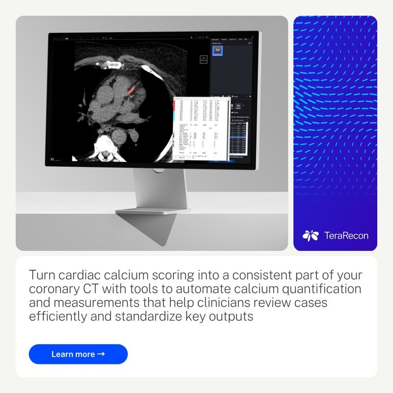
LAYOUT-07 Panels on a clean grid. Decided 2 November 2026; Steven Brown, on the Italy LinkedIn ads: "Emphasize the importance of clean grid systems."
LAYOUT-08 · ShouldGive each module one job, such as the message, the image or the attribution, then assemble the composition. Modules may differ in size and still read as one piece.
Check: can a reader tell the main message, the supporting image and the attribution apart at a glance? LAYOUT-05 One subject per panel is the Must behind this.
LAYOUT-08 Divide the composition into distinct jobs. Drawn from the examples in Agency guidelines R1 V4, pp. 1, 14, 23, 24, 25, 28; rewritten as a Should in our own voice by Steven Brown's direction, 3 November 2026: "We are the source of truth, we don't need to refer back to the agency."
LAYOUT-09 · ShouldAlign related edges, keep the gaps between modules even, and let the ground show as a frame around the composition.
LAYOUT-07 Panels on a clean grid sets the numbers. Environmental bands and apparel are not framed. Check: do the edges and gaps group what belongs together?
LAYOUT-09 Keep a visible frame and a consistent gutter rhythm. Drawn from the examples in Agency guidelines R1 V4, pp. 14, 23, 24, 25, 28; rewritten as a Should in our own voice by Steven Brown's direction, 3 November 2026: "We are the source of truth, we don't need to refer back to the agency."
LAYOUT-10 · ShouldWhen the aspect ratio changes, keep the reading order and each element's role, and choose a new arrangement and crop for the new space.
Compose a phone layout for its space rather than shrinking the desktop one. Check: does the narrow format keep the same message hierarchy?
LAYOUT-10 Recompose for the format. Drawn from the examples in Agency guidelines R1 V4, pp. 23, 25, 26, 28; rewritten as a Should in our own voice by Steven Brown's direction, 3 November 2026: "We are the source of truth, we don't need to refer back to the agency."
Renderings
RENDER-01 · ShouldSet fine anatomy on a quiet surface that separates it from its surroundings, large enough to read at its final size.
This does not mean recoloring diagnostic images or putting every clinical image on White. Check: can the anatomy be read at its final size?
RENDER-01 Give detailed anatomy a calm backing. Drawn from the examples in Agency guidelines R1 V4, pp. 14, 19, 20, 24; rewritten as a Should in our own voice by Steven Brown's direction, 3 November 2026: "We are the source of truth, we don't need to refer back to the agency."
RENDER-02 · MustFeature 3D renderings in Advanced Visualization, use them in a supporting role in Imaging Workflows, and keep them minimal in Insights.
In compositions, colorize renderings within the spectrum shown on p. 19. The agency's examples put renderings on White rounded tiles, also inside a gradient card.
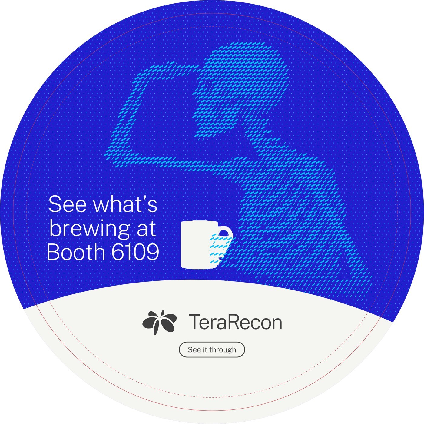
RENDER-02 Renderings lead in Advanced Visualization. Agency guidelines R1 V4, pp. 19–20.
Photography
PHOTO-01 · MustShow product UI on real devices in clean, real-world settings, never as a floating screenshot.
In our work: the booth, all the way round.
PHOTO-01 Product UI on real devices. Agency guidelines R1 V4, p. 21.
Web and print
WEB-01 · MustOn web pages, a dark band or panel is flat Deeper Cobalt (#3800AB), the dark end of the Cobalt Gradient. White text on it measures 12.0:1.
Elsewhere Deeper Cobalt is a gradient stop only (COLOR-07 Gradients). Deep Cobalt (#221ECD) stays the accent and text blue.
WEB-01 Deeper Cobalt is the dark ground on web pages. Decided 13 October 2026; Steven Brown, website restage decision D1; applied on the staged website from iteration 2.
WEB-02 · MustOn web pages, a pill field with Deeper Cobalt (#3800AB) pills never sits on a White or Bone ground; where a field sits on a light panel or fades out of a Cobalt panel, its ground is Cyan (#00C2FF) with the pills in Deeper Cobalt.
On White or Bone, Deeper Cobalt pills look stark; Deeper Cobalt measures 5.8:1 on Cyan.
WEB-02 Deeper Cobalt pills sit on Cyan, never White. Decided 14 October 2026; Steven Brown, website restage voice pins 20261014-204848-3ocj (Imaging Workflows hero) and 20261014-204928-wmuj (AI Framework hero); applied on the staged website 15 October 2026. Steven Brown: "Deeper cobalt pills mixed with a white background isn't really a great combination... It's just very stark... cyan might contrast well with deeper cobalt."
WEB-05 · MustA solid product chip on the web sets its text in the chip role, 14/12/12 px SemiBold, in the ink its category color takes.
The ink is Charcoal on Aqua (COLOR-09 Charcoal text on Cyan and Aqua), White on Violet and Charcoal on Orchid (COLOR-10 White text on Violet, Charcoal text on Orchid). Violet and Orchid chips measure 3.9:1 (White on Violet) and 3.7:1 (Charcoal on Orchid): below the 4.5:1 that WCAG AA asks of ordinary text. The 3:1 allowance applies to large text: at least 18 pt, or 14 pt bold. A 12–14 px SemiBold chip is not large text. Logo/brand-name text has a specific exemption; a functional label does not become exempt because it uses brand colors. Steven Brown accepted them for chips on 13 October 2026, since a chip carries a product name and nothing else.
WEB-05 Text on product chips. Decided 13 October 2026; Steven Brown, website restage decision B (category chips); applied on the staged website from iteration 3; its inks restated by color pair in COLOR-09 and COLOR-10 by Steven Brown, 3 November 2026: "One rule per color pair."; context clarified 3 November 2026 (documentation).
WEB-06 · MustOn the web, each clinical area carries one tertiary color, always the same one: Cardiology Red (#D6333D), Body imaging/oncology Yellow 2 (#AE7F2A), Pulmonology Teal 2 (#316E6B), Neurology Orange 2 (#BB5A26), Vascular Red 2 (#851E26), MSK Yellow Green 2 (#769424). Aqua, Violet and Orchid stay reserved for the product lines.
The color marks the area and never carries text: a chip outline around Charcoal text, the selected tab's underline, the hotspot dot on the body figure, a card's left edge and its selected outline. Each color measures at least 3:1 on White and on Bone, the contrast WCAG asks of non-text marks (3.5:1 to 9.5:1 on White, 3.2:1 to 8.7:1 on Bone); the light Orange, Yellow, Yellow Green and Green fall below it, so their "2" shades are used. These marks count as chart use under COLOR-06 Tertiary colors are for charts. The map lives in the module.css of the Solution Category Explorer on the TeraRecon AV page.
WEB-06 Clinical areas take tertiary colors by a fixed map. Decided 16 October 2026; Steven Brown, on Evan's note about the body module of the terarecon.com restage ("using different theme colors for the highlight by topic/solution area for body module"): "We'll go with tertiary colors for body modules."; counted as chart use, 3 November 2026: "It's a chart."
WEB-07 · MustA product card on a category gradient holds its copy column to 76 % of the card's width, so the copy stays on the gradient's Cobalt end.
The gradient and its stops are COLOR-11 White copy on a category gradient sits on the Cobalt end.
WEB-07 Product card copy column. Decided 13 October 2026; Steven Brown, website restage decision D8 and B (panel contrast); applied on the staged website from iteration 4; its gradient restated for every medium as COLOR-11 by Steven Brown, 3 November 2026: "One rule per color pair."
WEB-08 · MustOn web pages, card titles are set like every heading: Public Sans ExtraLight (200), tracking -0.02em. SemiBold stays on labels, chips and buttons.
WEB-08 Card titles are headlines. Decided 13 October 2026; Steven Brown, website restage decision D4; applied on the staged website from iteration 2.
WEB-09 · MustWeb pages set type on this scale, with breakpoints at 992 and 768 px. Headings are Public Sans ExtraLight (200) at -0.02em tracking; text is Regular (400) at -0.01em; labels, buttons and chips are SemiBold (600).
| Role | 992 px and wider | 768 to 991 px | Below 768 px | Weight |
|---|---|---|---|---|
| Display | 88 | 72 | 48 | ExtraLight 200 |
| Heading 1 | 64 | 56 | 40 | ExtraLight 200 |
| Heading 2 | 48 | 40 | 32 | ExtraLight 200 |
| Heading 3 | 32 | 28 | 24 | ExtraLight 200 |
| Heading 4 | 24 | 22 | 20 | ExtraLight 200 |
| Lead | 22 | 20 | 18 | Regular 400 |
| Body | 18 | 16 | 16 | Regular 400 |
| Small | 16 | 14 | 14 | Regular 400 |
| Label and button | 14 | 12 | 12 | SemiBold 600 |
| Chip | 14 | 12 | 12 | SemiBold 600 |
| Navigation | 16 | 16 | 16 | Regular 400 |
WEB-09 The web type scale. Decided 13 October 2026; Steven Brown, website restage decision D7; applied on the staged website from iteration 2.
WEB-10 · MustWeb page content sits in panels with a 24 px corner radius (16 px for a card inside a panel), at most 1568 px wide, with page gutters and gaps between panels of 40, 24 and 16 px (992 px and wider, 768 to 991 px, below 768 px).
The agency names rounded forms and even, narrow gutters (p. 6, p. 14) but gives no values; these come from this guide page's own panels.
WEB-10 Panels, corners and gutters on web pages. Decided 13 October 2026; Steven Brown, website restage decision D8; applied on the staged website from iteration 4.
WEB-11 · MustWeb pages space everything in steps of 4, 8, 12, 16, 24, 32, 48 and 64 px. Text is left-aligned; only the devices listed below are centered.
- Centered devices: the statistic cards (value, label and step), the product explorer (its heading, tab row and product picture read as one), heroes (aligned by their own settings) and form buttons.
| Space | 992 px and wider | 768 to 991 px | Below 768 px |
|---|---|---|---|
| Panel padding, all four sides | 48 | 32 | 24 |
| Between blocks in a panel | 24 | 24 | 16 |
| After a heading group | 48 | 32 | 32 |
| Between lines of text (paragraphs, list items) | 16 | 16 | 16 |
| Between columns | 32 | 24 | 16 |
| Body text measure | 68 characters | 68 characters | 68 characters |
WEB-11 Spacing on web pages. Decided 13 October 2026; Steven Brown, website restage decision D9; applied on the staged website from iteration 7.
PRINT-01 · MustIn print, use the PANTONEs from the palette and expect them to be duller than the screen; use CMYK only as a fallback, knowing it can't reach Cobalt.
Cobalt sits 15.6 ΔE (a measure of visible color difference) from its ink, and Deeper Cobalt has no ink.
PRINT-01 Screen is master; print is the nearest ink. Decided 8 October 2026.
PRINT-02 · MustPrint particle flow as two flat spot inks, one for the pills and one for the ground, from the pairings above.
The pairings are the rows of the table Print pairings at the top of 2.2 Print; the table under this rule gives each pairing's inks and contrast.
| Pills on ground | Inks | Contrast, screen / ink (ΔE) |
|---|---|---|
| Cyan on Deep Cobalt | 2995 C on 293 C | 54.3 / 39.6, the strongest on screen |
| Cyan on Cobalt | 2995 C on 2935 C | 38.9 / 31.4 |
| Aqua on Cobalt | 3115 C on 2935 C | 47.6 / 41.5, the strongest in ink |
| Deep Cobalt on Cyan | 293 C on 2995 C | 54.3 / 39.6 |
| Cyan on White | 2995 C on paper | 28.6 / about 31.6 |
| Cyan on Bone | 2995 C on 25% 2330 C | not measured |
PRINT-02 A print duotone is two spot inks. Decided 8 October 2026.
PRINT-03 · MustRun a print gradient only between two inks the job carries, at most PANTONE 2935 C → 293 C, with noise added against banding; when the printer can't hold two spots, use a flat spot ground.
PRINT-03 Print gradients run between two inks. Decided 8 October 2026.
PRINT-04 · MustMake print fades the same way as on screen: the ground ink as a tint over the pills, running to zero; get a proof.
PRINT-04 Fades in print. Decided 8 October 2026.
PRINT-05 · MustUse the spot pairings for offset and wide-format spot printing, and flat grounds for CMYK-only jobs; proof fabric (dye-sublimation banners and walls, called SEG, and apparel), which prints flatter than the swatch book.
Extended-gamut printing is the printer's call.
In our work: the booth, all the way round.
PRINT-05 By process. Decided 8 October 2026; written without "prefer" by Steven Brown's direction, 3 November 2026.
PRINT-06 · MayFor hero print pieces that should glow like the screen, a neon Cyan (PANTONE 801 C) on 2935 C may be proofed; it is not adopted.
PRINT-06 Open question: a neon Cyan. Decided 8 October 2026.
Email signature
LOGO-17 · MustMake your email signature with the brand kit's signature form: your name, title, mobile and @terarecon.com email, then the Charcoal lockup, www.terarecon.com and the address of your office, picked from the form's list. One of the kit's email banners may go under it.
One block for everyone keeps signatures alike and every address written the same way. Text is Charcoal and links Deep Cobalt; the name is set larger, not bold. The lockup is 150 px wide on White, so it stays readable when a mail app turns dark, and loads from a fixed address on terarecon.com that later kit releases never move.
LOGO-17 Email signature: the block from the brand kit. Decided 29 October 2026.
Sources and release history
The chapter guidance is reorganized from release 2026.11.10-1. The original guide, its agency source pages and release history remain available for reference.
Ask about the brand
Steven Brown
For brand questions, exceptions and files, send the draft and where it will appear.
sbrown@concertai.com ↗